The Background
This is the first in a series of five articles on home decoration written by L.B. Wheeler (1854-1899), an architect who practiced in Atlanta from 1883 to 1891. The articles were published in The Atlanta Constitution in December 1885 and January 1886.
Here, Wheeler introduced the series and pontificated in a somewhat circuitous manner on the origins and meaning of taste, the fickle nature of fashion, and ill-proportioned rooms, among other things.
However, it appears his main objective for the article was to rant about that most contentious of topics: wallpaper. Wheeler offered choice words on the subject and invoked the name of William Morris, an influential British textile designer, to argue against the “cheap, flashy appearance” of gold in wallpaper.
It truly was the Gilded Age.
Home Decoration.
The First of a Series of Interesting Papers.
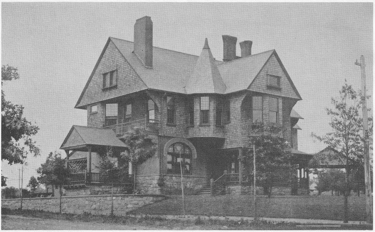
By L.B. Wheeler, Architect of the New H.I. Kimball House.
It seems to me that if a knowledge of the truths and principles, the observance of which are essential to the production of all good decorative to other art work, could become general, it would greatly raise the standard of excellence in those productions. It is my purpose, from time to time, to offer through The Constitution suggestions for thought upon the following subjects: Halls, fireplaces, yards and fences, convenience and arrangement of rooms, carpets, tapestries, bricabrac, furniture, style, fashion, etc. If any interest is thereby awakened in those subjects, and a desire for their further investigation created, my object will have been accomplished.
L.B. WHEELER
Decoration and Furniture.
It is essential that the arrangement, decoration and furniture of a room should be suitable for its purposes. However beautiful a room or an object may be in itself, if it fails to accomplish the purpose for which it was intended, it is a failure.
It would seem that practical application of truth so plain must be universal, but when we look around us, we find chairs which are uncomfortable to sit upon; rooms without suitable places for furniture, fireplaces so arranged that the back of the shivering applicant for warmth, receives a constant draught; sitting rooms, where the colors should be quiet and unobtrusive, the walls, forming a harmonious background for the occupants, and for the objects of interest and beauty that accumulate in such a place, having walls covered with paper, ablaze with Dutch gold, glaring red and black, thus forcing itself upon our notice, to the exclusion of all that is truly beautiful, refined and modest in the room.
Gold is very seldom used in the best designed papers. It is not introduced by William Morris into more than half a dozen of all the beautiful papers designed by him, and in these in such a manner that you are scarcely conscious of its presence. Gold, when it becomes too conspicuous in a design, gives it a cheap, flashy appearance, very objectionable in most of the papers used in house decoration; the figure is so strong that it destroys the effect of whatever is brought into contact with it or relieved against it: the colors are too bright and too many, and they are seldom harmonious; the general effects obtained, unless large quantities of Dutch gold are used, being some dirty gray. The tones, with a few exceptions, are never good and positive. The patterns are still worse, made without any regard to fitness of effect or the nature of the materials and processes at command. Attempts are frequently made to imitate nature, where the representation of some vine, flower or leaf is attempted you will probably find most of the laws which govern the direction of growth in nature and ornament violated.
Where figure subjects are aspired to, the results compare very favorably with the chromo-lithographic work on the bills heralding the approach of traveling shows. With such material at command, without any knowledge training, study or experience, their only stock in trade being their supposed inheritance of what is called good taste; “something with which, by the way, every true American is abundantly provided, and in which his neighbor is sadly deficient” it is not surprising that so many fail in the attempt to make their homes attractive and beautiful.
Many persons have selected beautiful papers for the walls, a lovely pattern for the frieze, but somehow when they were sent home and put up, the effect was not just what was expected, in fact it was disappointing, and their attempt at decoration proved a failure. They have yet to learn that colors, forms and objects are of as much importance, and require as great skill in their introduction and arrangement in a room as they do in a picture. Very few would think themselves capable of creating a work of art or making a change for the better in an existing one, yet they would not hesitate to destroy the effect of a beautiful room by the introduction of some inharmonious object or color.
The contents of our homes are usually chosen because we like them, but when we think of the effect fashion has upon our likes and dislikes, that the thing we thought perfectly beautiful last year, is perfectly hideous this year, how our so-called good taste is constantly changing, it is simply a matter of different influences brought to bear upon an immature education.
When we think of this, would it not be wise to use a little more judgment and less taste in the selection of things of so much importance to our welfare and happiness as the furniture and decoration of our homes? A form or color that is beautiful once is beautiful forever.
Who ever tires of the masterpieces of art, Beethoven‘s symphonies, or the scenes and beauties of nature familiar from childhood? Rather does not the pleasure derived from these things increase with continued acquaintance? That some people are more susceptible to the influence of the beautiful than others, and that they acquire more readily, though, perhaps unconsciously, an education from the objects by which they are surrounded, is true, but the value of this education depends upon their opportunities for observation. The definition of taste, according to the common conception, is this:
Taste is an inherited faculty to judge of the right and wrong a thing, about which we know nothing. The reputation of having this faculty, is often very cheaply obtained. The frequent and persistent assertion of your opinion upon matters of art, a month’s trip to to Europe, the ability to copy a few flowers indifferently well with the assistance of a teacher, or the having been connected in some distant way with art, perhaps a dealer in art materials, giving one a clear title to judge of the masterpieces in architecture, sculpture, painting, music and poetry.
Among a few of the mistakes made by amatures [sic] is the common one of failing to pay proper regard to the proportions of a room. Owing to the almost universal custom of making the ceilings of our homes a uniform height, regardless of the dimensions of the rooms, it happens that very few rooms only are of agreeable proportions. As it is of the first importance to the effect of a room that its proportions should be pleasing, this opportunity should be taken to correct any errors originally made in this respect by a proper arrangement of the decorations.
If we look around us we shall find this very seldom done. Rooms already too small are made to appear still smaller, by using too large and strong a pattern upon the walls, and by the introduction of clumsy excrescences in the finish and furniture. Ceilings, which are too high, are made to look still higher, and when too low to appear still lower, and many other mistakes are made by the failure to use the numerous expedients available for correcting such faults in the arrangement of decorations.
The walls are often so light in color that objects hung upon or relieved against them have a spotty appearance, destroying all repose and breadth of effect. Sometimes the effect produced is gloomy and cheerless, owing to the absence of a principal light where the general tone is dark.
In selecting wall papers those patterns which are pronounced or peculiar should be avoided. When we go into our neighbors’ houses and find the walls covered with a novel and striking paper, we come away with the impression that the paper in Mrs. So-and-So’s house is beautiful. Our admiration is somewhat dampened when on the day following we find the same paper at another friend’s, and by the time we have seen it in several different houses, it affects us as being very commonplace. This feeling is in direct proportion to the power with which the paper first challenged our attention.
As manufacturers produce large quantities of each design, and frequently dispose of them to the same dealers, we take considerable risk in using those of a striking and novel design.
L.B. WHEELER8
References
- Lyon, Elizabeth A. Atlanta Architecture: The Victorian Heritage, 1837-1918. The Atlanta Historical Society (1976). ↩︎
- “Holding Her Own.” The Atlanta Constitution, August 8, 1886, p. 9. ↩︎
- “Handsome Church for Ponce de Leon”. The Atlanta Constitution, January 4, 1914, p. 1. ↩︎
- “The Real Estate Field”. The Atlanta Journal, January 4, 1915, p. 13. ↩︎
- “The Real Estate Field”. The Atlanta Journal, January 17, 1915, p. H5. ↩︎
- “Wanted Boarders” (advertisement). The Atlanta Journal, May 8, 1933, p. 17. ↩︎
- Photo credit: Atlanta in 1890: The Gate City. The Atlanta Historical Society, Inc. Macon, Georgia: Mercer University Press, 1986. ↩︎
- Wheeler, L.B. “Home Decoration.” The Atlanta Constitution, December 6, 1885, p. 13. ↩︎