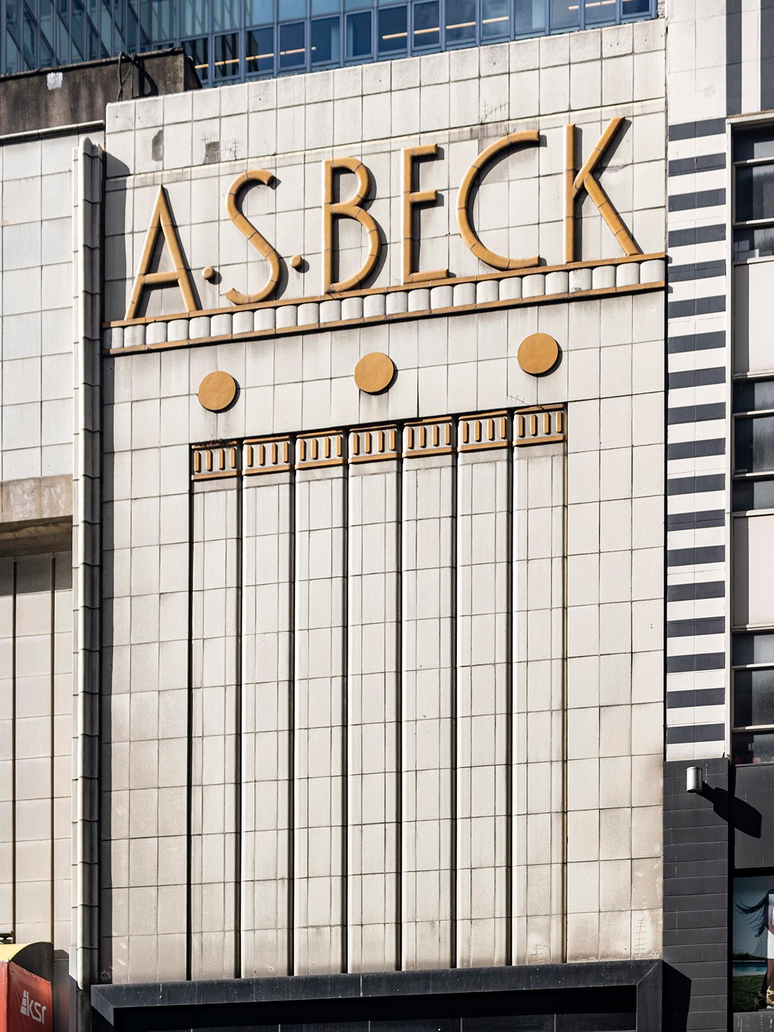
Is it a relic sign or a fine example of Art Deco architecture? The answer is both.
I admired this swanky old Manhattan storefront for years on my walks to and from Moynihan Train Hall, but for some reason, I only recently thought to take a picture of it.
It was easy to find the opening-day newspaper advertisements for the A.S. Beck shoe store, but I’ve yet to determine the designer. Whoever it was, they did a swell job.
References
Advertisement. Daily News (New York), September 18, 1936, p. 16. ↩︎
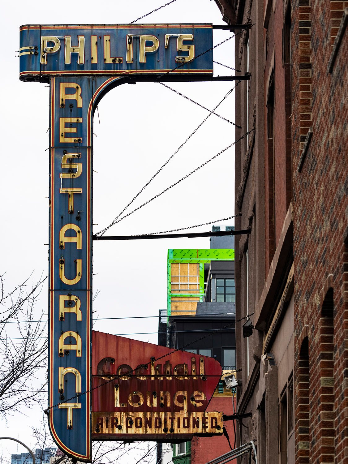
Philip’s Restaurant (1940). 1145 S. Broad Street, Philadelphia.
This swanky old sign is a true relic of South Philly, which is changing as rapidly as any other neighborhood these days.
Owned and operated by the Muzi family, Philip’s Restaurant waslicensed for business at this location in 1940,1 although later advertisements claimed it opened in 1938.2
The blue portion of the sign likely dates to 1940, but I suspect the “Cocktail Lounge” segment was added later.
Originally built as a residence, the 3-story brownstone structure that housed the restaurant previously served as the Circolo Italiano clubhouse for at least 20 years.34
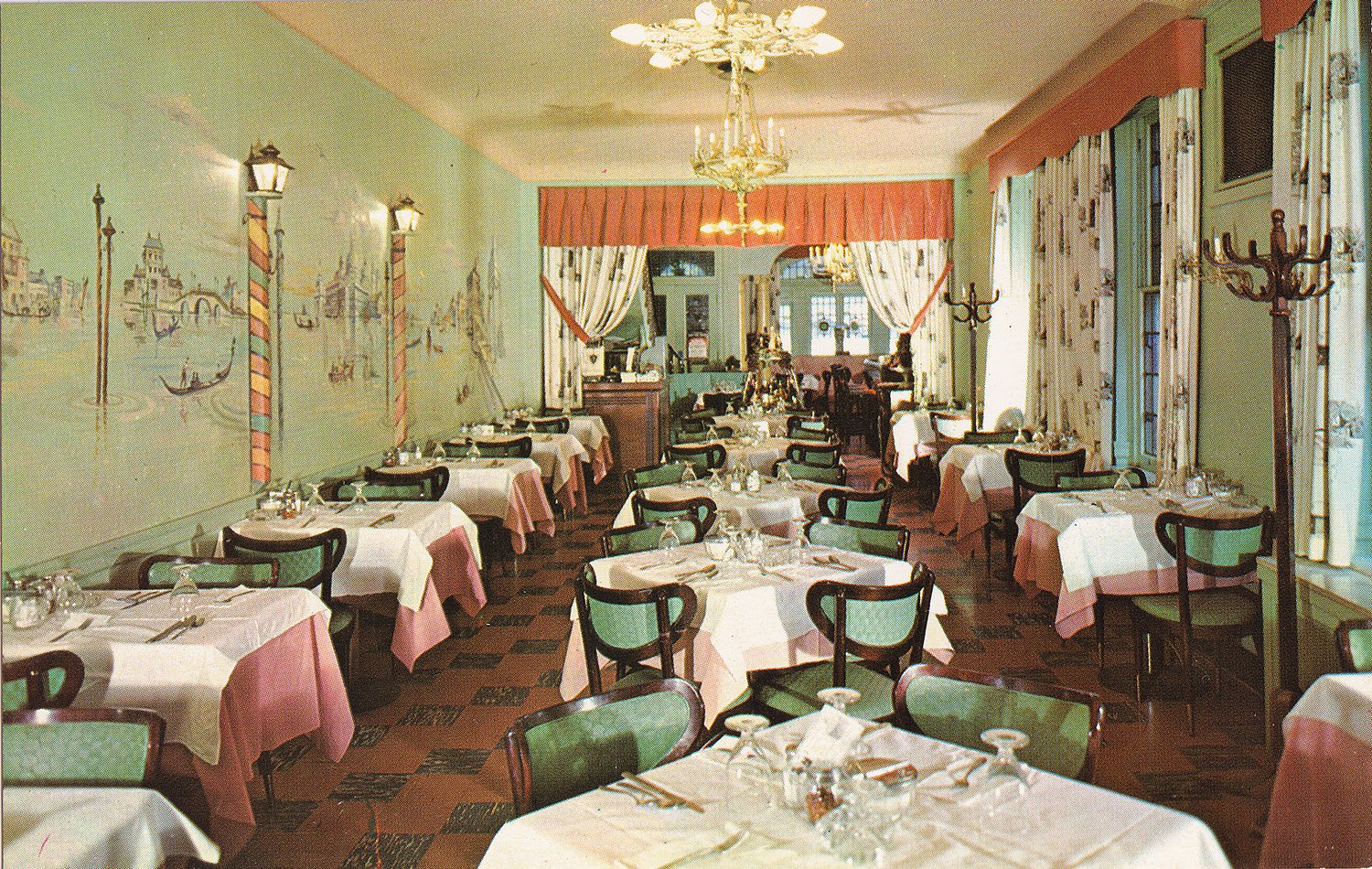
Philip’s touted itself as “Serving the finest in Italian cuisine”, and the interior photograph shown below is from a postcard published circa 1960, based on a note from the back that adds the restaurant had been in “The same location for 20 years.”
Interior of Philips Restaurant, circa 1960. Photograph by Bill Bennett from an undated postcard published by Bill Bennett of Philadelphia and Pennsburg, Pennsylvania.
Philip’s closed in 2001, and the building has apparently been unoccupied since 2018.5 The sign remains untouched.
References
“Latest Reports Of Legal Actions”. The Philadelphia Inquirer, October 23, 1940, p. 39. ↩︎
Advertisement. The Philadelphia InquirerMagazine, October 27, 1968, p. 44. ↩︎
“Sale on South Broad Street”. The Philadelphia Inquirer, May 12, 1916, p. 7. ↩︎
“Circolo Italiano Meets”. The Philadelphia Inquirer, May 1, 1936, p. 32. ↩︎
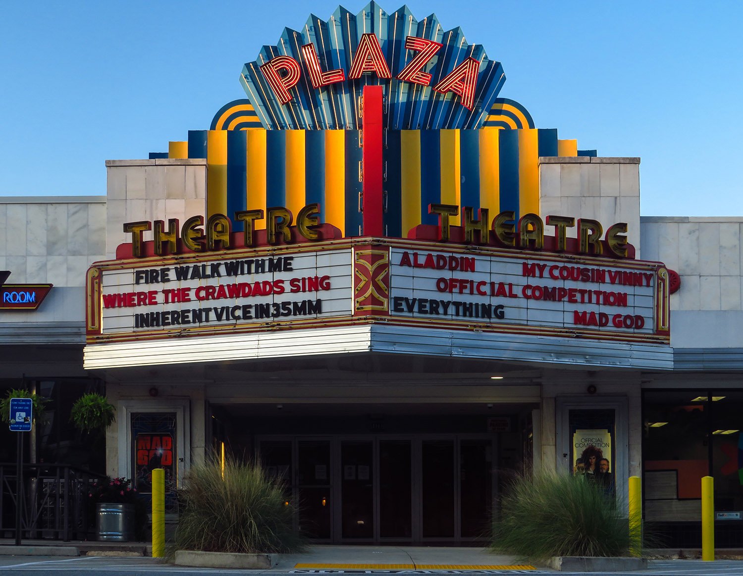
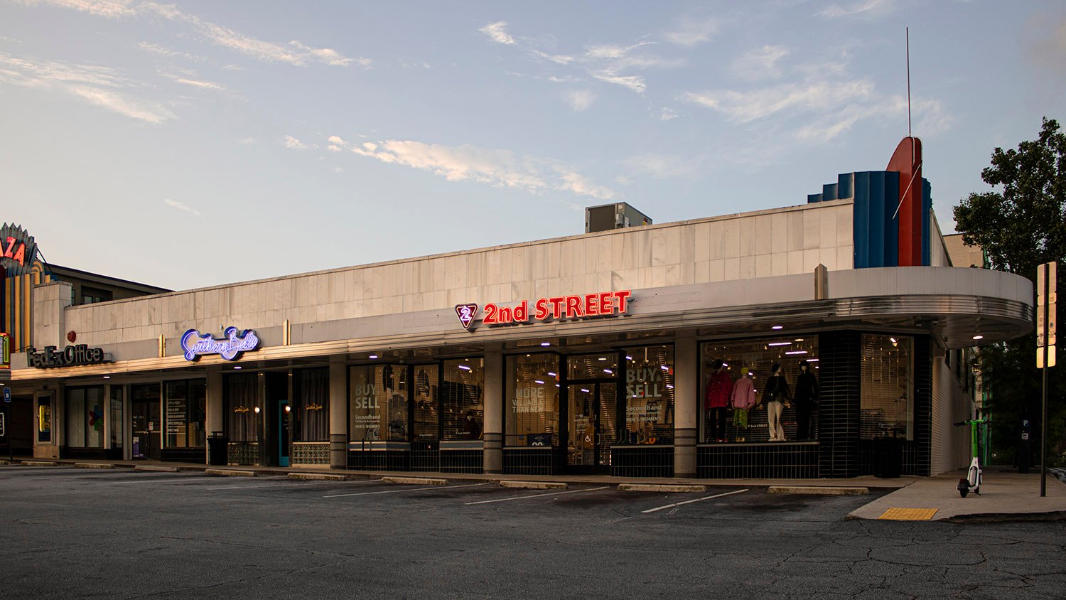
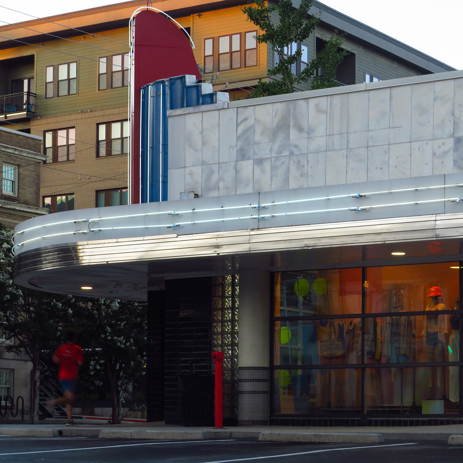
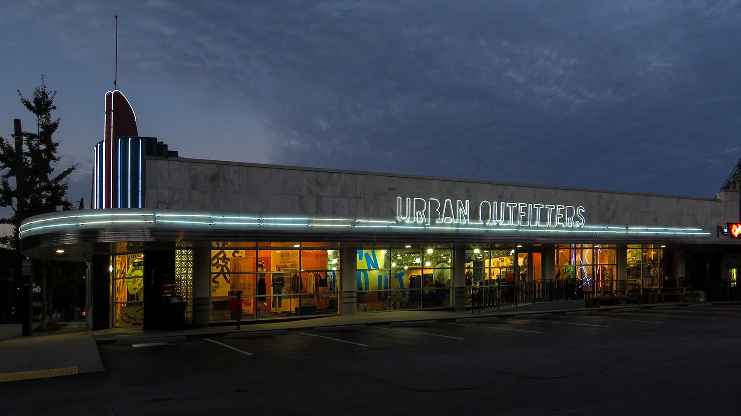
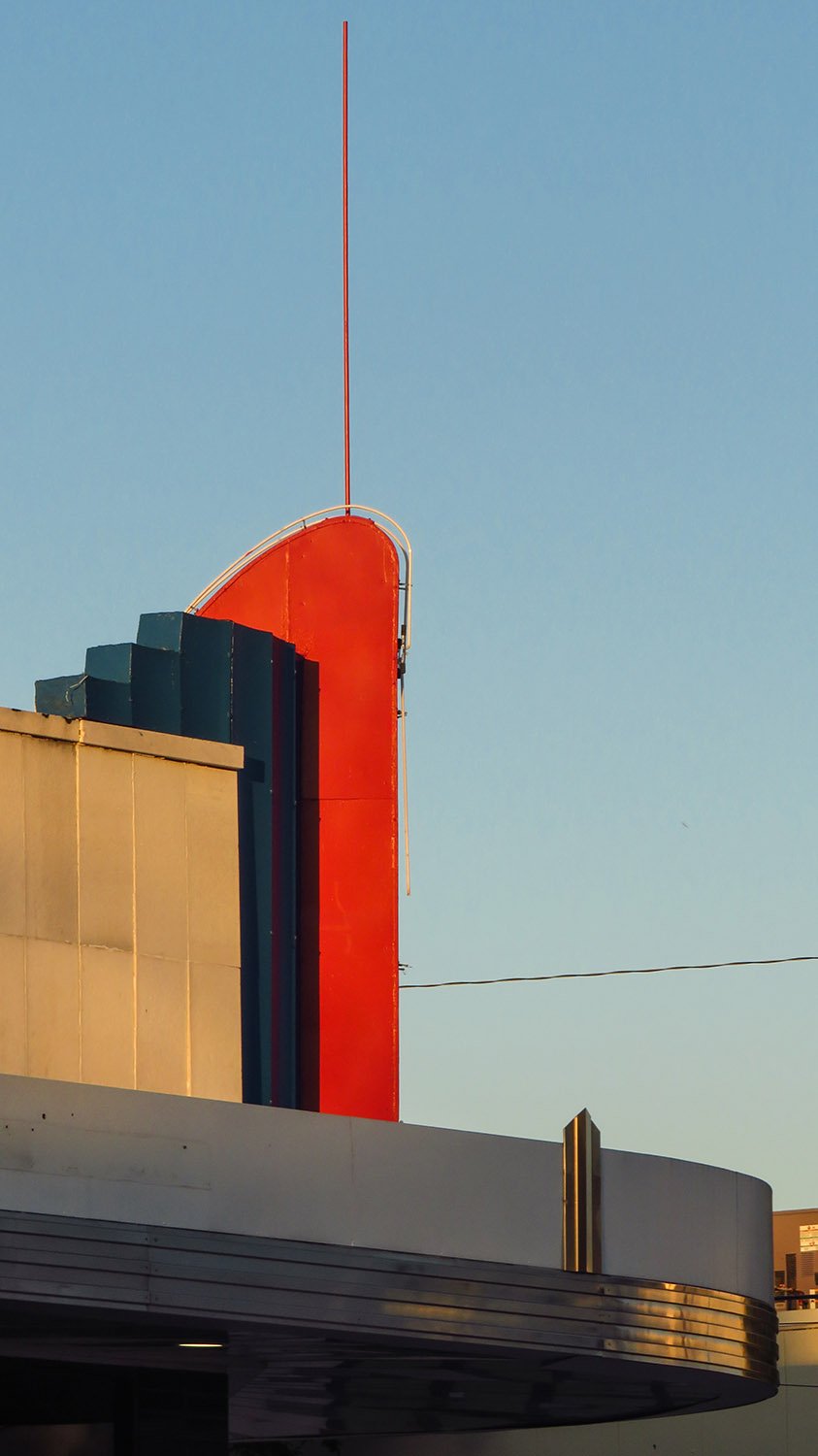
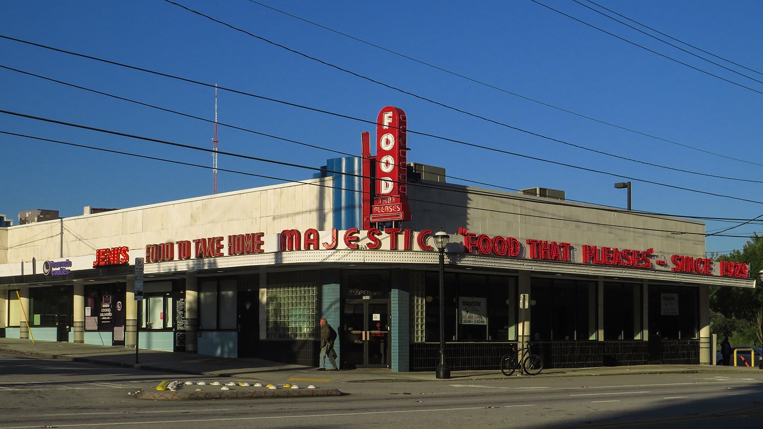
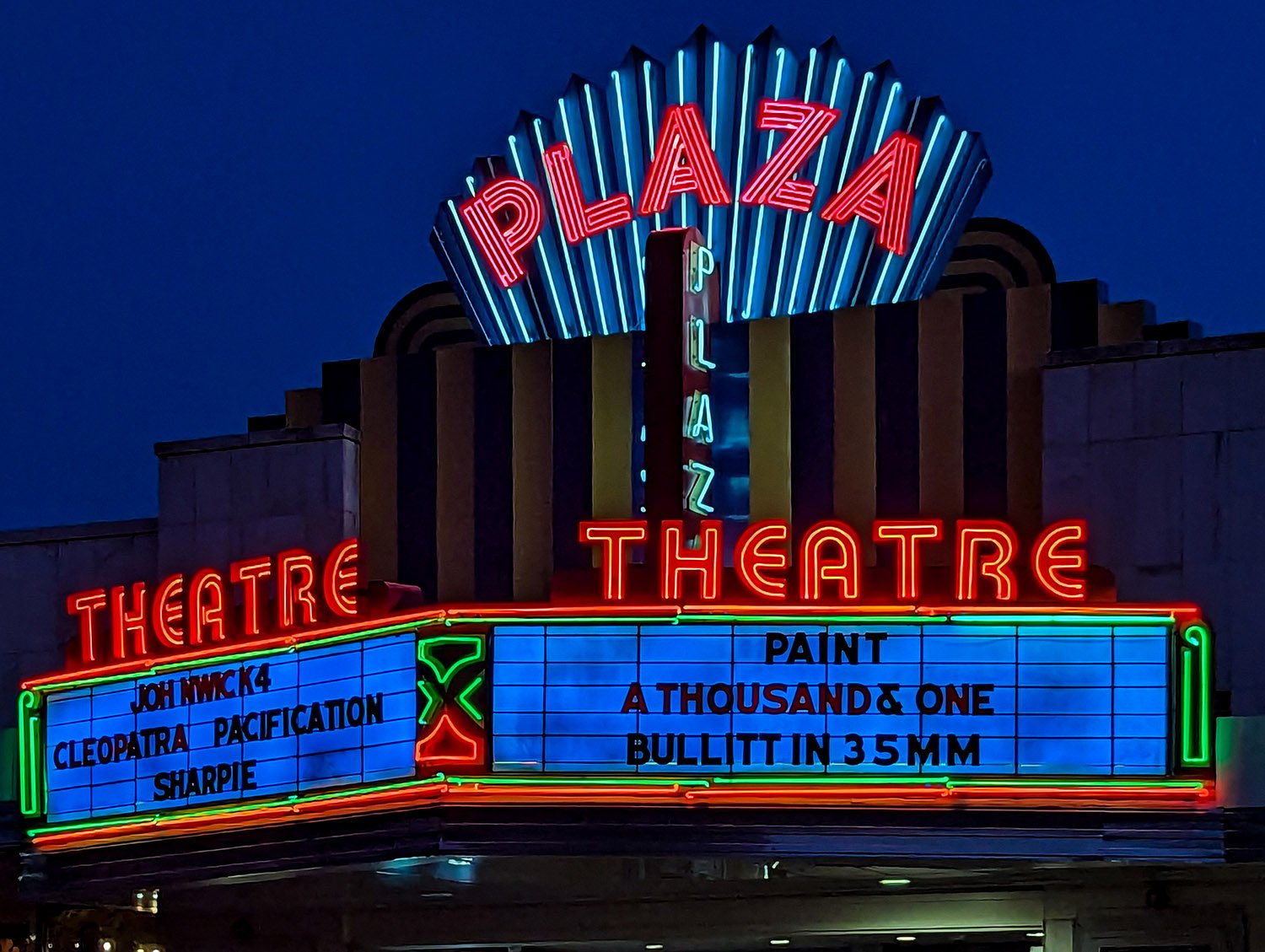
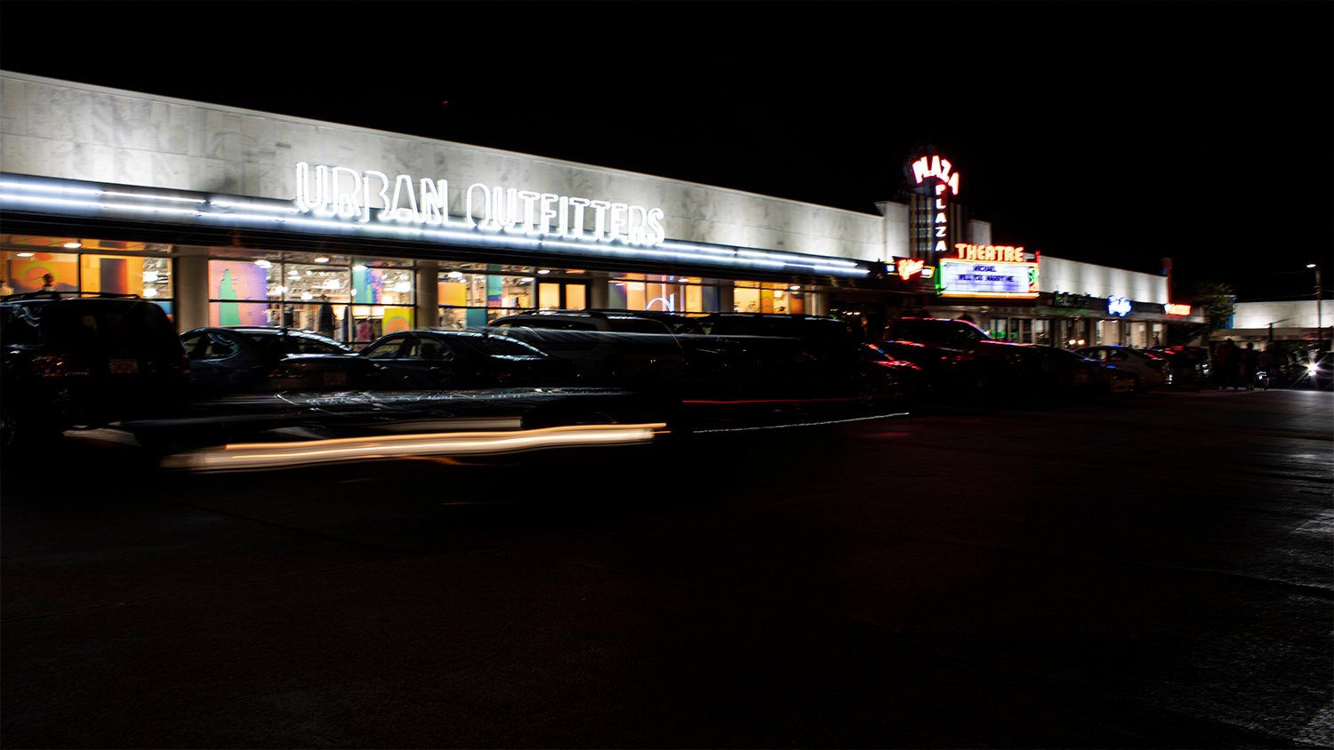
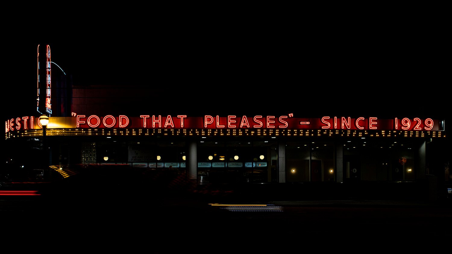
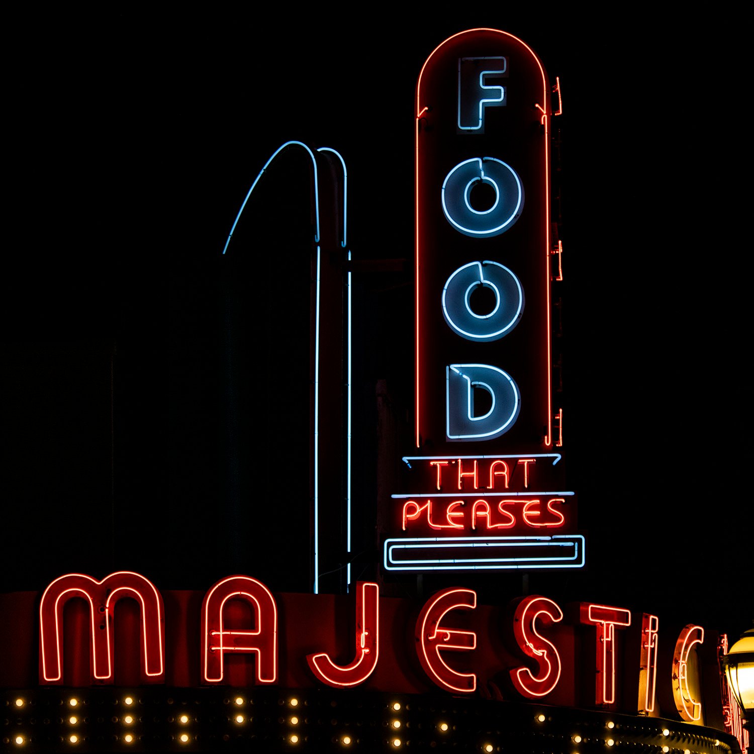
George H. Bond. Briarcliff Plaza (1939). Poncey-Highland, Atlanta.123Looking at Briarcliff Plaza from the northwestNortheast corner of Briarcliff Plaza, AtlantaLooking at Briarcliff Plaza from the northeastOrnamental detail on Briarcliff Plaza, AtlantaLooking toward the Majestic Diner in the west building of Briarcliff Plaza, AtlantaPlaza Theatre marquee at nightLooking at Briarcliff Plaza from the east at nightLooking at the Majestic Diner at nightMajestic Diner sign at night
References
“$200,000 Going Into Business Houses In Atlanta”. The Atlanta Constitution, January 8, 1939, p. 8K. ↩︎
“Half of Briarcliff Plaza Space Already Leased”. The Atlanta Journal, April 30, 1939, p. 7-D. ↩︎
“Briarcliff Plaza To Be Dedicated”. The Atlanta Journal, December 22, 1939, p. 23. ↩︎
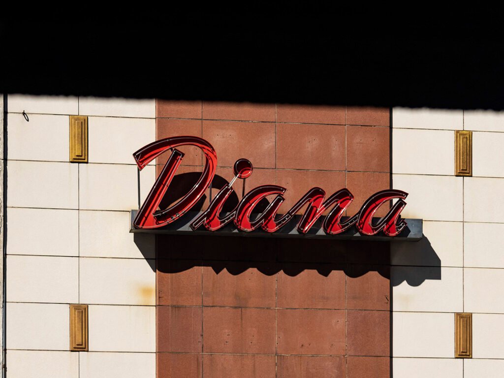
It’s hard to pin down an exact date for this sign in downtown Birmingham, Alabama, but the earliest newspaper ad I can find for the Diana store is from Christmas 1979.1
Previously, the space had been occupied since 1934 by Peggie Hale,2 a nationwide retailer of women’s clothing. Diana Stores purchased Peggie Hale, Inc. in 1945,3 operating stores under both brands.
By 1955, the company opened a Diana Outlet in Birmingham, two blocks north at 313 North 19th Avenue.4 Between 1975 and 1977, advertisements for the outlet noted sales and discounts that were also available at Peggie Hale.56
It appears the Peggie Hale store transitioned to Diana at some point between 1977 and 1979, and the last ads for the store are from late 1983.7 It’s unclear when Diana closed, but the space has long since been abandoned, and the sign remains untouched.
References
Advertisement. The Birmingham News (Birmingham, Alabama), December 25, 1979. p. 15D. ↩︎
Advertisement. The Birmingham News (Birmingham, Alabama), August 23, 1934, p. 11. ↩︎
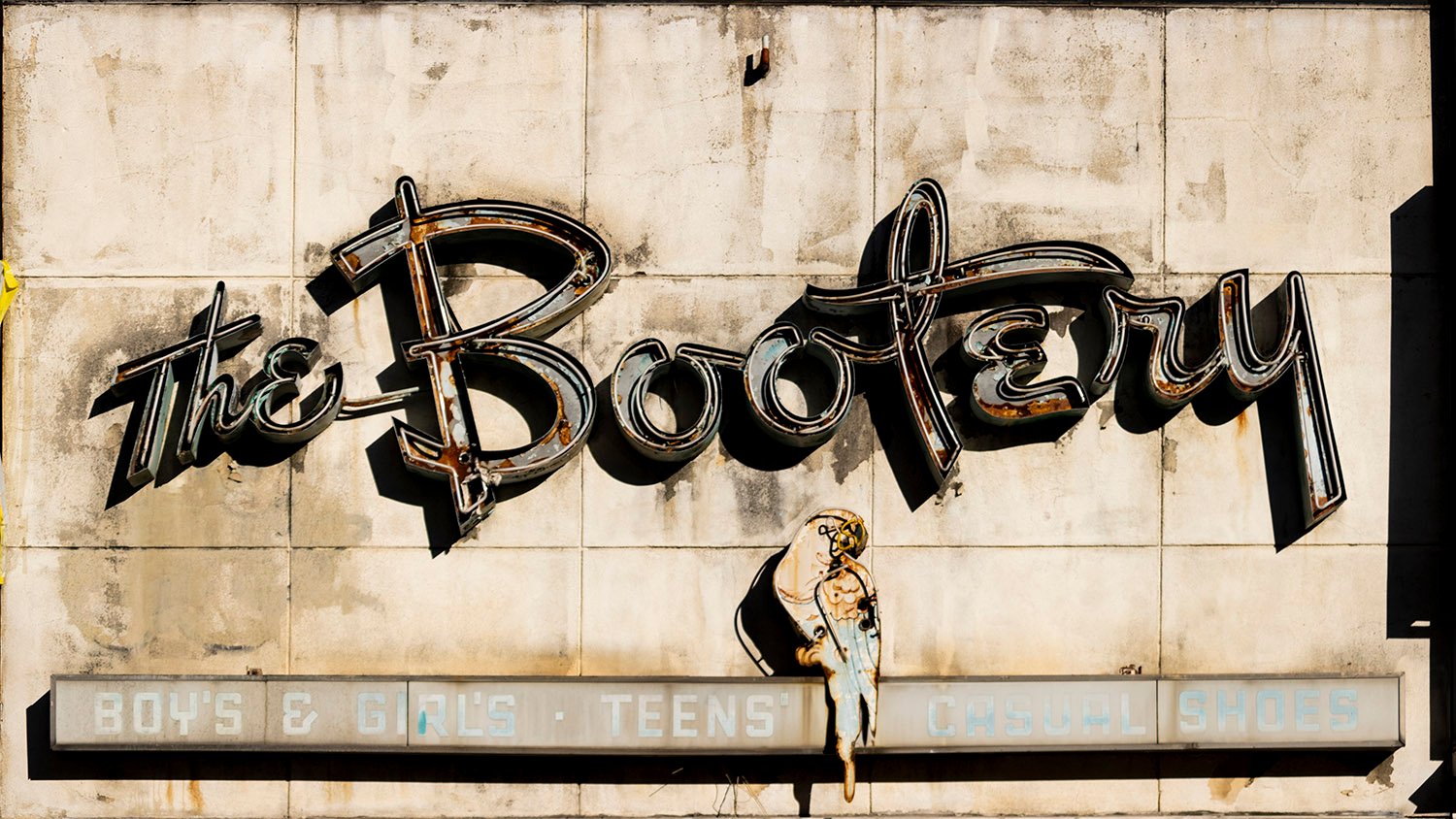
The Bootery (1958-2025). 81 Peachtree Street, Atlanta.
This old parrot was recently toppled from its longtime perch on Atlanta’s Peachtree Street. Squawk!
The Bootery was a national shoe store chain that first opened in Atlanta in 1946, catering to “Boys and Girls of All Ages,”1 and later touting itself as “Atlanta’s Most Popular Children’s Shoe Store.”2
When the store moved to 81 Peachtree Street (previously 81 Whitehall Street) in August 1958,34 it was an exclusive seller ofPoll-Parrotshoes, and the parrot was the brand’s mascot.56
The store closed sometime after 1996,7 but the sign was left to fade and rust for decades, and was finally removed in 2025 as the structure at 81 Peachtree was hollowed out to serve as a courtyard, part of a major renovation of the neighboring Bass Dry Goods building.8
References
Advertisement. The Atlanta Constitution, March 15, 1946, p. 6. ↩︎
Advertisement. The Atlanta Journal and Constitution, March 30, 1958, p. 9-F. ↩︎
‘”The Bootery” Shoe Store Grand Opening August 14-16’. Atlanta Daily World, August 13, 1958, p. 3. ↩︎
Advertisement. The Atlanta Constitution, August 14, 1958, p. 16. ↩︎
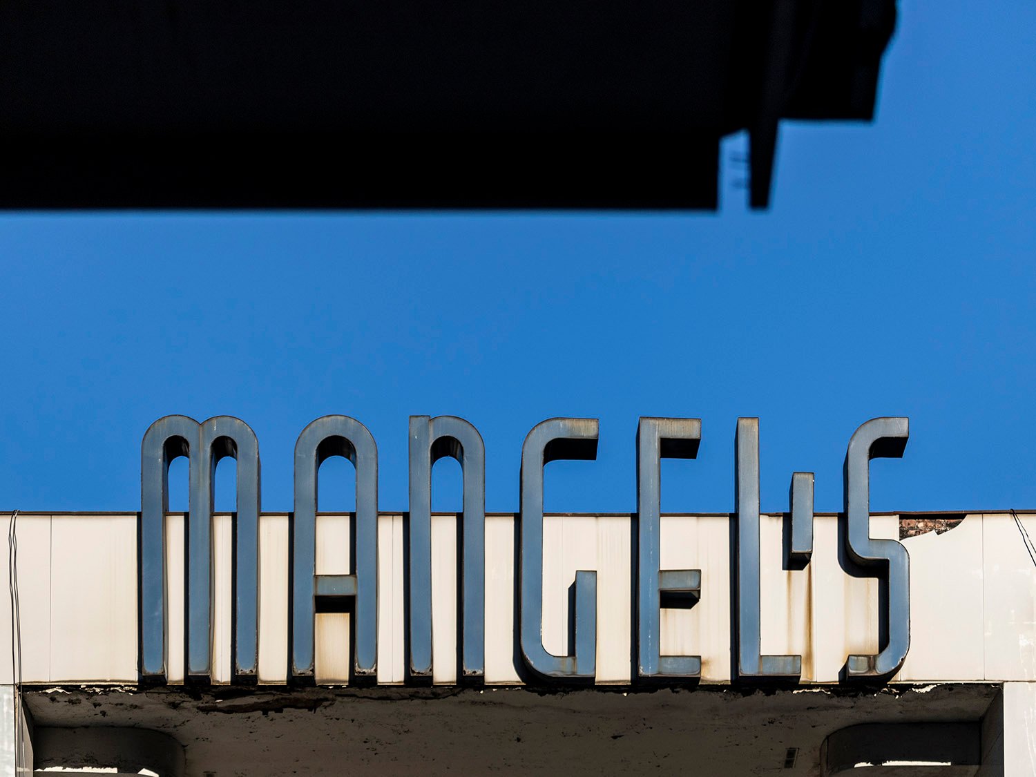
This sign at 74 Peachtree Street in Atlanta (previously 74 Whitehall Street) likely debuted with the Mangel’s store, which opened in May 19461 in a portion of the two surviving floors from the former Hirsch Building.2
Mangel’s was a New York-based retail chain3 that billed itself as “your headquarters for smart apparel at budget-saving prices,”4 and the Whitehall store was its second Atlanta location, with its first store in the city opening in 1919.5
Mangel’s operated at this location for decades, but seems to have quietly closed sometime after 1988.6
References
Advertisement. The Atlanta Journal, May 24, 1946, p. 10. ↩︎
“Realty Trades”. The Atlanta Constitution, August 24, 1935, p. 4. ↩︎
“Anniversary Sale At Mangel Store First Of Its Kind”. The Atlanta Journal, May 3, 1929, p. 31. ↩︎
Advertisement. The Atlanta Journal, May 24, 1946, p. 10. ↩︎
“Anniversary Sale At Mangel Store First Of Its Kind”. The Atlanta Journal, May 3, 1929, p. 31. ↩︎
“Retail Management” (advertisement). The Atlanta Journal and Constitution, October 2, 1988, p. 80-P. ↩︎
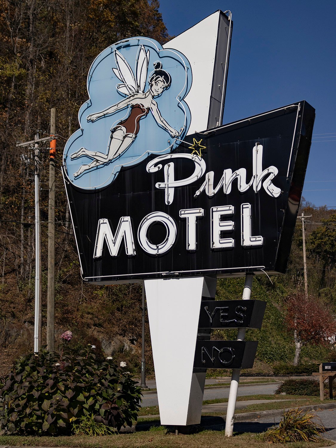
Pink Motel (1957). 1306 Tsali Boulevard, Cherokee, North Carolina.
Nothing makes a night better than pink.
This sign in Cherokee, North Carolina, debuted at the Pink Motel’s opening in 1957. And if you’re wondering about the origin of the name, a newspaper report from the time helpfully explained:
If you are a motel operator, supplying your own linen, name-tagged and all, you will often get back from the laundry the linen of some other operator. So, if you have pink bed sheets and towels, how’s anyone but a colorblind person going to get your linens mixed-up with that of white-linen folks?
So, that’s how the name “Pink Motel” started. It was only logical to carry the pink idea still further until it was “done up pink.” The outside of the Pink Motel is painted pink. The walls, furniture, vertical venetian blinds, the bathroom tile, the furnishings…even the soap…are all pink.1
References
“20-Unit Pink Motel At Cherokee Is Original Color Scheme Idea”. Asheville Citizen-Times (Asheville, North Carolina), July 14, 1957, p. B11. ↩︎
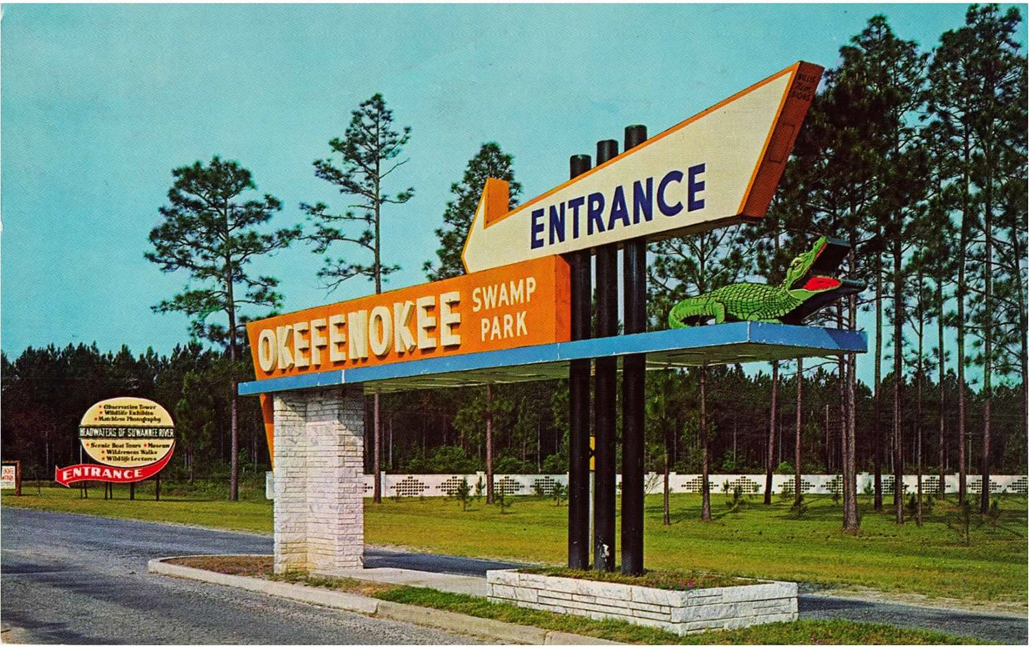
Okefenokee Swamp Park entrance sign. Photograph by Gene Aiken from an undated postcard.
Year by year, more disappear: the quirky, colorful business signs of the 20th century that once littered the United States with their kitschy, eye-catching designs, luring visitors to stores, restaurants, lounges, theaters, shopping centers, tourist attractions, and, of course, motels.
The synthesis of folk art tradition and cold-hard commercialism, these signs followed the growth of the American highway system, and were perhaps the most prominent symbols of the cynical and disposable culture of convenience and impulse that wholly consumed the United States in the 20th century.
The signs functioned as both advertisements and wayfinding tools, and could never be classified as high art: even in their prime, they were widely criticized as crass and unsightly markers to rampant consumerism and unfettered sprawl. Yet one era’s trash becomes another era’s treasure, and these signs attracted wider appreciation as their numbers began to dwindle.
Hand-painted, two-dimensional signs on the outer walls of buildings were a ubiquitous feature of the American landscape starting in the late 19th century, but by the 1920s, sign-making reached new heights and three-dimensional form with “sky signs”, now known as scaffold signs.
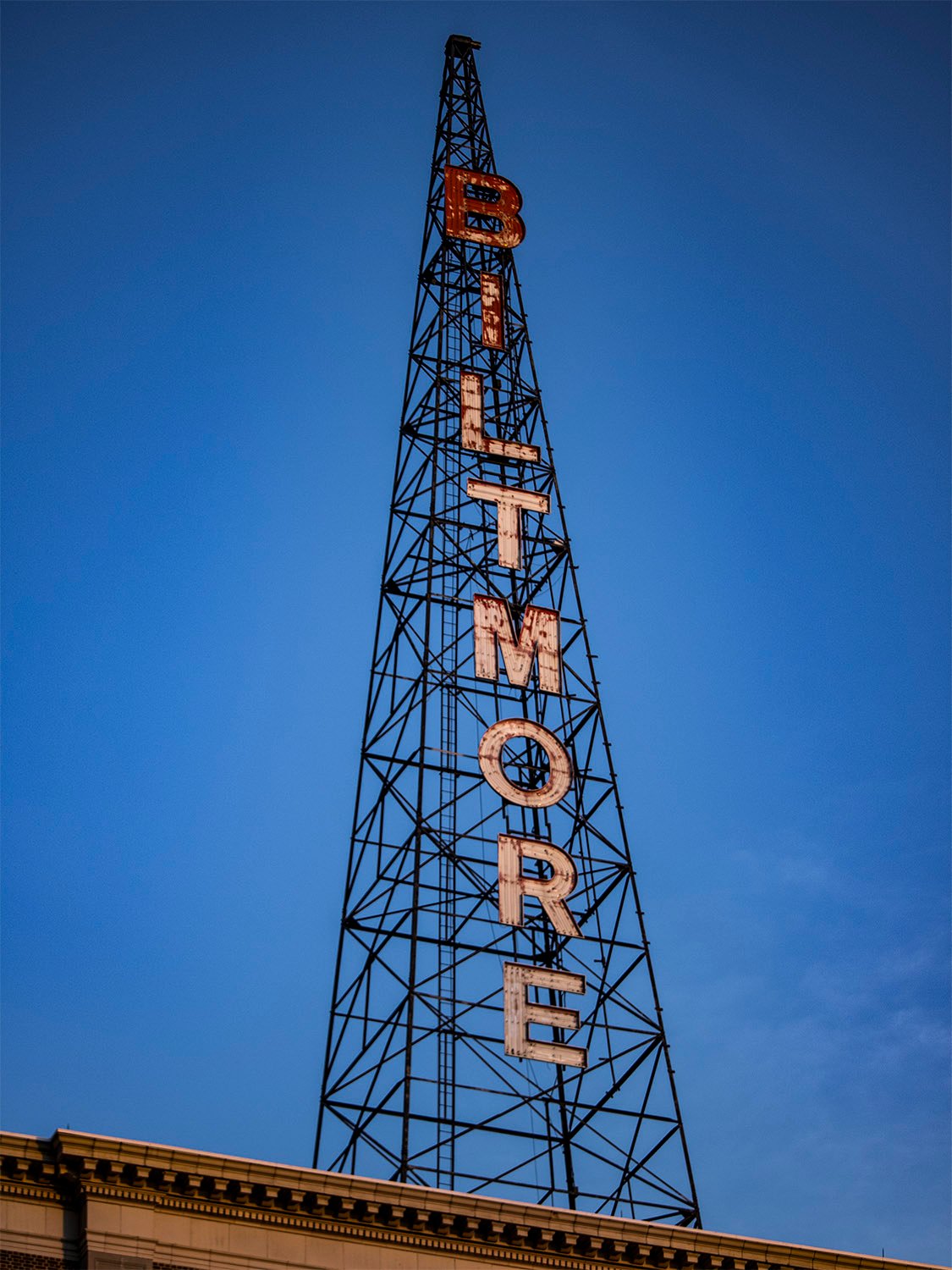
Sky sign on Biltmore Hotel (1924). Atlanta.
Often perched atop towering hotels or other tall buildings in city centers, these machine-produced signs were attached to steel scaffolding and lit by electricity, still a novelty in many places.
As Americans began driving the first automobiles across a patchwork network of highways, sky signs served as bright, beckoning beacons that could be easily spotted from miles around.
Neon lights also debuted in the 1920s, and their distinctive glowing colors quickly became a standard feature of commercial signage, seemingly overnight.
Used by everyone from mom-and-pop shops to department stores, by the 1940s, neon signs were synonymous with nightlife entertainment and what is now referred to as Streamline Moderne architecture.
Clubs, diners, and movie theaters of the era often prominently incorporated neon elements into their sleek, curvaceous designs inspired by an increasingly mobile world of planes, trains, and automobiles.
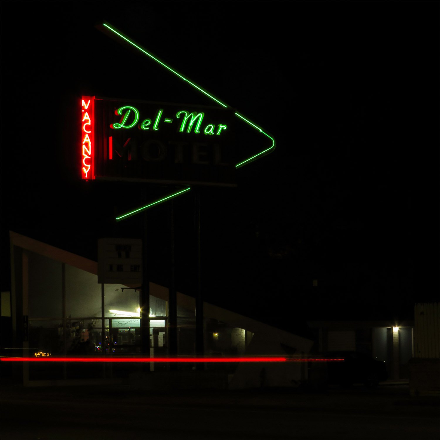
Del-Mar Motel (1955). Valdosta, Georgia. Designed by Joe Bright.
The creative zenith of signmaking emerged with the advent of the Interstate Highway System in the mid-20th century.
Far-out, futuristic signs inspired by the Space Age and the Atomic Era dominated in the 1950s and 60s, today closely associated with Googie architecture, which originated in southern California and spread unevenly throughout the country.
Popular elements of Googie-derived signs included:
starbursts
shooting stars
exploding atoms
orbiting satellites
giant boomerangs
oversized arrows
Many signs of the era were more down-to-earth in their inspiration: roadside business signs often incorporated symbols that were evocative of their specific locale or region — a chomping alligator on the entrance sign for Okefenokee Swamp Park in Georgia, for instance (pictured above).
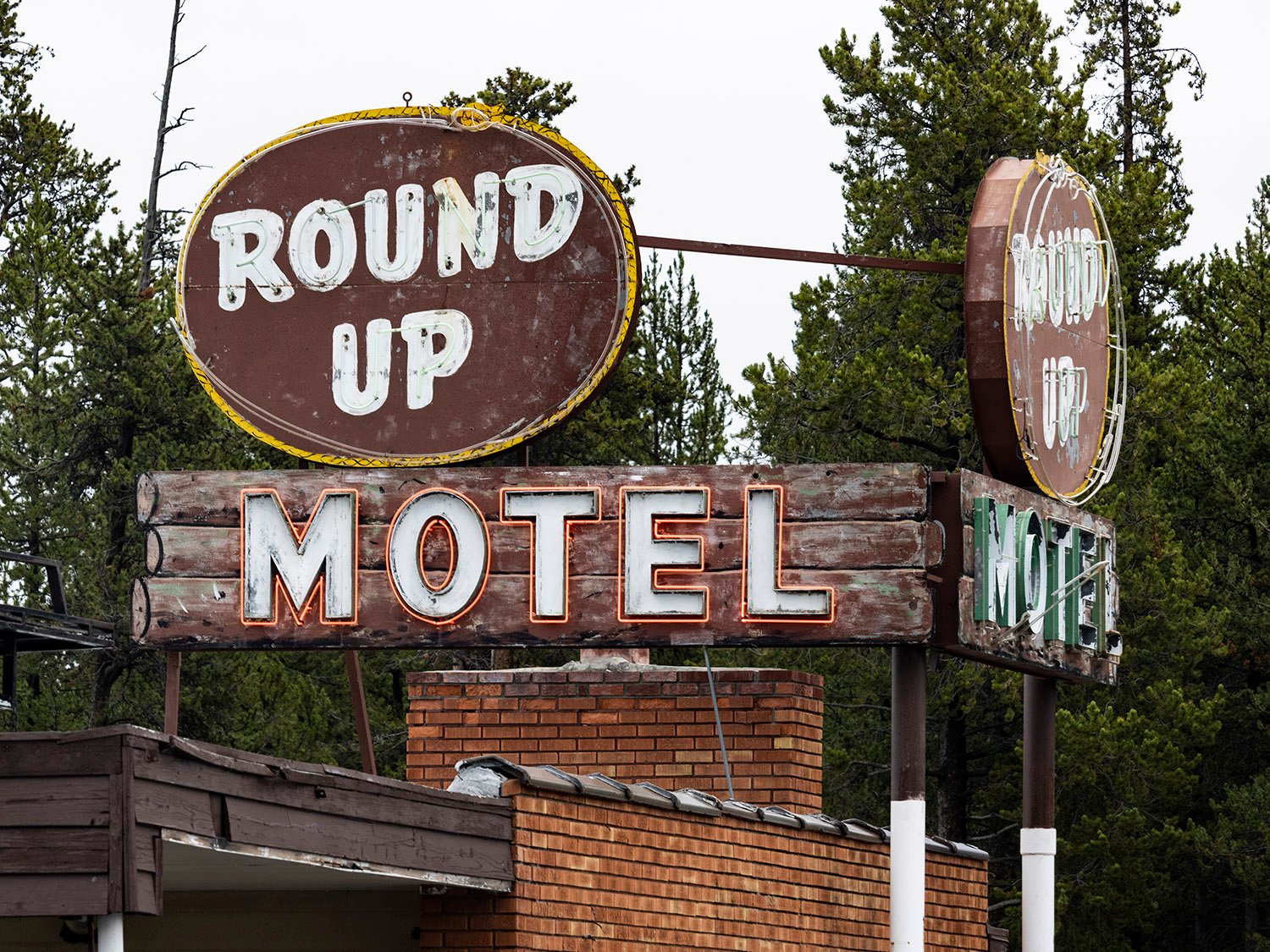
Round Up Motel. West Yellowstone, Montana.
Other signs were more exotic in flavor, capitalizing on the Tiki culture that emerged in the White middle class following World War II, using symbols and typefaces that were stereotypically Polynesian, Hawaiian, or Pan-Asian.
Typically designed by local sign makers, vernacular roadside signs were often used as distinctive focal points for structures that were otherwise unremarkable and interchangeable — see one hole-in-the-wall motel, for instance, and you’ve seen them all. It was the sign that was memorable, not the building.
Vernacular signs were already falling out of fashion when Robert Venturi and Denise Scott Brown, a husband-and-wife architectural team from Philadelphia, galvanized the architectural world with the 1972 publication of Learning from Las Vegas, in which they praised vernacular road signs for their “architecture of communication over space”1and presented them as a legitimate art form worthy of analysis.
Venturi and Scott Brown accused architects of designing to suit “their own particular upper-middle-class values, which they assign to everyone” and admonished them to “gain insight from the commonplace”.2
Yet even as architects began drawing inspiration from them, by the 1970s, vernacular roadside signs were steadily supplanted by standardized signs that became more subdued, less conspicuous, and thoroughly homogenous.
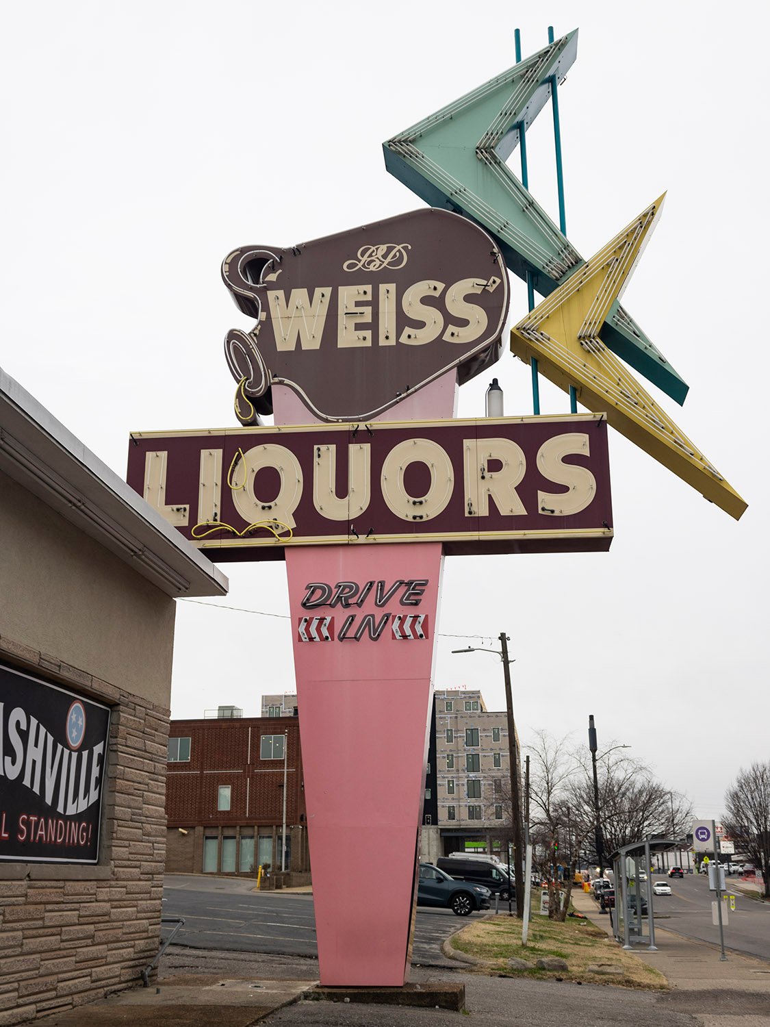
Weiss Liquors (circa 1966). Nashville, Tennessee.
Today, roadside signs from the mid-20th century are nearly extinct, often regulated out of existence by restrictive sign ordinances or demolished when their associated businesses close or succumb to redevelopment. Those that remain are either in a state of decay or have been well-maintained and, in some cases, skillfully restored.
If you’re hunting for relic roadside signs in the United States, there are a few good places to start:
Neglected or run-down urban neighborhoods or rural towns.
Nostalgic destinations such as long-running local restaurants, theaters, and stores, or tourist areas near beaches, mountains, or national parks.
Shopping centers built in the 1950s, 60s, or 70s that have retained elements of their original design.
These relic signs are quaint reminders of a time when the appeal of travel lay in the freedom of its uncertainty and little surprises, when Americans weren’t so embedded in the illusion of control, merely navigating from one planned destination to the next on routes prescribed by machine, coddling our consumed minds with the bland promise of comfort, safety, and familiarity.
Or, perhaps, that time never existed at all.
The map below charts the location of every vintage sign I’ve photographed so far, with accompanying images. Many of the signs have since been removed.
References
Venturi, Robert; Scott Brown, Denise; Izenour, Steven. Learning from Las Vegas, Revised Edition: The Forgotten Symbolism of Architectural Form. Cambridge, Mass.: MIT Press (1977). ↩︎
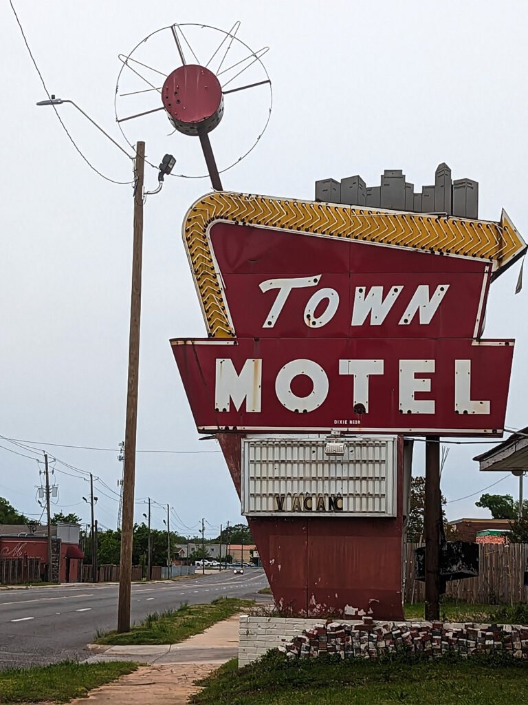
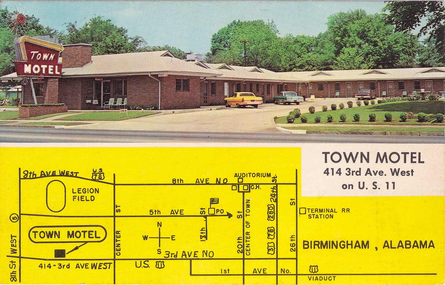
Town Motel (sign debuted after 1957). 414 3rd Avenue West, Birmingham, Alabama.
It’s hard to nail down a precise date for this fantastic Googie-style sign, but it was likely erected sometime after 1957.
The Town Motel opened in 19511 and expanded in 1957,2 but newspaper images from both dates show two completely different signs — neither of them was this one.
An undated postcard, pictured below, shows the sign in its original — and much more pristine — condition, noting that the motel was owned and managed by Mr. and Mrs. Charles D. Mitchell and Son, who operated the establishment from 1951 to at least 1960.3
References
“Phone Seale Lumber For Loan Information.” Birmingham Post-Herald (Birmingham, Alabama), May 26, 1951, p. 8. ↩︎
“Town Motel Again Re-orders From Rhodes-Carroll”. The Birmingham News (Birmingham, Alabama), February 23, 1957, p. 14. ↩︎
Polk’s Birmingham (Jefferson County, Alabama) City Directory 1960. Richmond, Virginia: R.L. Polk & Co., Publishers (1960). ↩︎