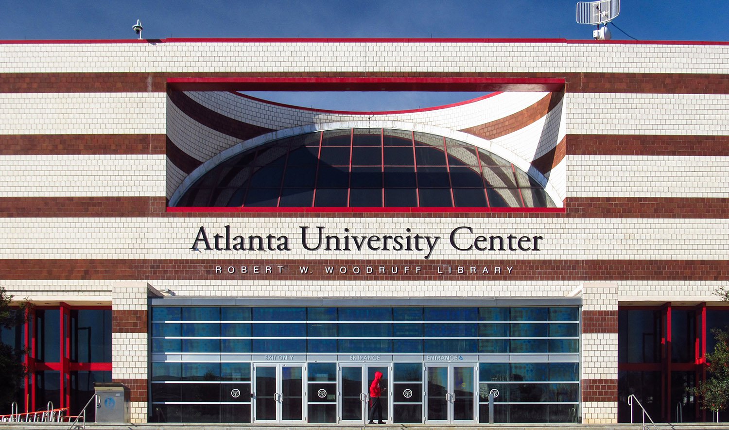
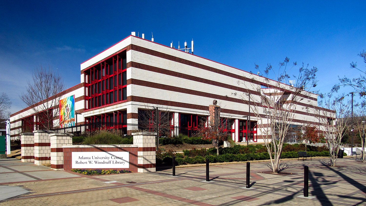
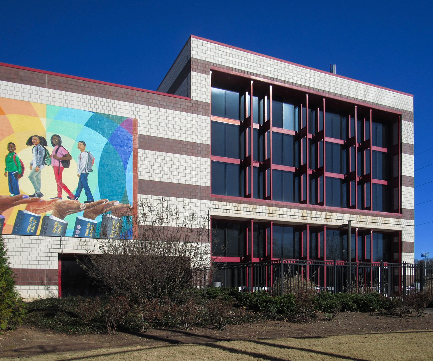
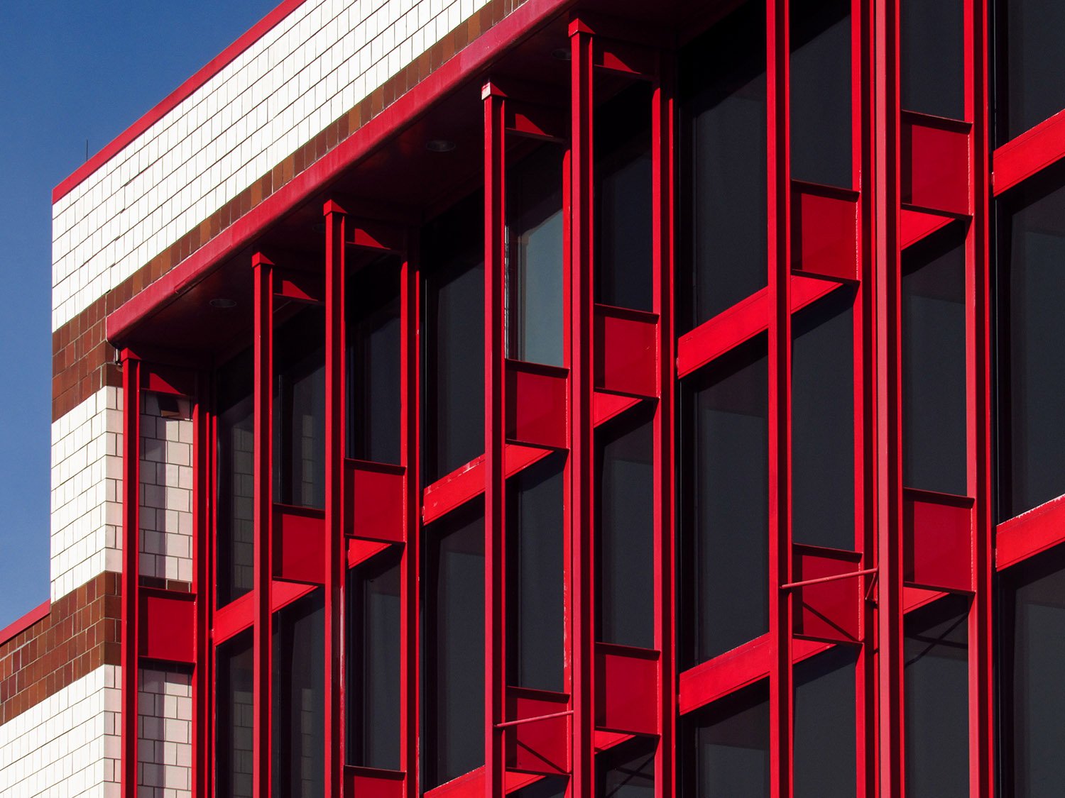
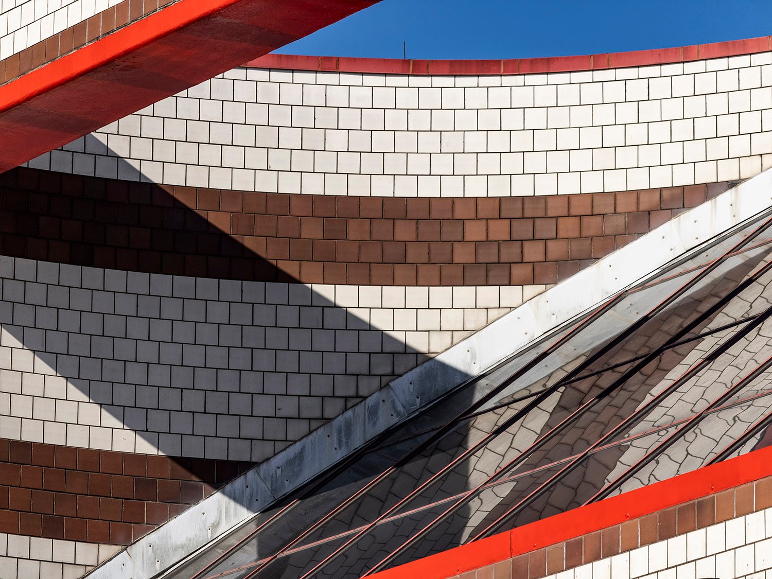
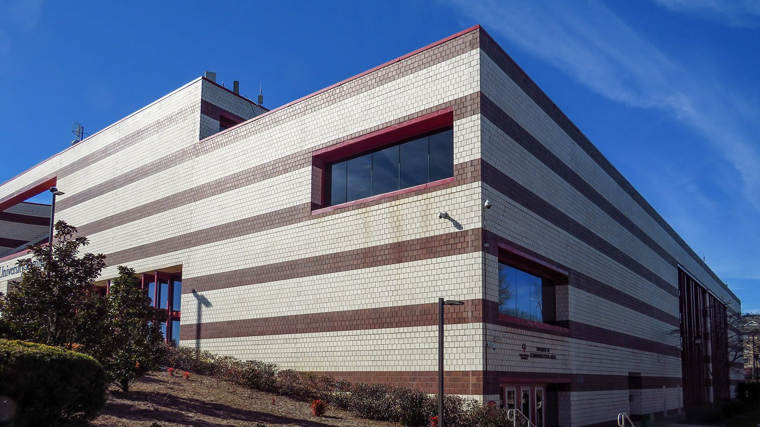
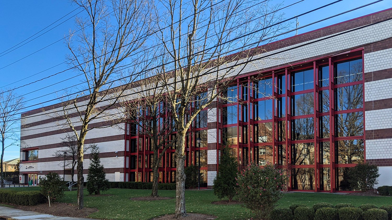
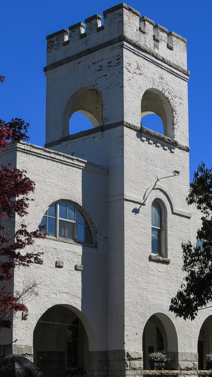
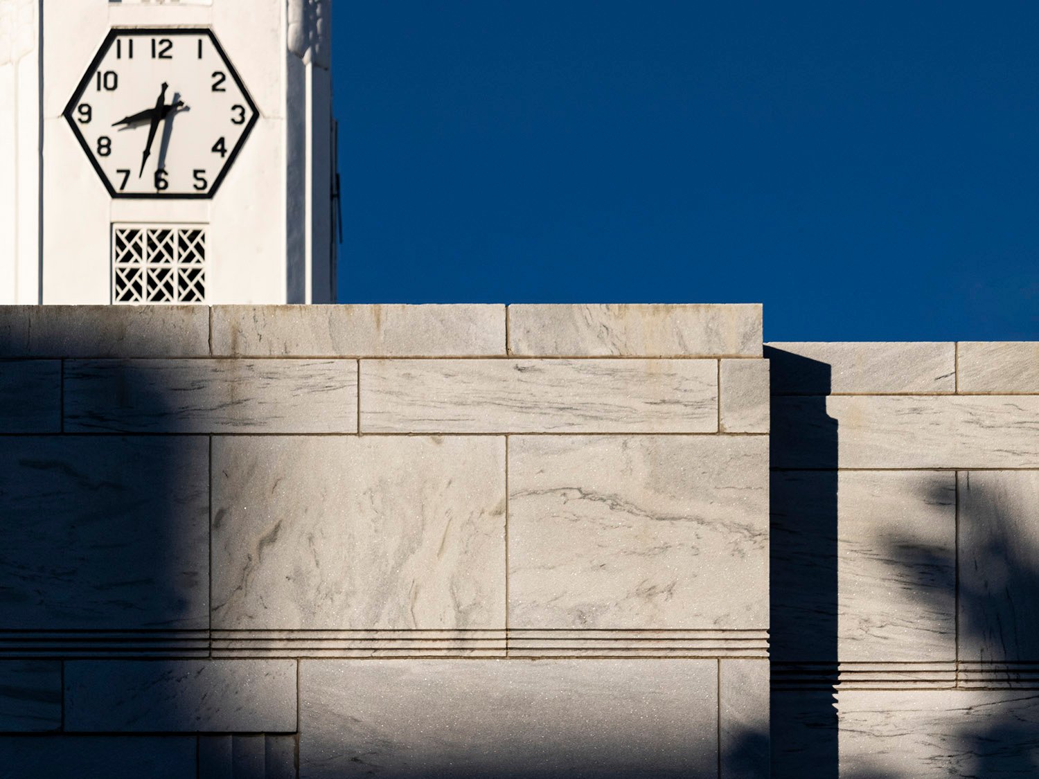
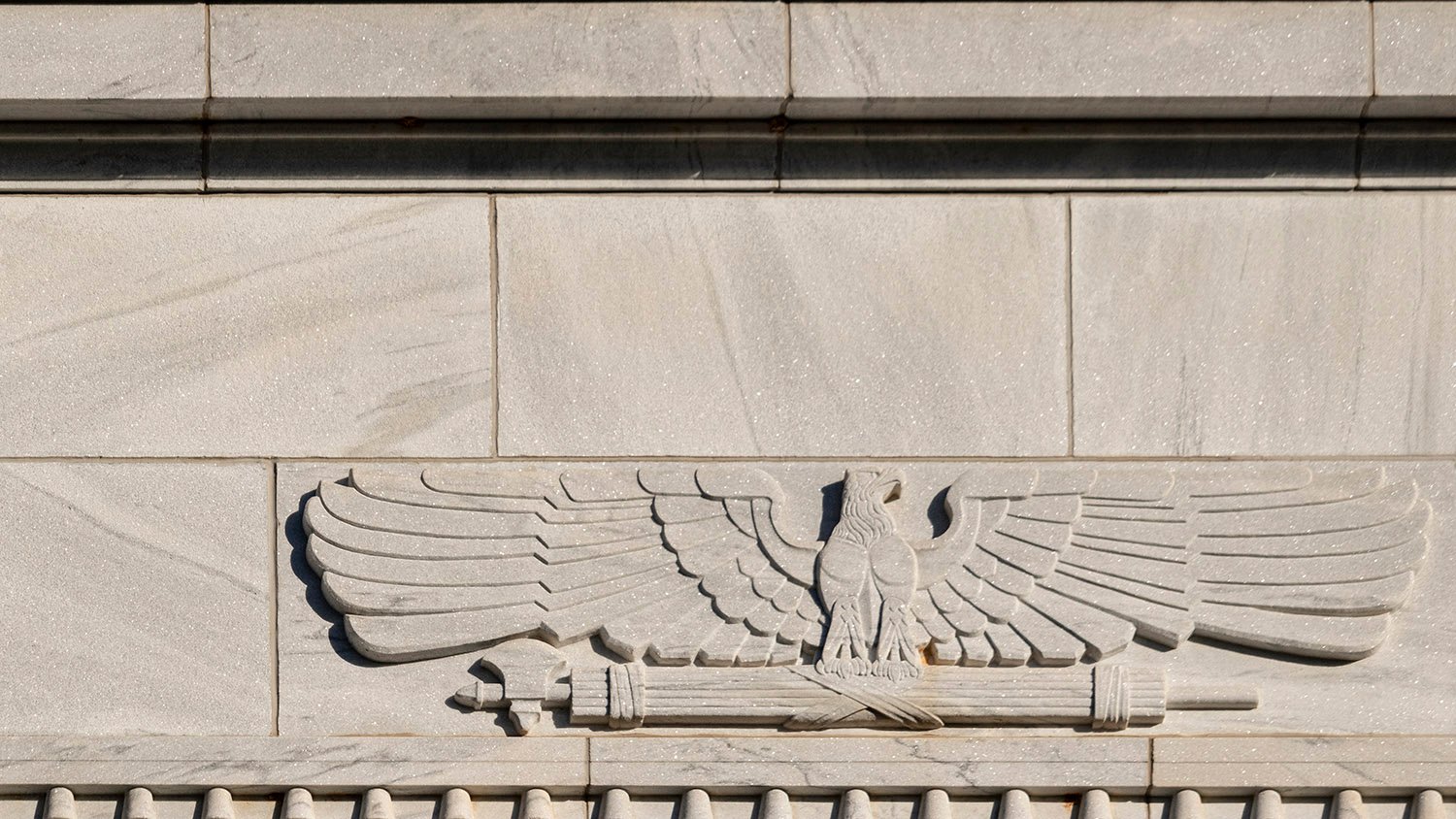
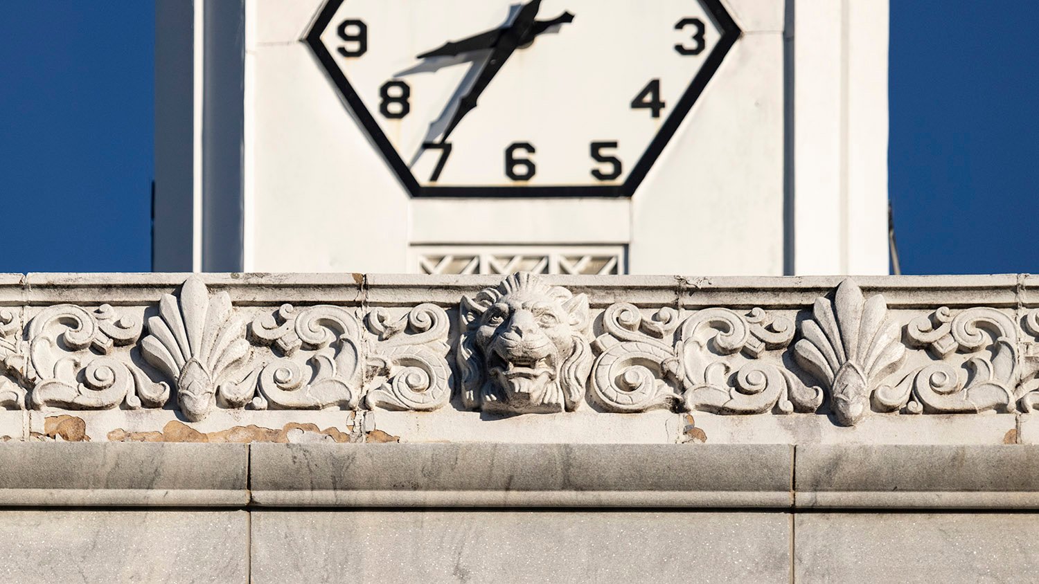
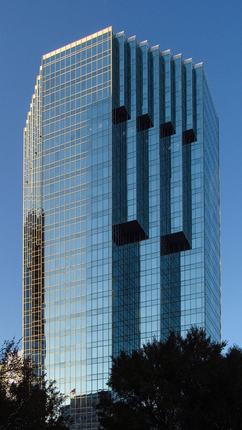
Joseph Amisano of Toombs, Amisano & Wells with J.W. Robinson and Associates, Inc. Robert W. Woodruff Library (1982). Atlanta University Center.1234Looking at the Robert W. Woodruff Library from the southeastSouth elevation of the Robert W. Woodruff Library, AtlantaWindows on the south elevation of the Robert W. Woodruff Library, AtlantaSkylight on the east facade of the Robert W. Woodruff Library, AtlantaLooking at the Robert W. Woodruff Library from the northeastNorth elevation of the Robert W. Woodruff Library, Atlanta
References
Dees, Learned and Hunt, Eunice S. “New AUC Library To Open in Jan.” The Atlanta Voice, November 14, 1981, p. 1B. ↩︎
Salyer, Sharon J. “Library Dedication Is Friday At AUC”. The Atlanta Constitution, April 22, 1982, p. 17-A. ↩︎
Barnes, Beverly. “Woodruff Library Is Dedicated”. The Atlanta Journal-The Atlanta Constitution Weekend, April 24, 1982, p. 14-A. ↩︎
Powell, Kay. “Joe Amisano, admired architect”. The Atlanta Journal-Constitution, April 21, 2008, p. B6. ↩︎
C. Walter Smith. PublicComfort Building at Oakland Cemetery (1899). Atlanta.
The Public Comfort Building in Oakland Cemetery is the only surviving work in Atlanta known to have been designed byC. Walter Smith (1865-1910), an architect who worked for at least seven years as a draughtsman and assistant for G.L. Norrman before embarking on a fairly unremarkable solo career.
Location of the Public Comfort Building
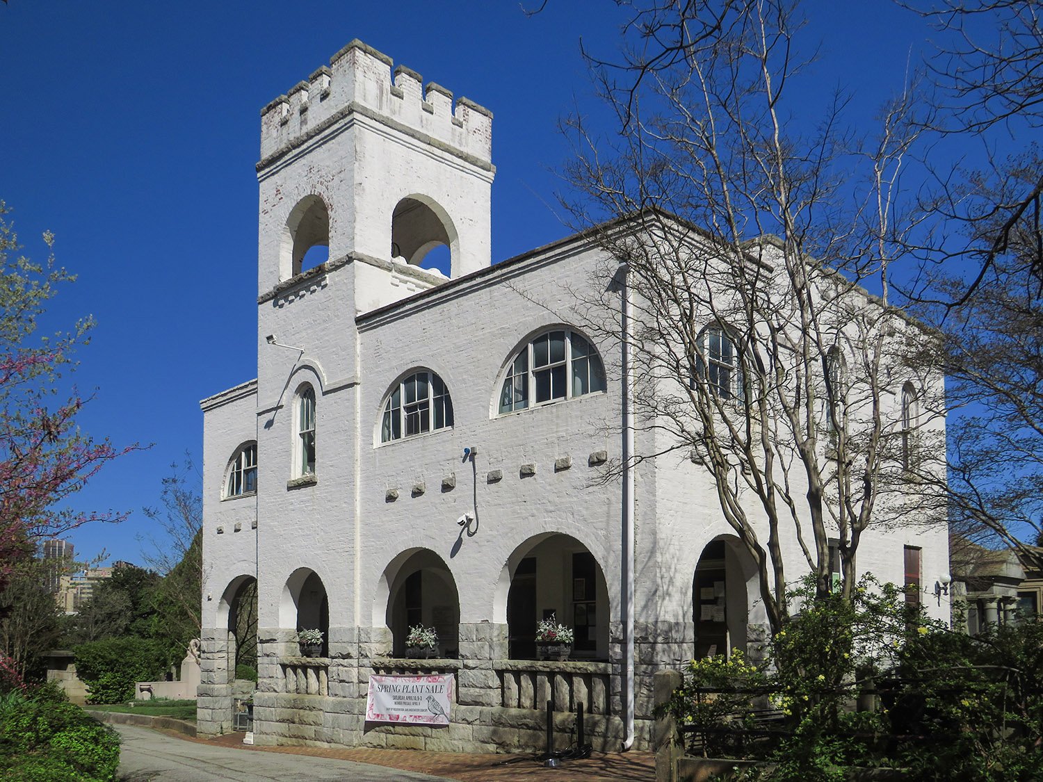
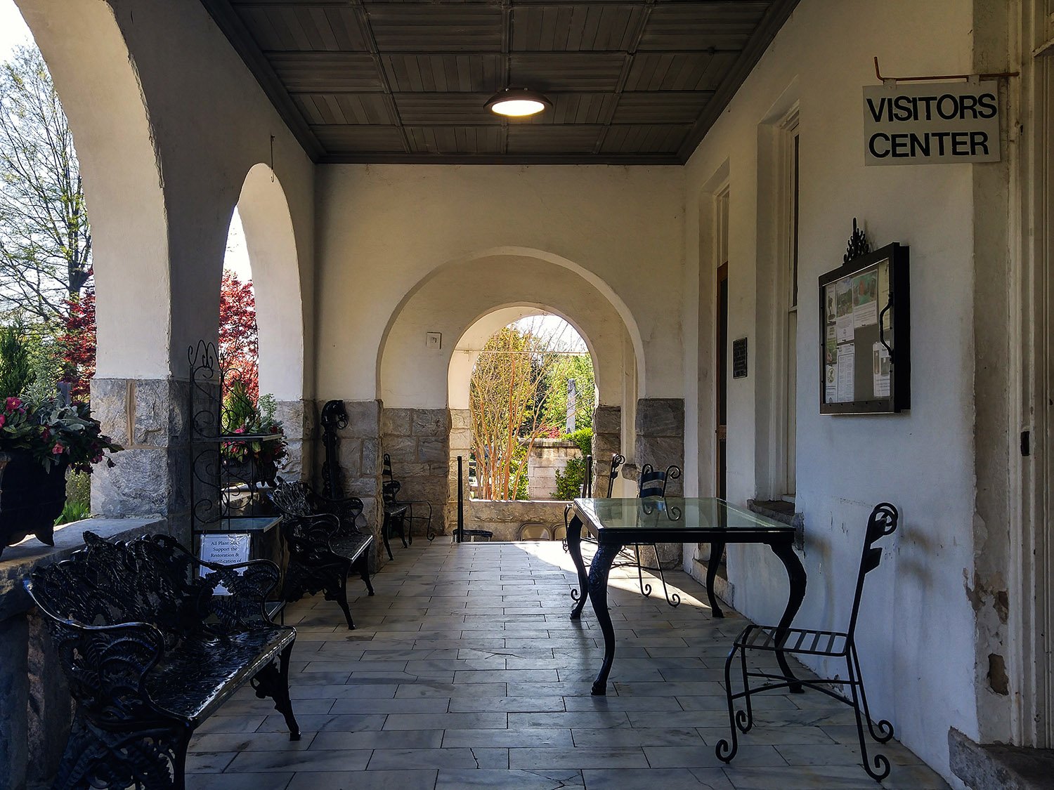
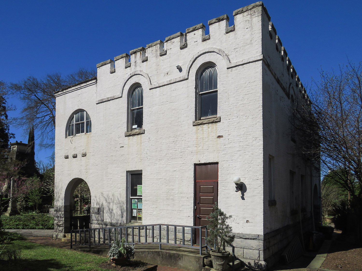
Built on a small hill in the western portion of the 48-acre cemetery, this two-story structure includes a full basement and totals2,800 square feet.1 The exterior is faced in stucco-covered brick2and rusticated granite trim, and marble flooring3 is used on the front porch and in the basement.
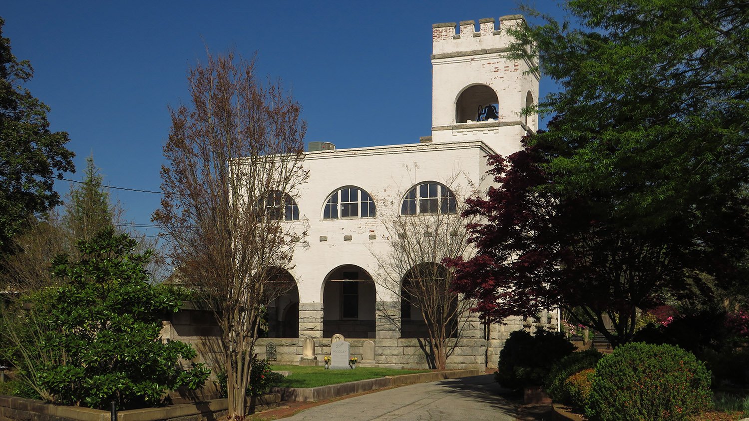
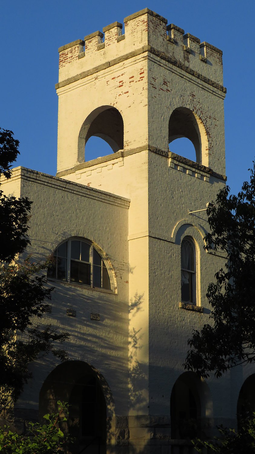
Modeled after “the old Norman and English castellated churches,“4 the building’s design can be broadly defined as Romanesque, and its focal point is a 50-foot-high crenelated bell tower,5 heavily inspired by similar designs from G.L. Norrman.
Today, Oakland Cemetery refers to the entire structure as the “Bell Tower.”
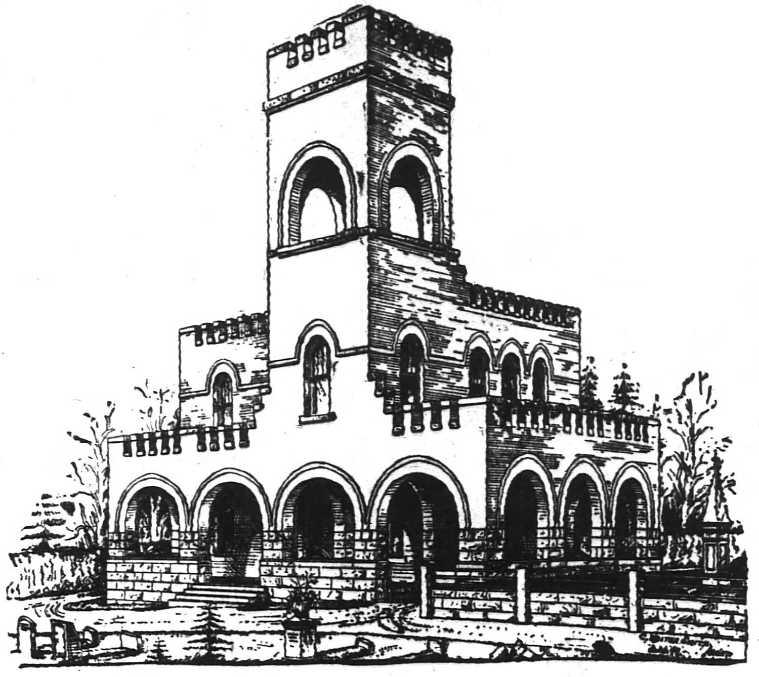
C. Walter Smith. Public Comfort Building at Oakland Cemetery (1899). Atlanta.6
An illustration from 1899 (pictured above) reveals the building’s original design: a one-story porch topped by battlements originally flanked the south facade, and a porte-cochère to accommodate wagons was attached to the east side.
Curiously, the final design was reversed, with the porte-cochère moved to the west side of the structure, likely one of “a few slight changes” announced before construction began.7
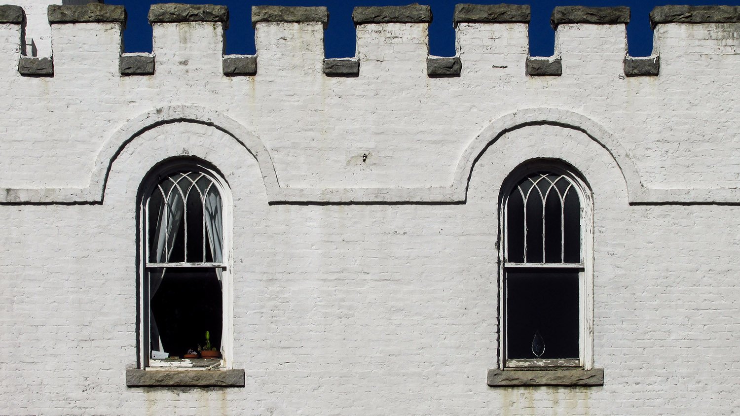
Roman arches on the porch and bell tower, and Gothic-stylearched windows on the second floor completed the appearance of a small, storybook castle—again, Smith borrowed significantly from Norrman for the aesthetic.
Looking at the Public Comfort Building from the southeast
In its original conception, the building was one of Smith’s better designs. Despite years of training under “the South’s most prominent architect”8—his words—Smith’s skill never came close to Norman’s high level of artistry, although his work here was at least intriguing.
Unfortunately, the initial vision was compromisedby the later addition of second-floor porchesover the front porch and porte-cochère, topped with flat roofs and punctuated by incongruent half-round openings.
I suspect the porches were added circa 1908, when the cemetery spent $5,000 on a range of improvements9 following its first annual report to the city, which requested $1,000 for “needed changes and repairs in the main building.”10
The alterations are detrimental: the upper porches add unnecessary visual mass to the structure and pull focus away from the bell tower, robbing the entire composition of the uplifting, monumental effect Smith originally intended.
West elevation of the Public Comfort Building, Oakland Cemetery, Atlanta
“Public comfort” was a polite 19th-century euphemism for restrooms, which were originally housed on the ground floor of the structure.
When the building was completed in October 1899, The Atlanta Journal delicately noted: “Here one now finds a convenience and comfort that was lacking for many years.”11 I guess early visitors just had to hold it—or maybe piss on a grave.
The building initially had six rooms, including a ladies’ parlor and an “apartment for gentlemen.” All six rooms had tiled mantels,12 which was apparently noteworthy. Two of the mantels remain intact.
The structure also included an office for the cemetery’s sexton,13 and Oakland Cemetery’s website claims the building contained a chapel, with the second floor used as the sexton’s residence. So many uses for such a small structure.
Second-floor windows on the Public Comfort Building, Oakland Cemetery, Atlanta
Despite its fanciful design, the building was, at heart, purely utilitarian, “suitable for the purposes for which it is intended,”14 as the Journal put it.
People need to pee, of course, but the building’s other raison d’être was concealed in the basement.15 The structure was built on the site of a converted two-story farmhouse16 known as the “dead house”17 —you can see where this is going.
As the Journal explained:
“There is a vault with eight catacombs and sixteen racks. This is as strong and substantial as could be made. For the retention of bodies for any length of time the catacombs will answer every purpose, as they are built to be air-tight for years to come. The racks, as a matter of course, are intended as a temporary place of keeping and are conveniently arranged. When the iron gate to the vault is locked entrance is practically impossible.”18
Front porch of the Public Comfort Building, Oakland Cemetery, Atlanta
Since Oakland is a public cemetery operated by the city of Atlanta, the building was funded through a city council appropriation.19 The Atlanta Building Company secured the contract with the lowest bid, and the project’s total cost was $4,600,20 with $650 spent on the stone.21
Construction on the building was initially slated to begin on April 27, 1899,22 but was apparently delayed until June and completed in four months.23
Although early plans called for one or two additional public comfort buildings in the cemetery,24 those never materialized, and this structure remained the only significant public building on site, altered many times by piecemeal repairs and additions.
When the Historic Oakland Foundation was formed in 1976 to preserve and maintain the cemetery’s historic integrity, the building became office space for the organization, with the ground floor converted into a small visitors center,25 a function that it served for decades.
East elevation of the Public Comfort Building, Oakland Cemetery, Atlanta
In 2022, as Oakland Cemetery prepared to build a much larger visitors’ center outside its main entrance, the former Public Comfort Building received a gut renovation designed by Smith Dalia Architects, Atlanta’s finest firm for the adaptive reuse of historic structures.
The project included tearing out the hodgepodge of rooms on each floor for larger, open spaces, removing god-awful windows added to the second-floor porches, and making necessary accessibility alterations, which altered a portion of the front porch.2627
The building reopened later that year28 as an event space: the fallback choice when owners don’t know what to do with a historic structure.
Bell tower on the Public Comfort Building, Oakland Cemetery, Atlanta
Following its renovation, the building now appears a little too clean and gleaming—I actually preferred it when it was worn and shabby—but it still has an undeniable anachronistic charm that’s uncommon in Atlanta.
And as one of just six known extant works by Walter Smith, it’s also a matter of curiosity, if nothing else.
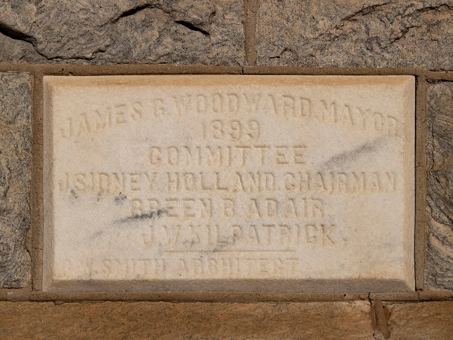
Cornerstone on the Public Comfort Building, Oakland Cemetery, Atlanta
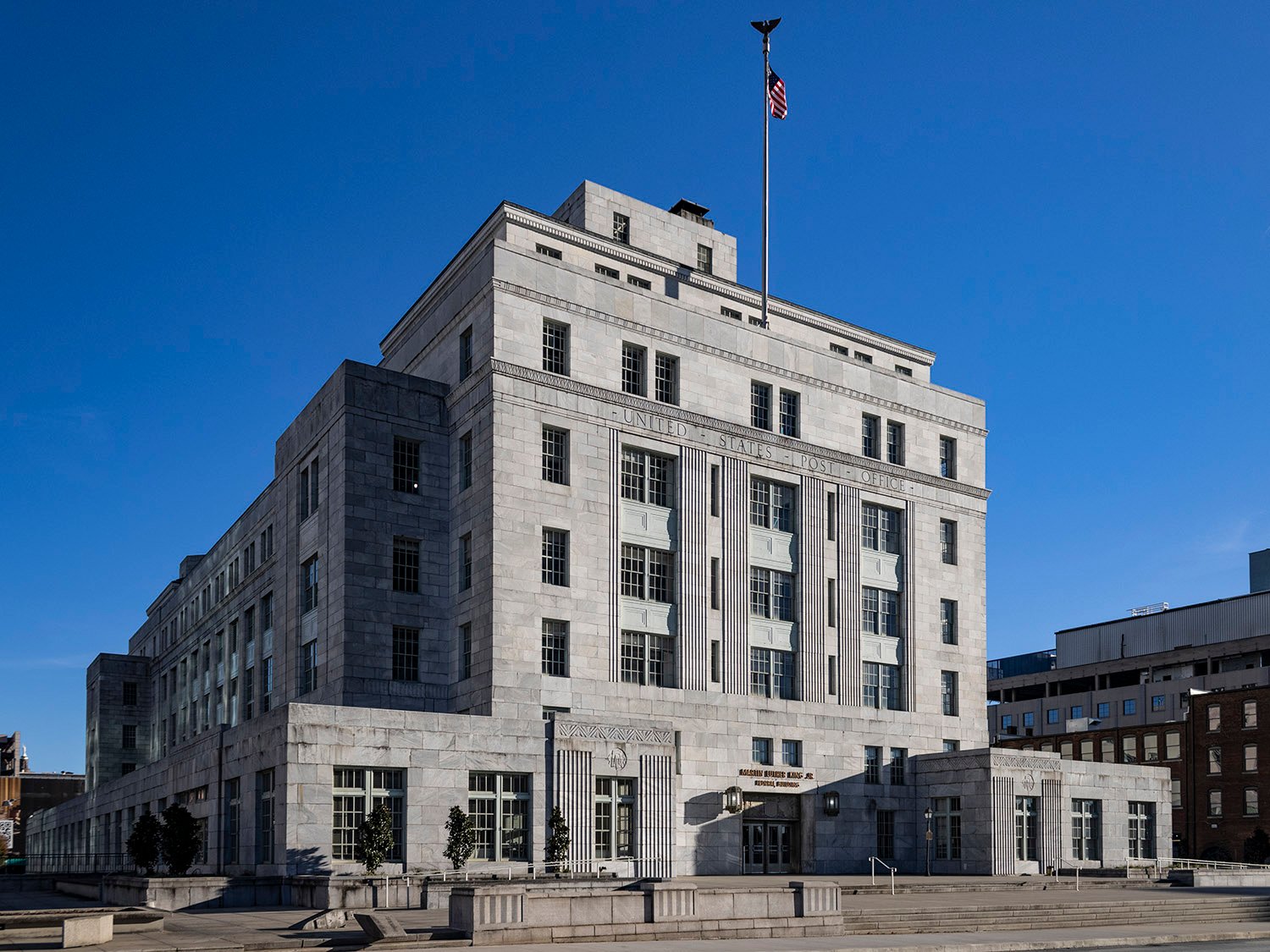
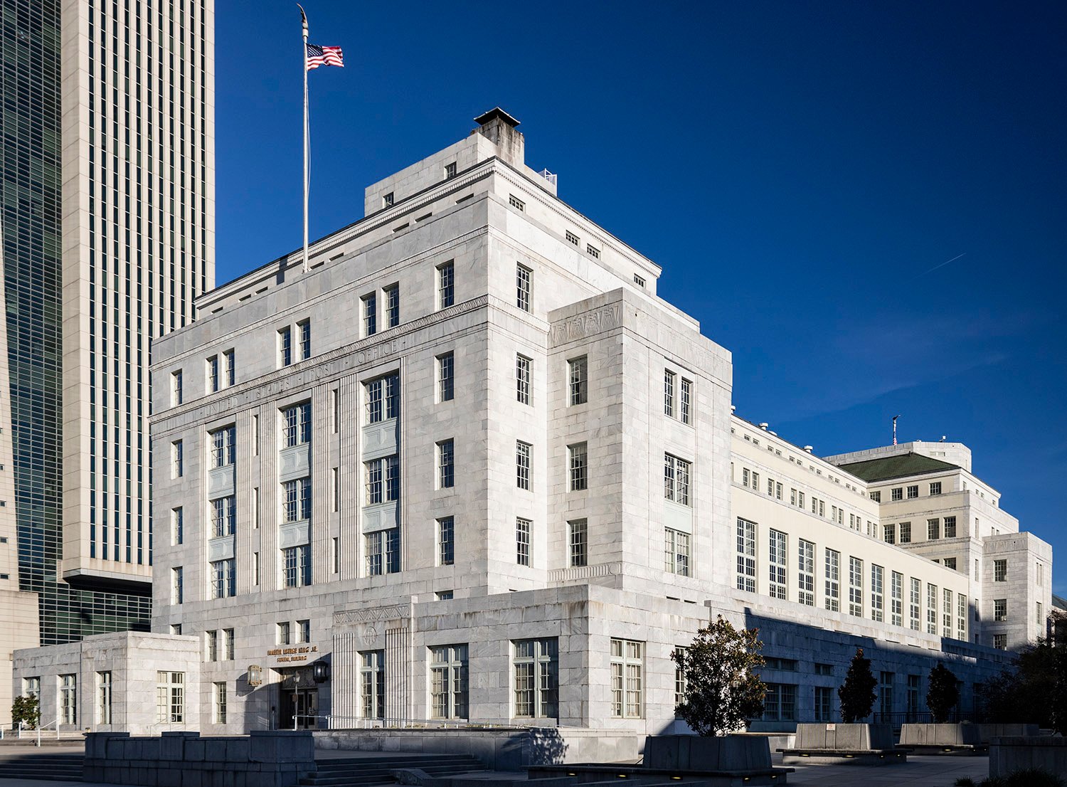
A. Ten Eyck Brown with A. Barili, Jr., and J.W. Humphreys, associate architects. United States Post Office (1933). Atlanta.1
Don’t let Atlanta historians fool you: A. Ten Eyck Brown (1878-1940) likely had little to do with the design of this monumental structure, which ranks among the city’s most exquisite buildings.
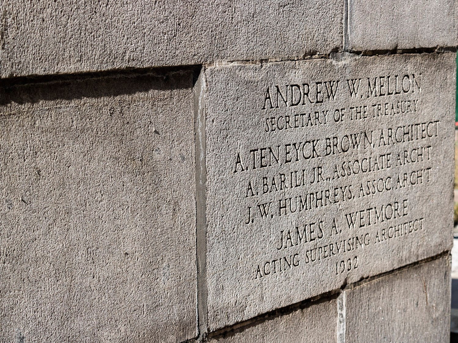
Opened in December 19332 as the United States Post Office, the project appears to have been primarily designedby Brown’s associate architects, Alfredo Barili, Jr.,andJ. Wharton Humphreys, who established their own firm a few years later.3
Compare the later works credited to Brown with those of his early years, and it’s clear that his own skills were inadequate for the more sophisticated designs that emerged from his firm in the 1920s onwards—this project is no exception.
East facade of the United States Post Office, Atlanta
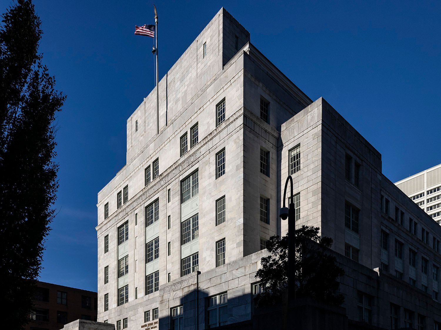
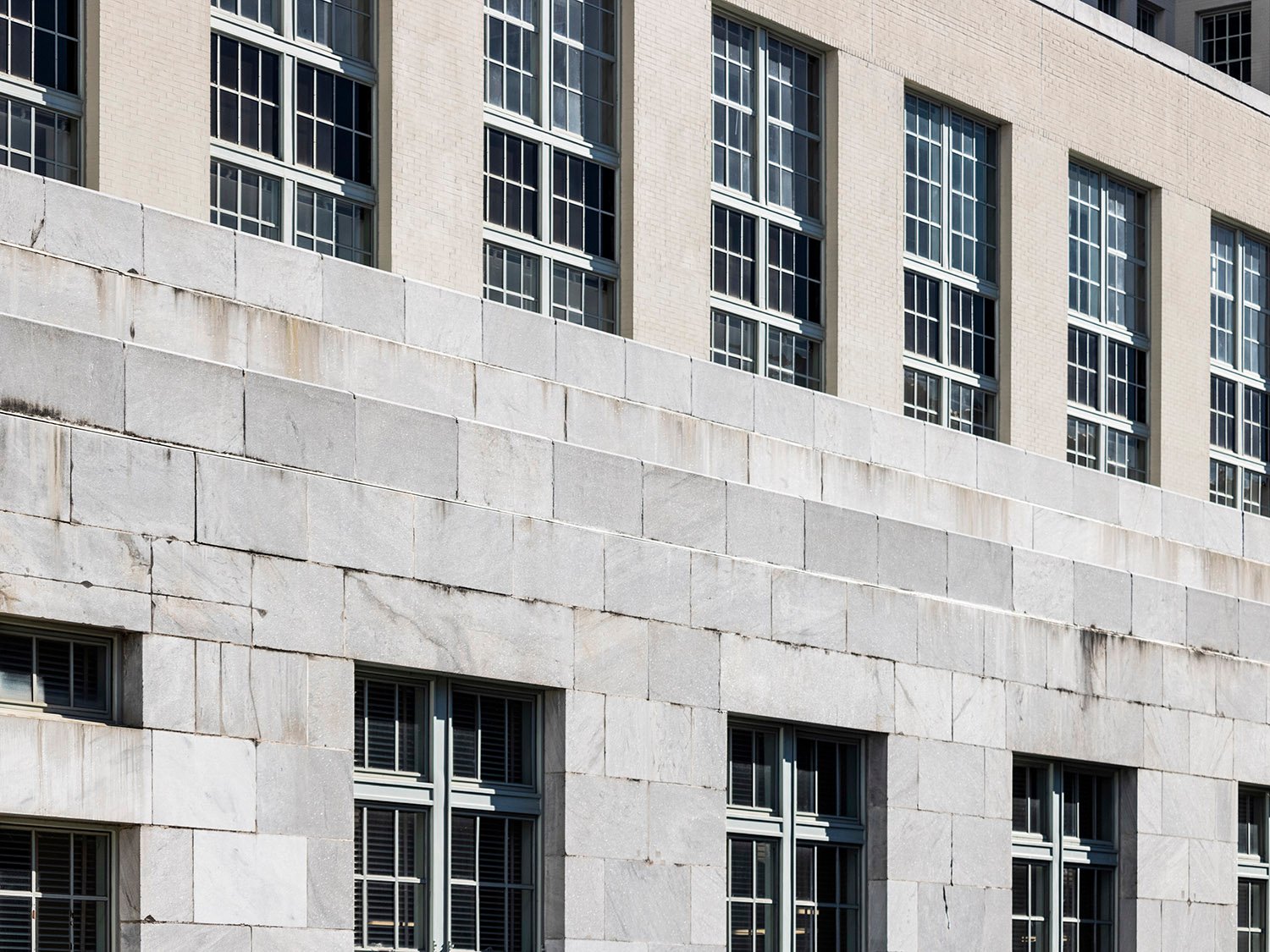
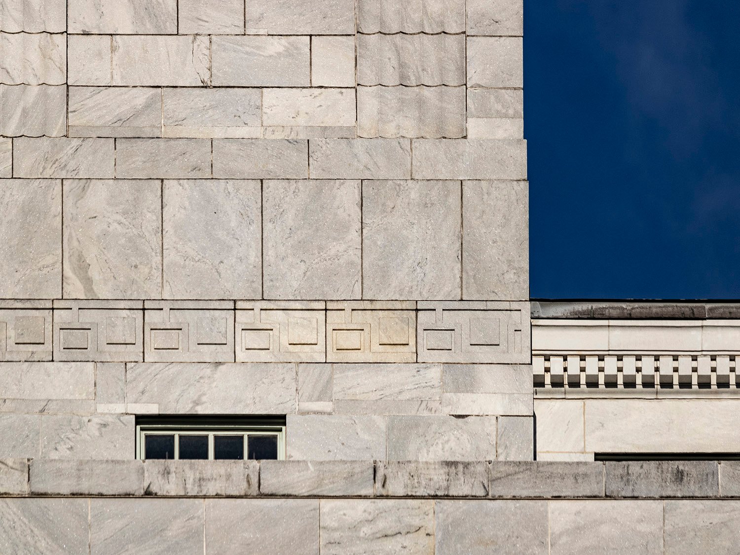
Designed in the Classical Moderne style, the building sits atop a base of Stone Mountain granite and is sleekly clad in Georgia marble.4
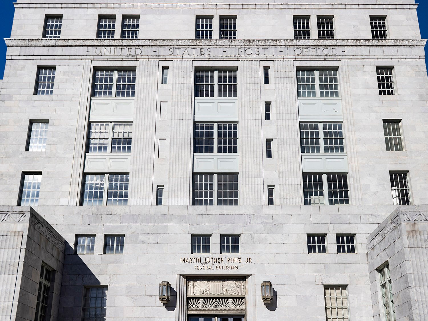
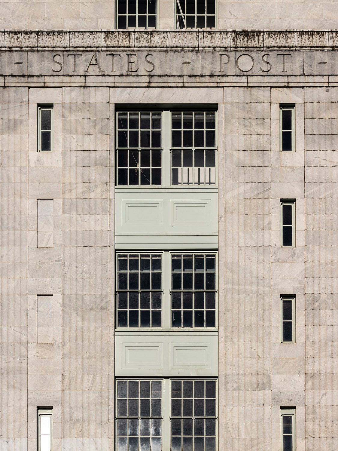
The structure’s otherwise smooth facades on the east and west are punctuated by a trio of slightly recessed bays that recall Brown’s earlier design for the Fulton County Courthouse, but the effect is much more successful here.
Indeed, the courthouse design is a joyless mess: the building’s facade is cluttered with windows of varying sizes, and the deeply recessed center bay, supported by six multi-story columns, resembles a giant jail grating.
In this design, the variation in the bays is much subtler, and the windows are given space to breathe, providing enough contrast and visual balance for a pleasing, cohesive composition.
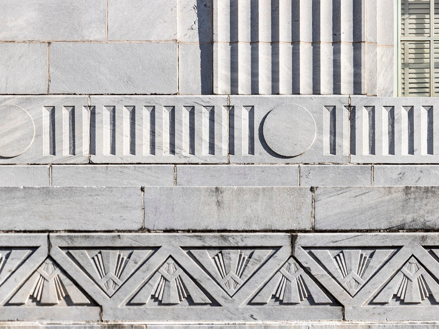
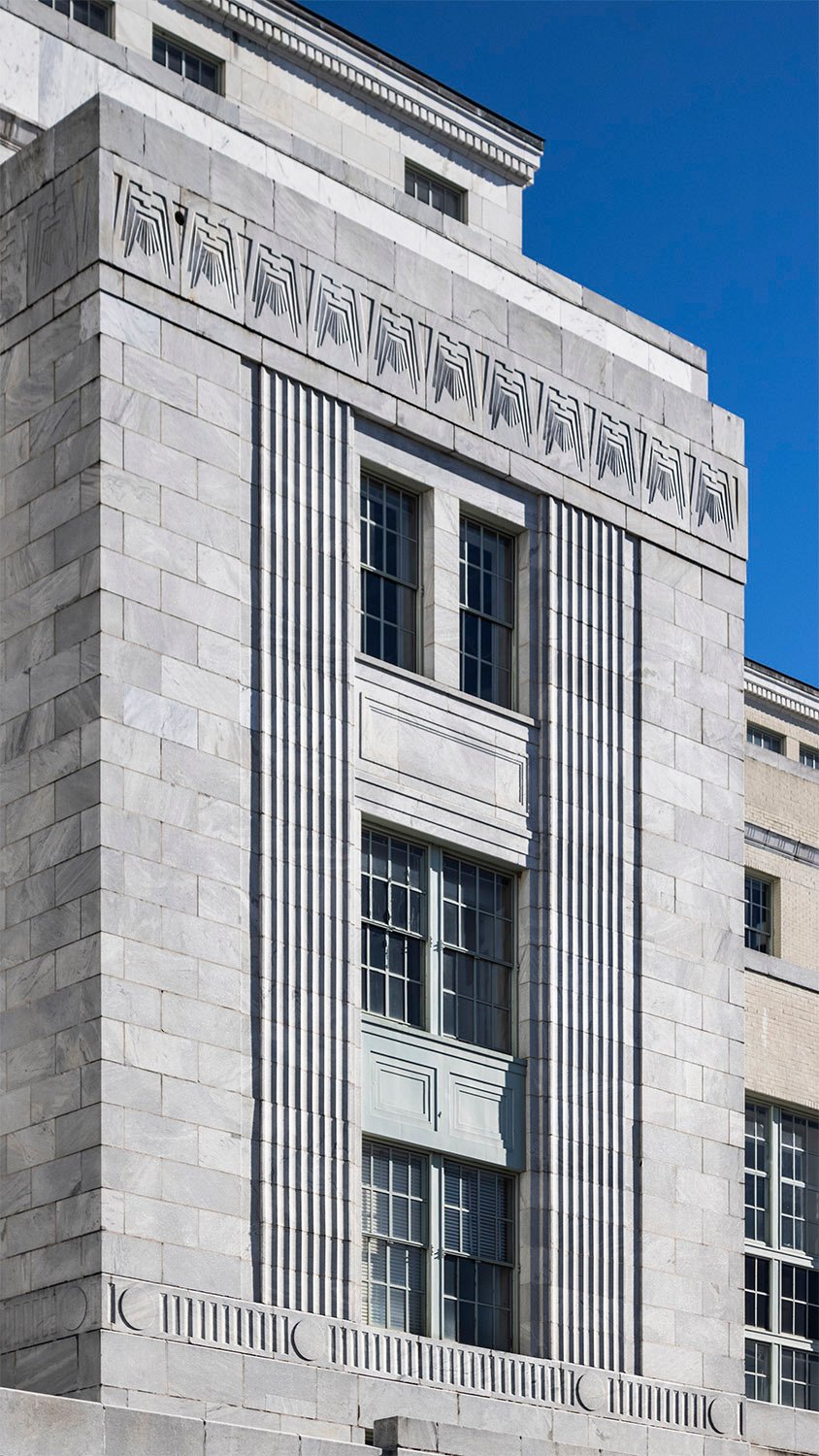
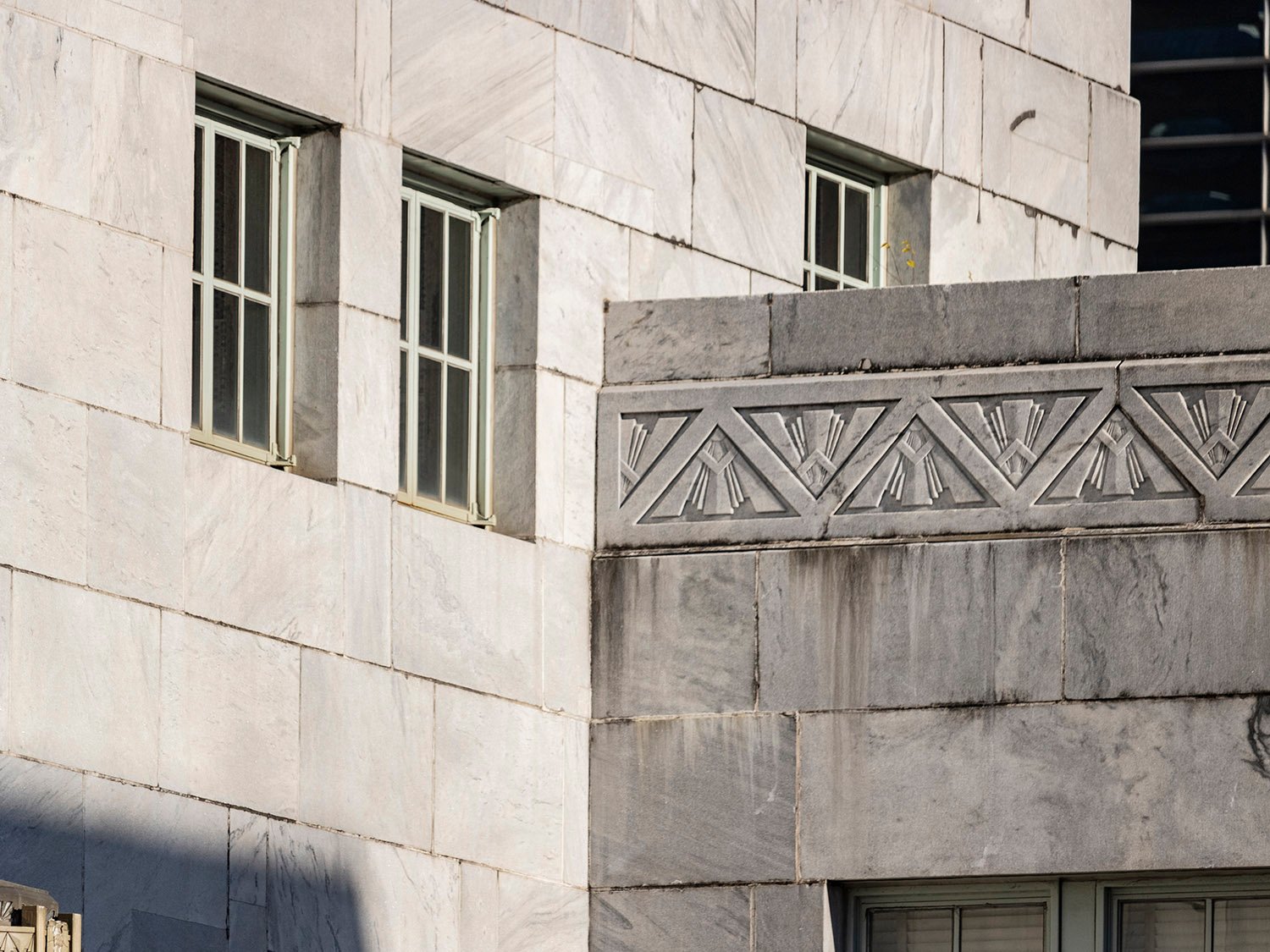
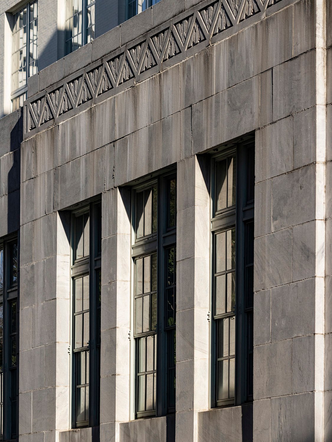
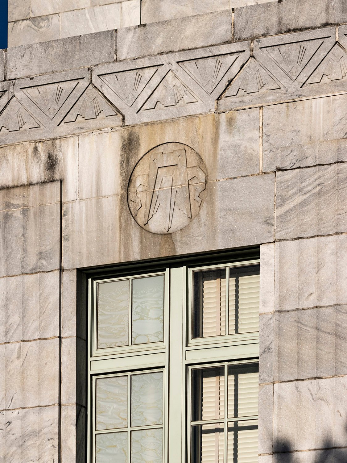
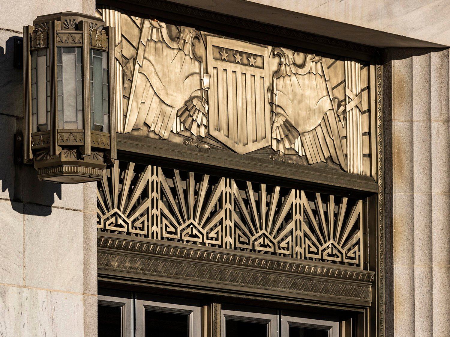
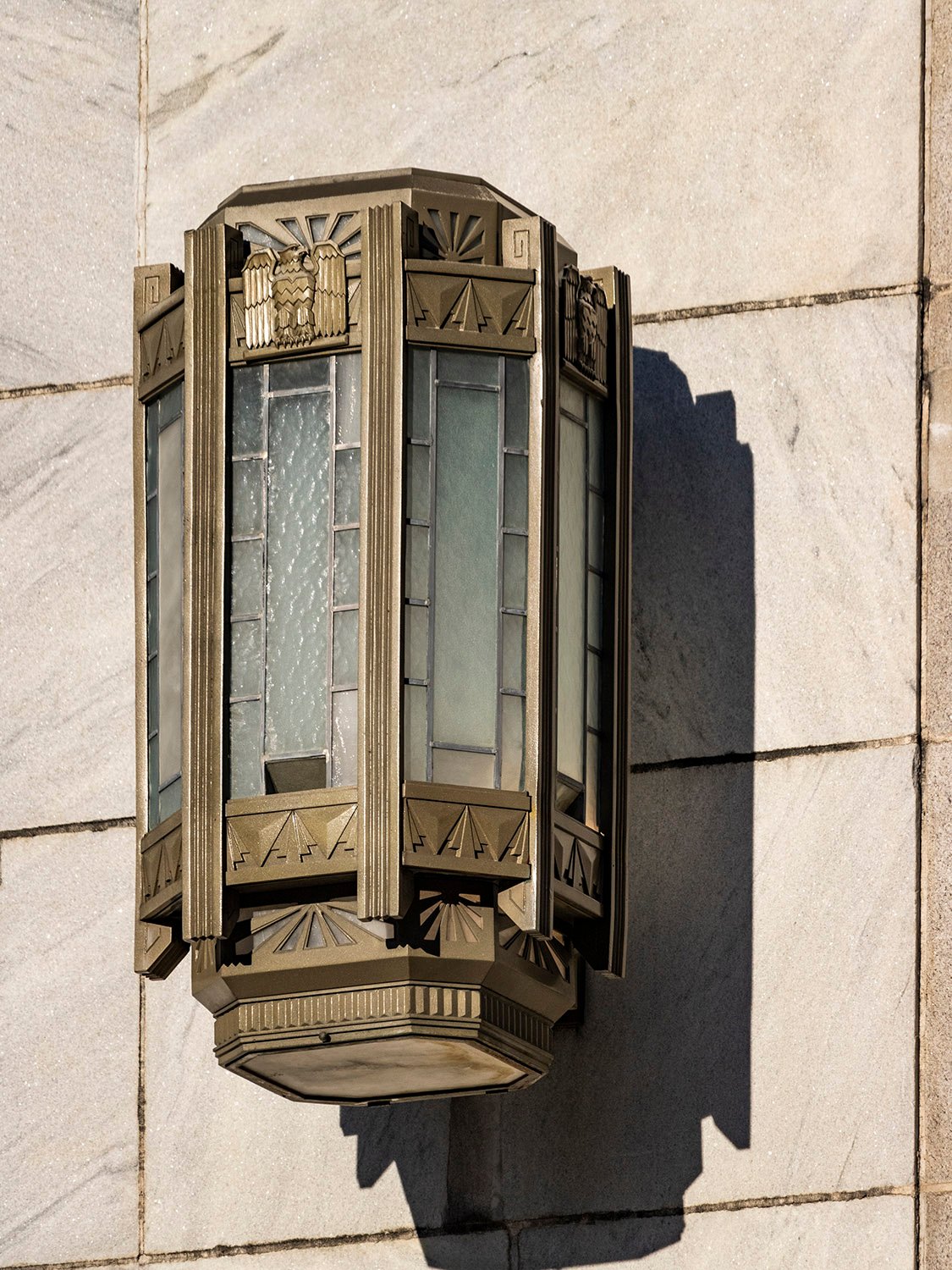
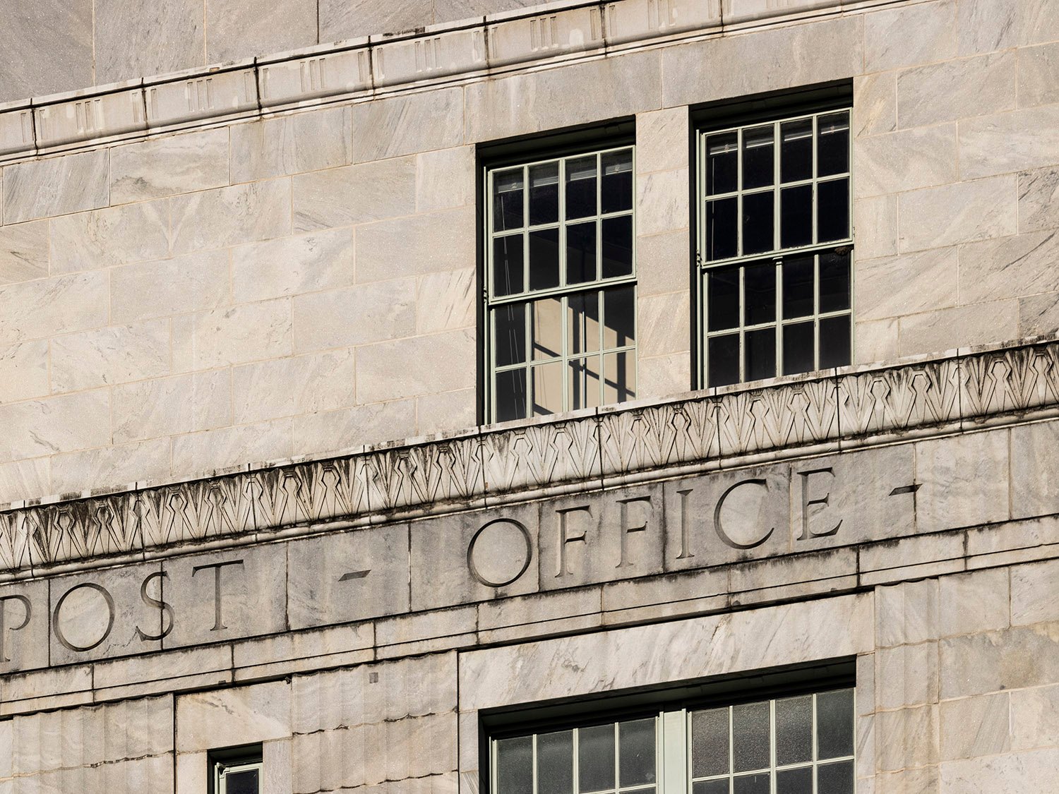
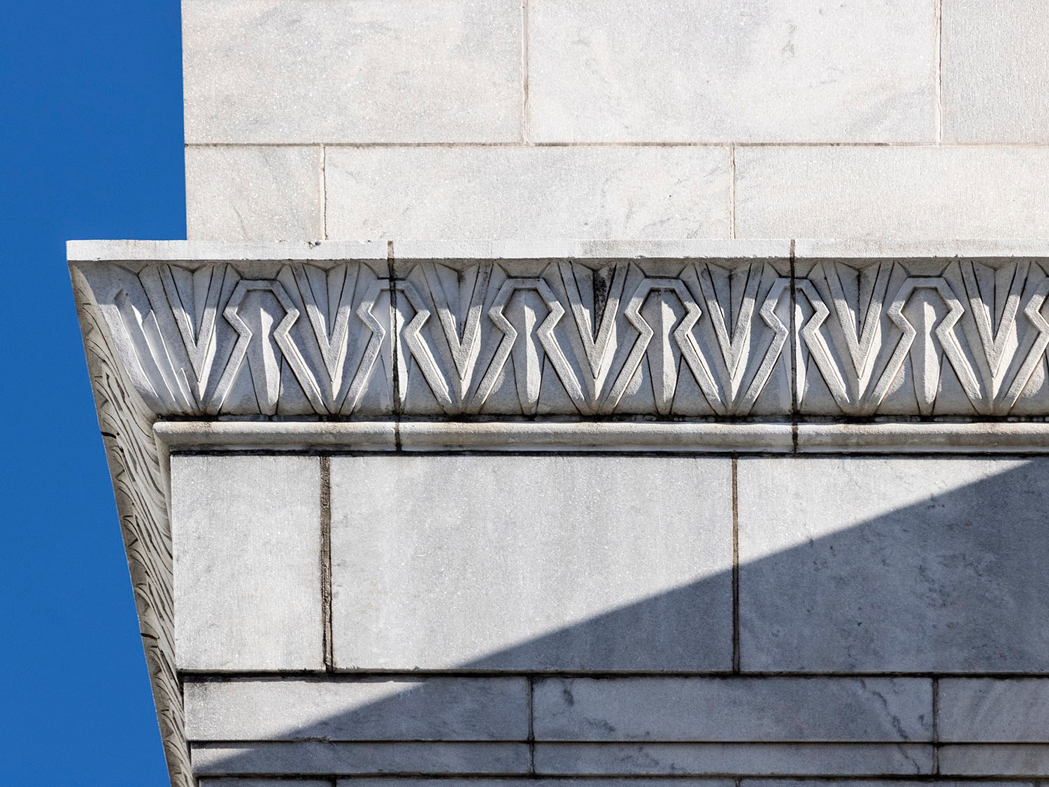
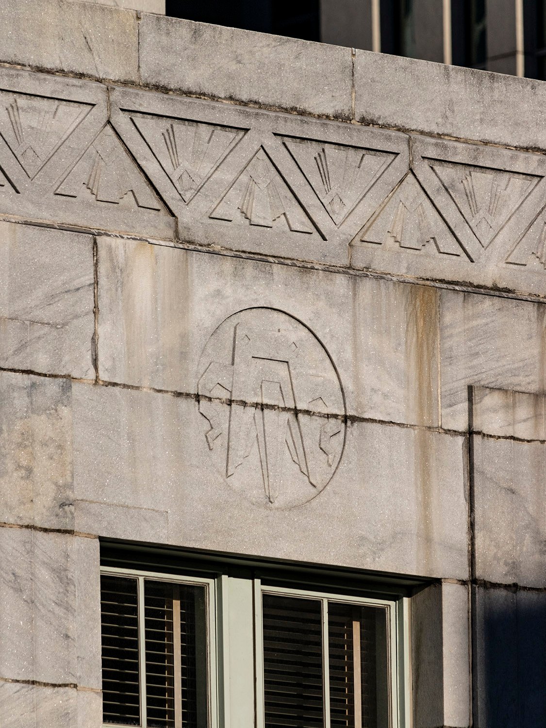
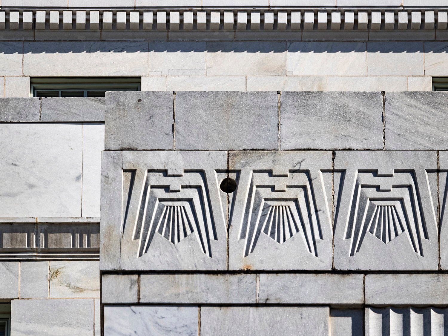
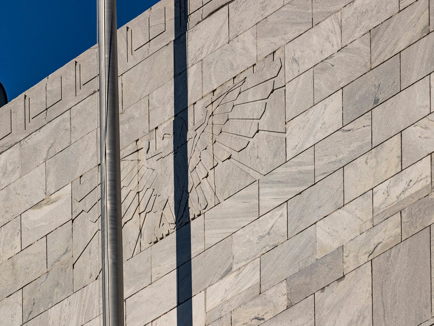
This building also shines in its incorporation of fine textural detail, trimmed with pilasters, friezes, and stringcourses in stark geometric patterns, many of which are of pre-Columbian inspiration. Emphasizing the structure’s bold ziggurat form, the design evokes the image of some ancient American temple dropped into a modern metropolis.
Ornamentation on the United States Post Office, Atlanta
The project was completed for the princely sum of $3 million,5 and the volume of materials used in its construction is staggering: the structure is composed of 12,222 marble pieces totaling 4,798,404 pounds, with the largest block weighing 8,400 pounds.6
Atlanta, of course, never pays for quality architecture, and this bulwark of a building exists only because it was bankrolled by the United States government.
At the time, federal building projects were supervised by the U.S. Treasury, and Brown was a natural choice to pick as the lead architect, since he began his career in the office of the supervising architect of the Treasury.78
Brown was approaching the end of his life and career in the 1930s and was well-respected in Atlanta and the Southeast. Known as “Tony” to his friends,9 he became one of the city’s wealthiest architects in the early 20th century, with his firm designing dozens of large-scale public buildings across multiple states, though his fortunes appear to have been greatly reduced during the Depression.
Preston Stevens of Stevens & Wilkinson described him as “debonair and attractive,” and recalled a claim by another architect, Francis P. Smith, who said that ‘”Tony” could almost hypnotize his clients by sitting across the table from them and sketching designs upside down.’10
Bay on the southwest corner of the United States Post Office, Atlanta
I can’t criticize Brown too much for claiming primary credit on this project, as most architects of the era did the same. The myth of the lone designer had long become untenable, and by the turn of the 20th century, every Atlanta architect managed a team of design assistants.
As building projects grew increasingly large, costly, and complex to manage, most prominent architects effectively became figureheads, promoting their businesses and securing commissions while delegating the actual design work to their employees.
It’s well documented that numerous projects credited to Atlanta architects of the time, like W.T. Downing, Morgan & Dillon, W.A. Edwards, and Hentz, Reid & Adler—to name a few—were designed by assistants, many of whom went on to establish their own firms.
Brown at least had the decency to share credit with the actual designers of his projects—often listing them as associate architects or supervising architects—a practice he began in 1922, when he was appointed the supervising architect for more than twenty public school buildings in Atlanta,1112 nearly all of which were designed by other architects.1314
Contrast his approach with, say, G. Lloyd Preacher, who claimed credit for every work produced by his firm, even though it was abundantly clear which projects weren’t his own. The most striking example is Atlanta’s fine neo-Gothic city hall, credited to Preacher but designed by one of his employees, George H. Bond,15 who was infinitely more talented.
Looking at the United States Post Office, Atlanta, from the southwest
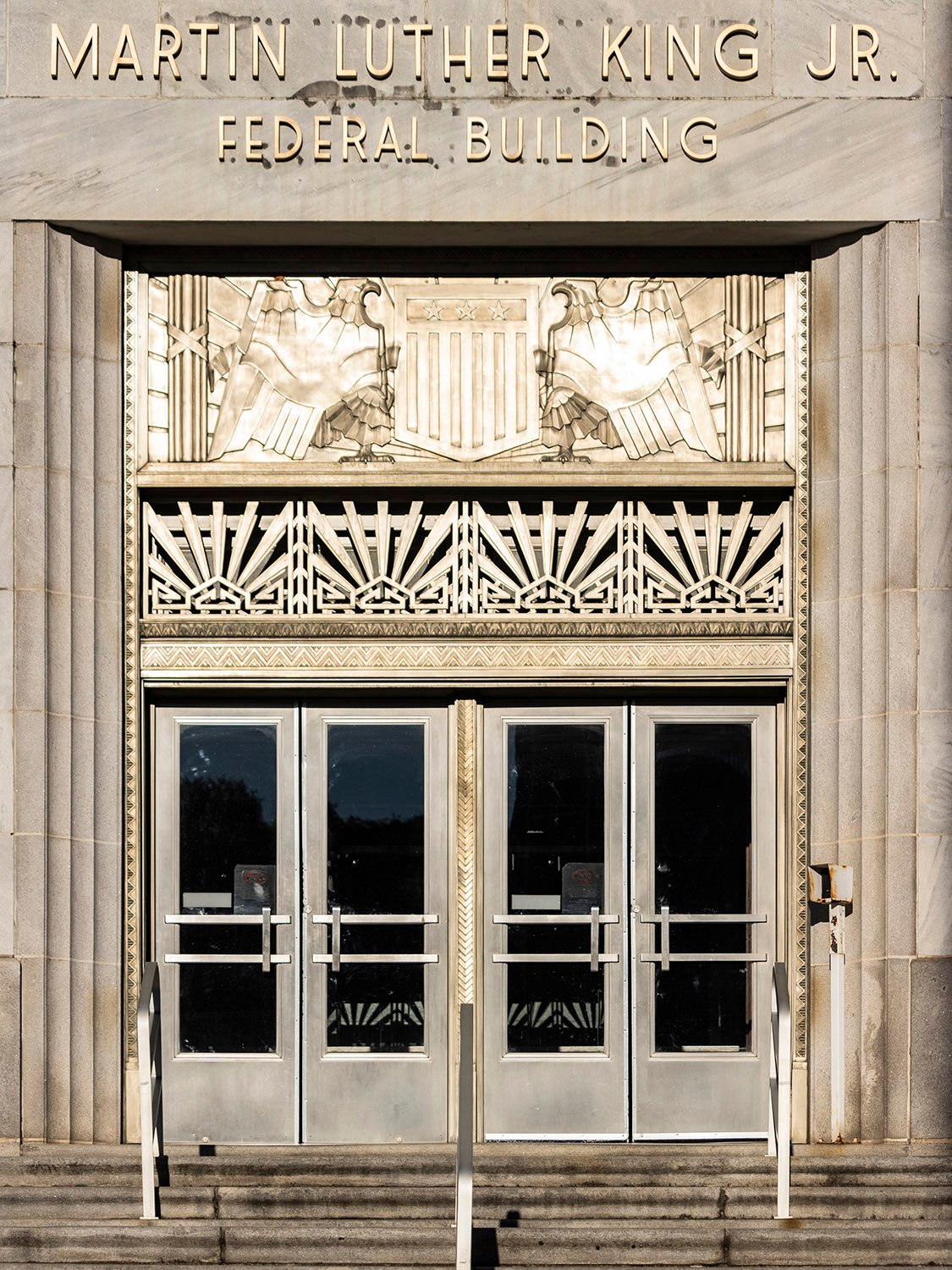
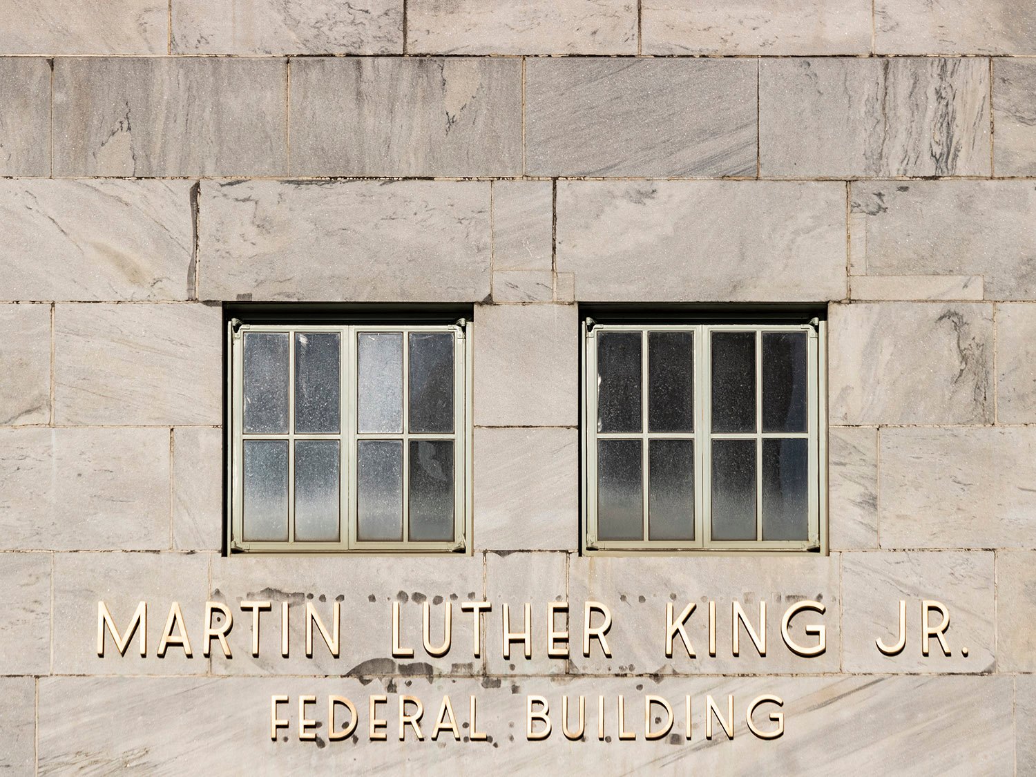
Questions of credit aside, the former United States Post Office (later renamed the Martin Luther King, Jr. Federal Building) is one of the few structures in the city with any actual design caliber, and its quality of craftsmanship and attention to detail are unknown to modern architecture, in Atlanta or elsewhere.
Gallery
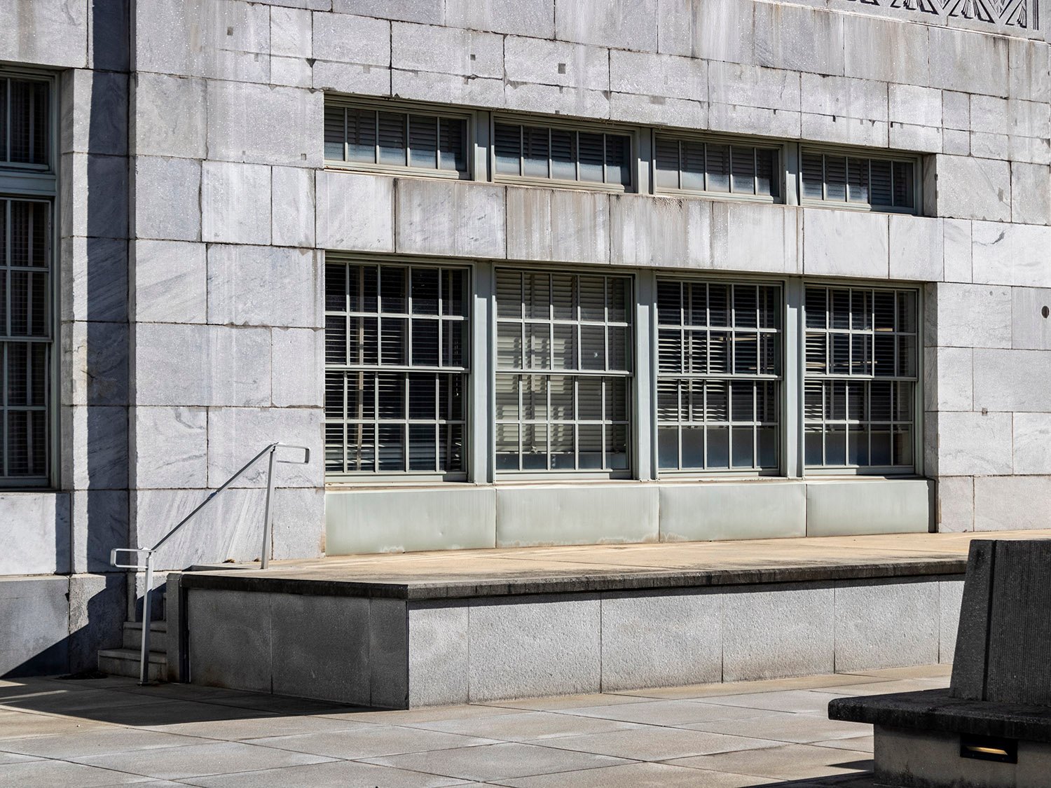
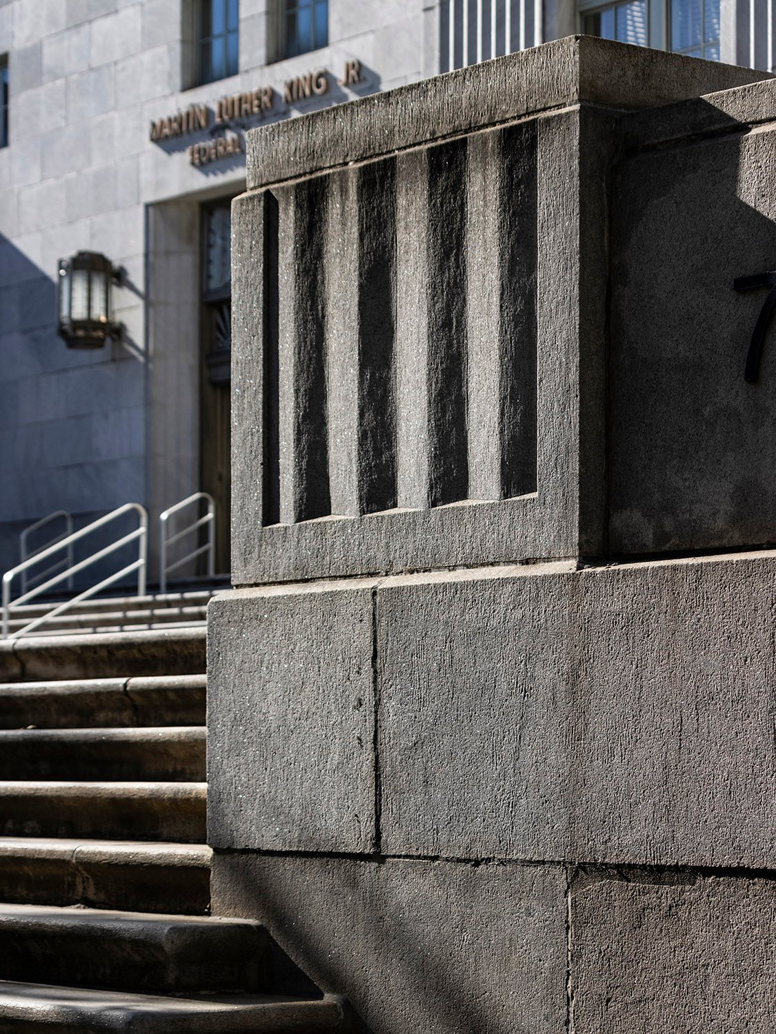
Looking at the United States Post Office, Atlanta, from the northeastBas-relief stringcourse and windows on the United States Post Office, AtlantaFirst-floor window and bas-relief string course on the facade of the United States Post Office, AtlantaWindows on the south elevation of the United States Post Office, AtlantaCenter bay on the facade of the United States Post Office, AtlantaBas-relief ornamentation and first-floor window on the facade of the United States Post Office, AtlantaMain entrance of the United States Post Office, AtlantaNickel-alloy transom panels and sconce at the entrance of the United States Post Office, AtlantaNickel-alloy sconce at the entrance of the United States Post Office, AtlantaMarble block on the United States Post Office, AtlantaInscription and windows on the facade of the United States Post Office, AtlantaA pair of windows on the facade of the United States Post Office, AtlantaCornice on the facade of the United States Post Office, AtlantaBas-relief stringcourse, ornamentation over a first-floor window on the United States Post Office, AtlantaBas-relief stringcourse and dentilled cornice on the south elevation of the United States Post Office, AtlantaBas-relief ornamentation on the facade of the United States Post Office, AtlantaWindows on the south elevation of the United States Post Office, AtlantaGranite base, pedestal, and steps on the United States Post Office, AtlantaCornerstone of the United States Post Office, Atlanta
Hamilton, Tom J., Jr. “Leaders Laud Administration Policies at Dedication of Atlanta’s New $3,000,000 Post Office Building”. The Atlanta Journal, December 3, 1933, p. 1. ↩︎
“Barili & Humphries Architectural Firm Is Announced Here”. The Atlanta Journal, February 21, 1937, p. 6-D. ↩︎
“New Post Office Is Dedicated And Accepted By City”. The Atlanta Journal, February 19, 1933, p. 1-B. ↩︎
Hamilton, Tom J., Jr. “Leaders Laud Administration Policies at Dedication of Atlanta’s New $3,000,000 Post Office Building”. The Atlanta Journal, December 3, 1933, p. 1. ↩︎
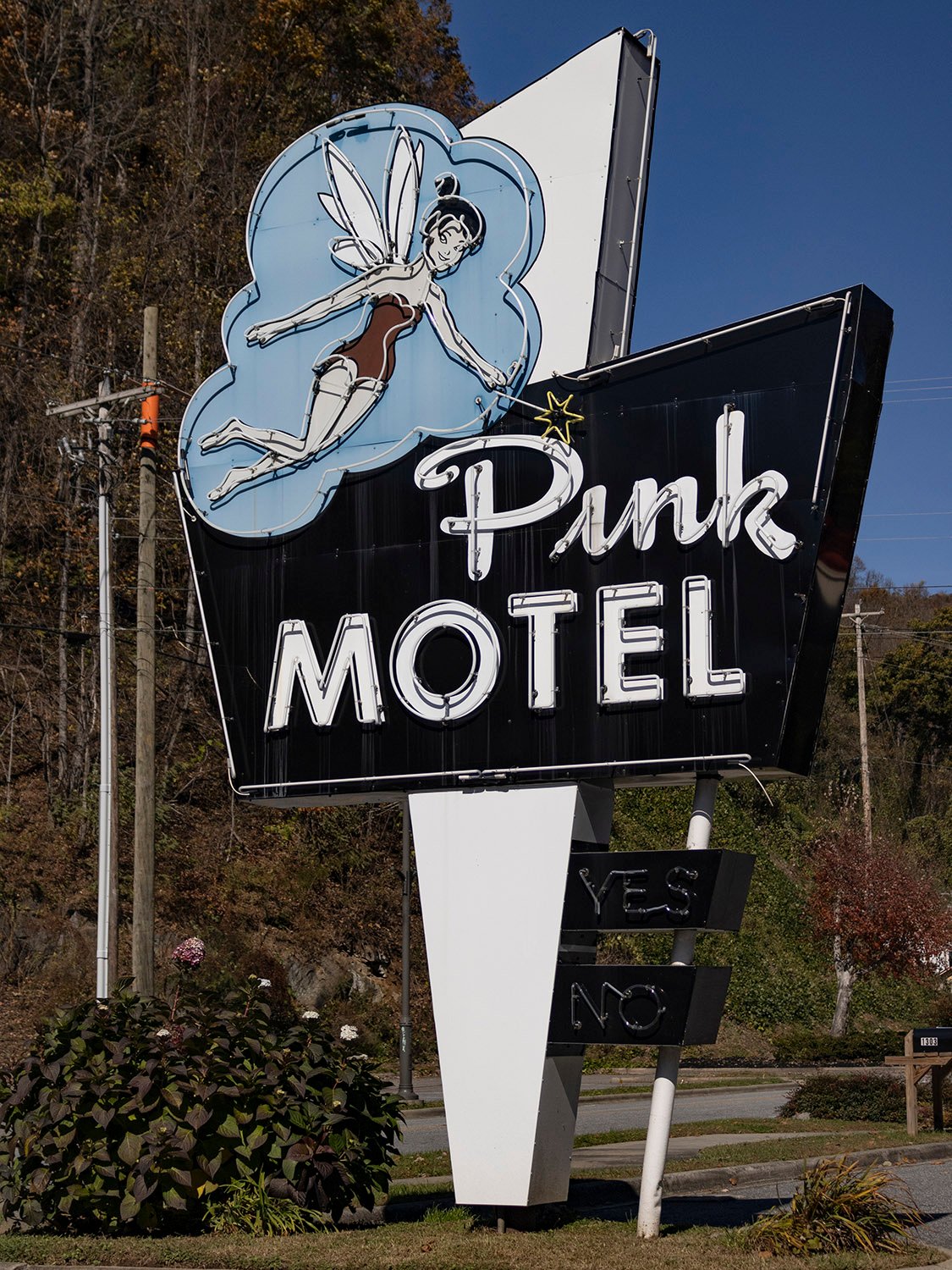
Pink Motel (1957). 1306 Tsali Boulevard, Cherokee, North Carolina.
Nothing makes a night better than pink.
This sign in Cherokee, North Carolina, debuted at the Pink Motel’s opening in 1957. And if you’re wondering about the origin of the name, a newspaper report from the time helpfully explained:
“If you are a motel operator, supplying your own linen, name-tagged and all, you will often get back from the laundry the linen of some other operator. So, if you have pink bed sheets and towels, how’s anyone but a colorblind person going to get your linens mixed-up with that of white-linen folks?
“So, that’s how the name “Pink Motel” started. It was only logical to carry the pink idea still further until it was “done up pink.” The outside of the Pink Motel is painted pink. The walls, furniture, vertical venetian blinds, the bathroom tile, the furnishings…even the soap…are all pink.”1
Location of Pink Motel
References
“20-Unit Pink Motel At Cherokee Is Original Color Scheme Idea”. Asheville Citizen-Times (Asheville, North Carolina), July 14, 1957, p. B11. ↩︎
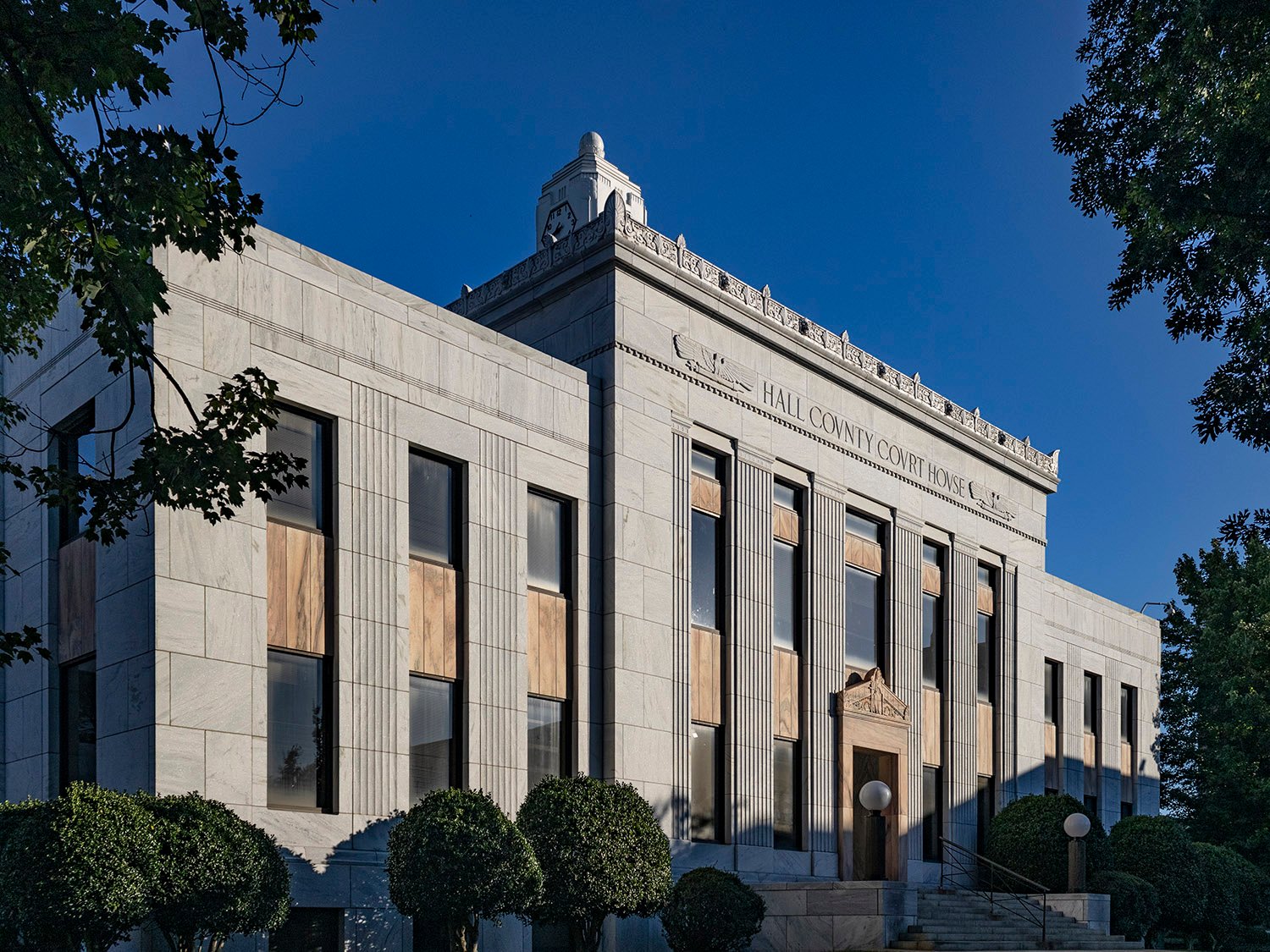
Daniel & Beutell. Hall County Courthouse (1938). Gainesville, Georgia.12345
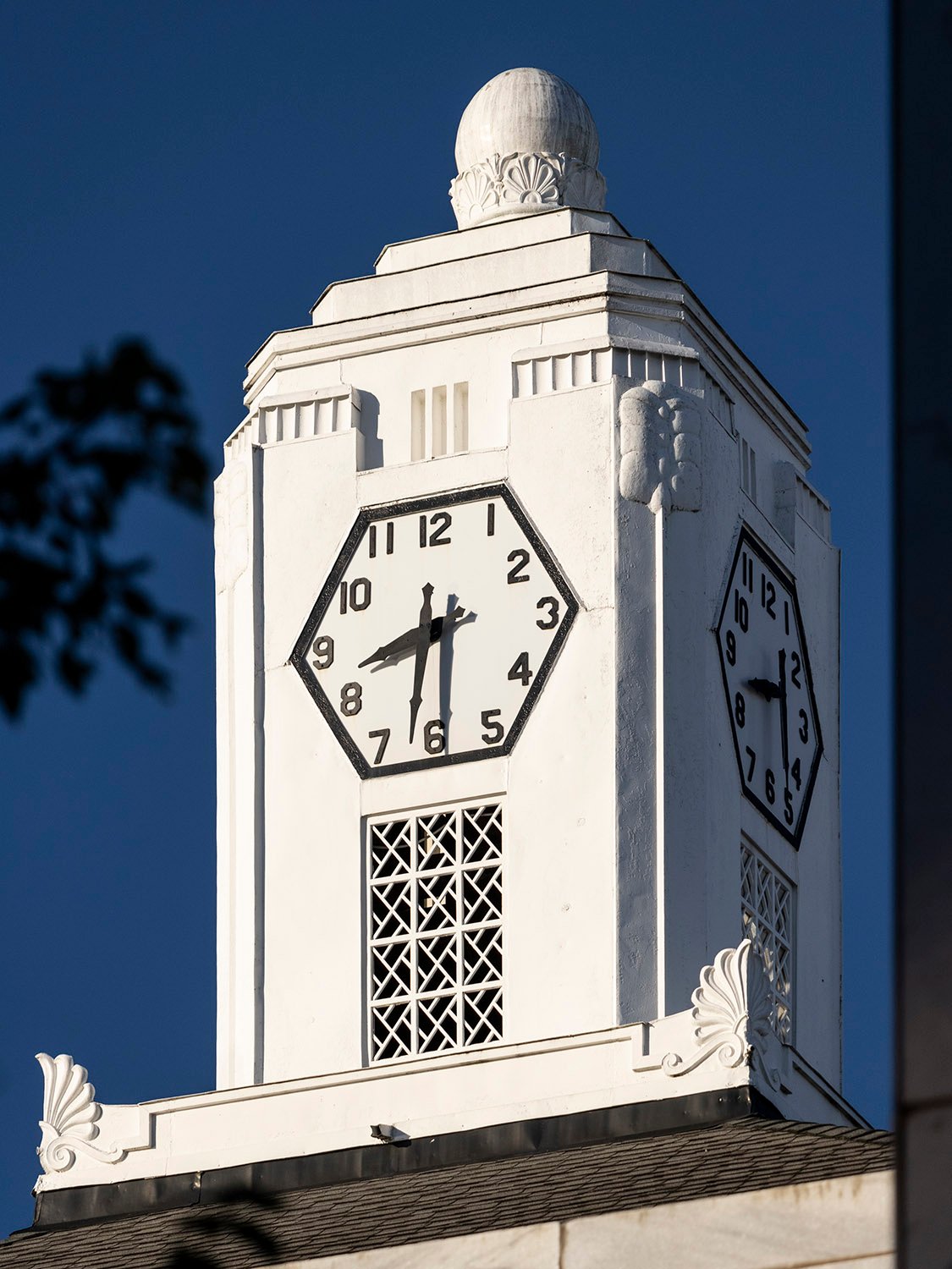
This stark but stately county courthouse in Gainesville, Georgia, owes its existence to the United States federal government.
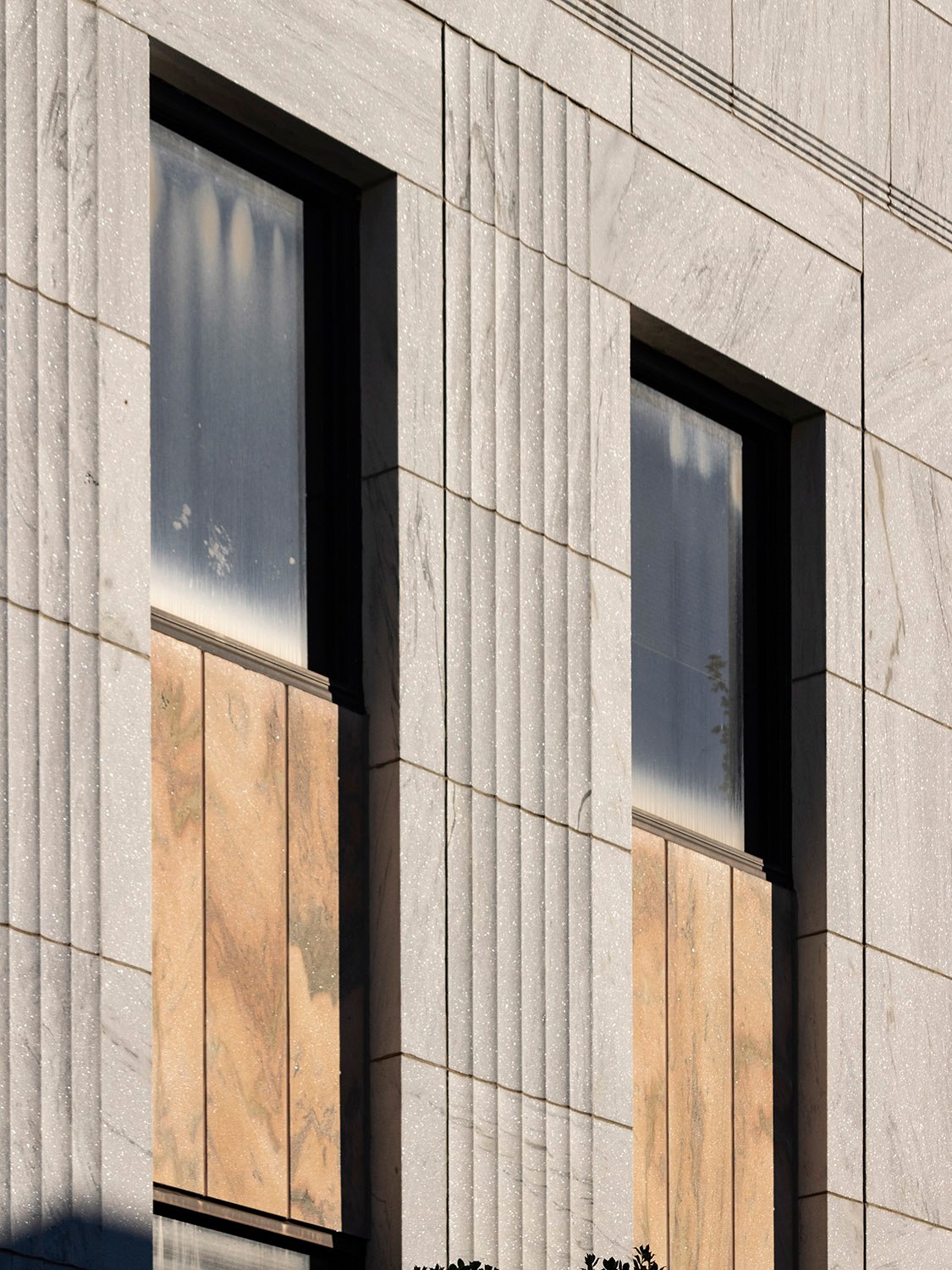
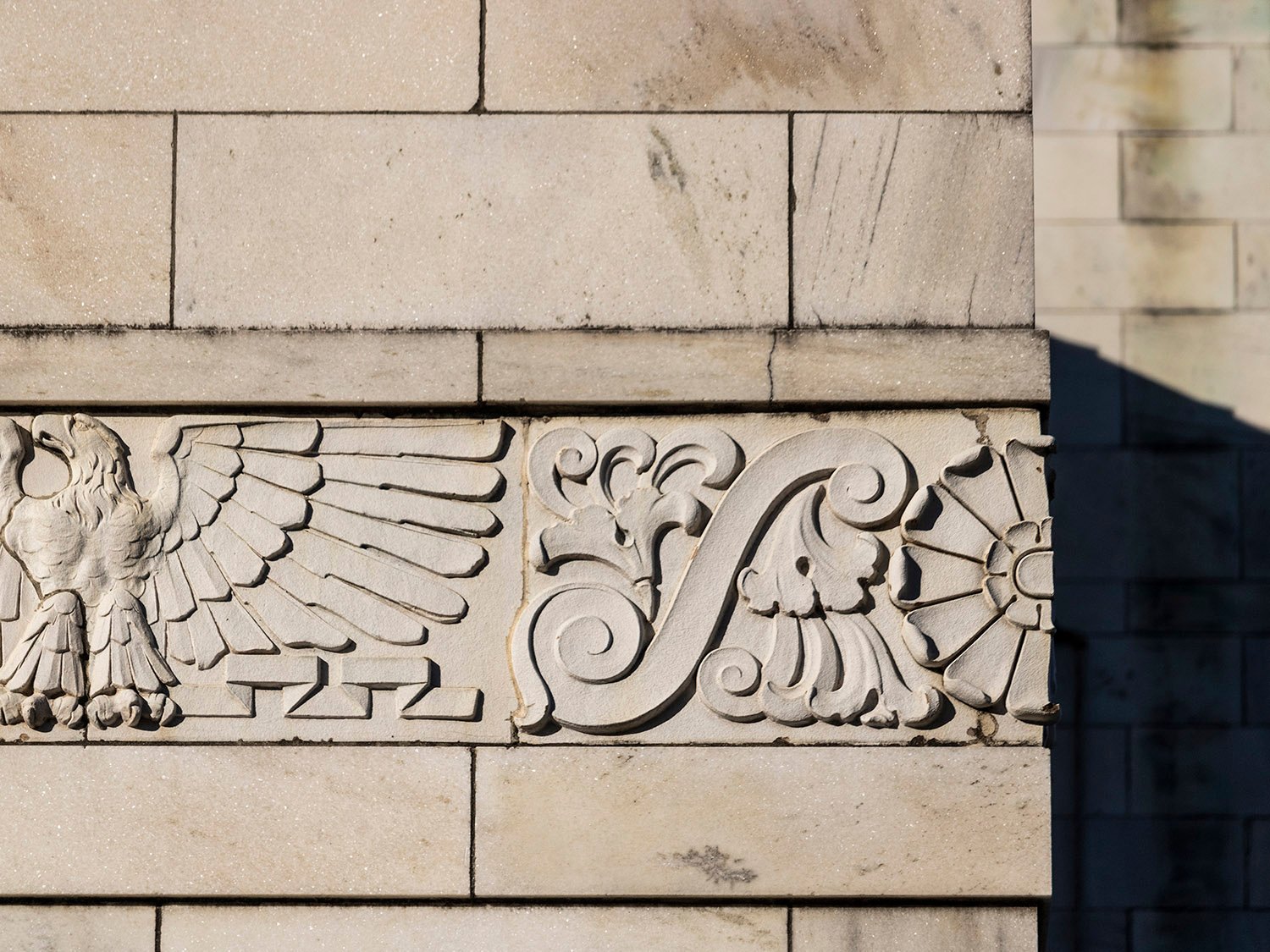
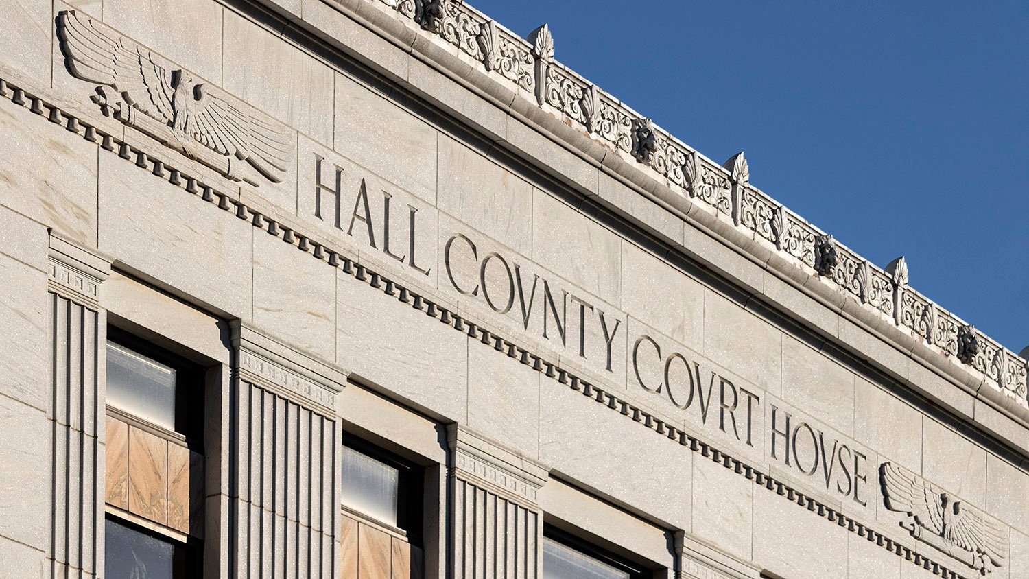
Built at the height of the Great Depression, the structure is primarily in the Classical Moderne style, with some Beaux-Arts ornamentation, and was designed by Daniel & Beutell of Atlanta.
Construction began three months after an April 1936 tornado that destroyed much of the city’s business district, including the former courthouse.
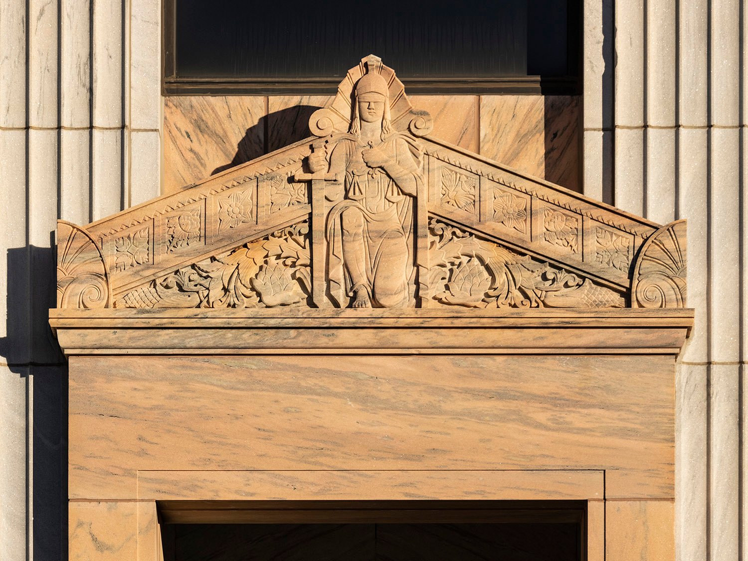
Pediment on the Hall County Courthouse, Gainesville, Georgia
When the courthouse was completed in March 1938, it was dedicated in a gala ceremony attended by President Franklin D. Roosevelt. Not shabby.
Gallery
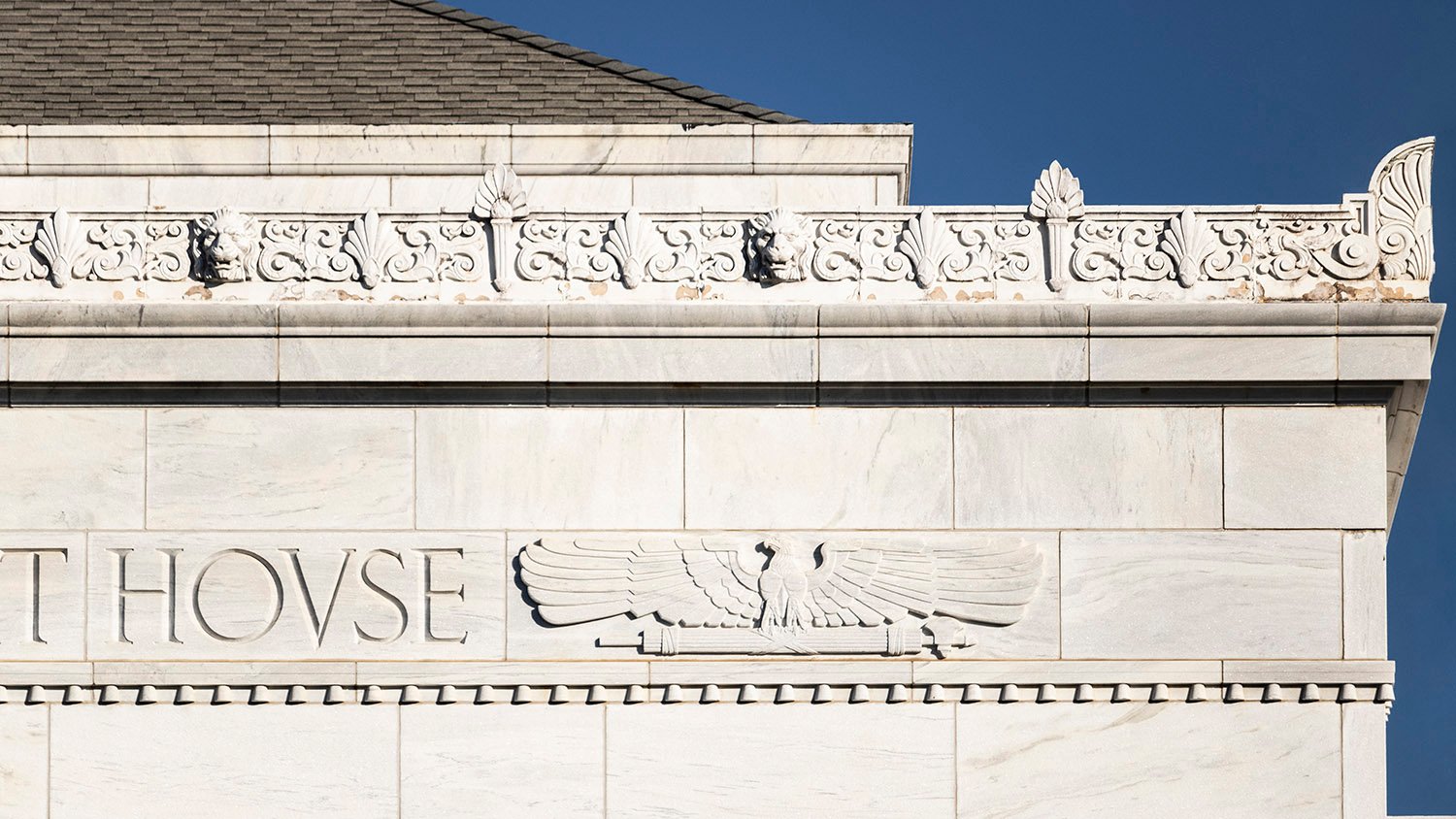
Cornice and bas-relief ornamentation on the Hall County Courthouse, Gainesville, GeorgiaClock tower on the Hall County Courthouse, Gainesville, GeorgiaSecond-floor windows and spandrels on the facade of the Hall County Courthouse, Gainesville, GeorgiaBas-relief stringcourse on the facade of the Hall County Courthouse, Gainesville, GeorgiaInscription on the Hall County Courthouse, Gainesville, GeorgiaClock tower and marble blocks on the Hall County Courthouse, Gainesville, GeorgiaBas-relief ornamentation on the Hall County Courthouse, Gainesville, GeorgiaLight and pedestal at the entrance of the Hall County Courthouse, Gainesville, GeorgiaCornice on the facade of the Hall County Courthouse, Gainesville, Georgia
References
“Gainesville Gets $40,000 RFC Loan For Civic Center”. The Atlanta Journal, June 12, 1936, p. 13. ↩︎
“PWA Approves $126,000 Grant For New Hall County Courthouse”. The Atlanta Journal, July 9, 1936, p. 9. ↩︎
“PWA Soon To Launch Gainesville Building”. The Atlanta Constitution, July 10, 1936, p. 10. ↩︎
“More Than 50,000 To Hear Roosevelt At Gainesville Wednesday”. The Atlanta Journal, March 22, 1938, p. 1. ↩︎
“Georgia Hails President Roosevelt at Mighty Celebration in New Gainesville”. The Atlanta Journal, March 23, 1938, p. 12. ↩︎
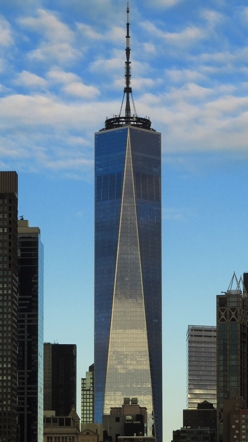
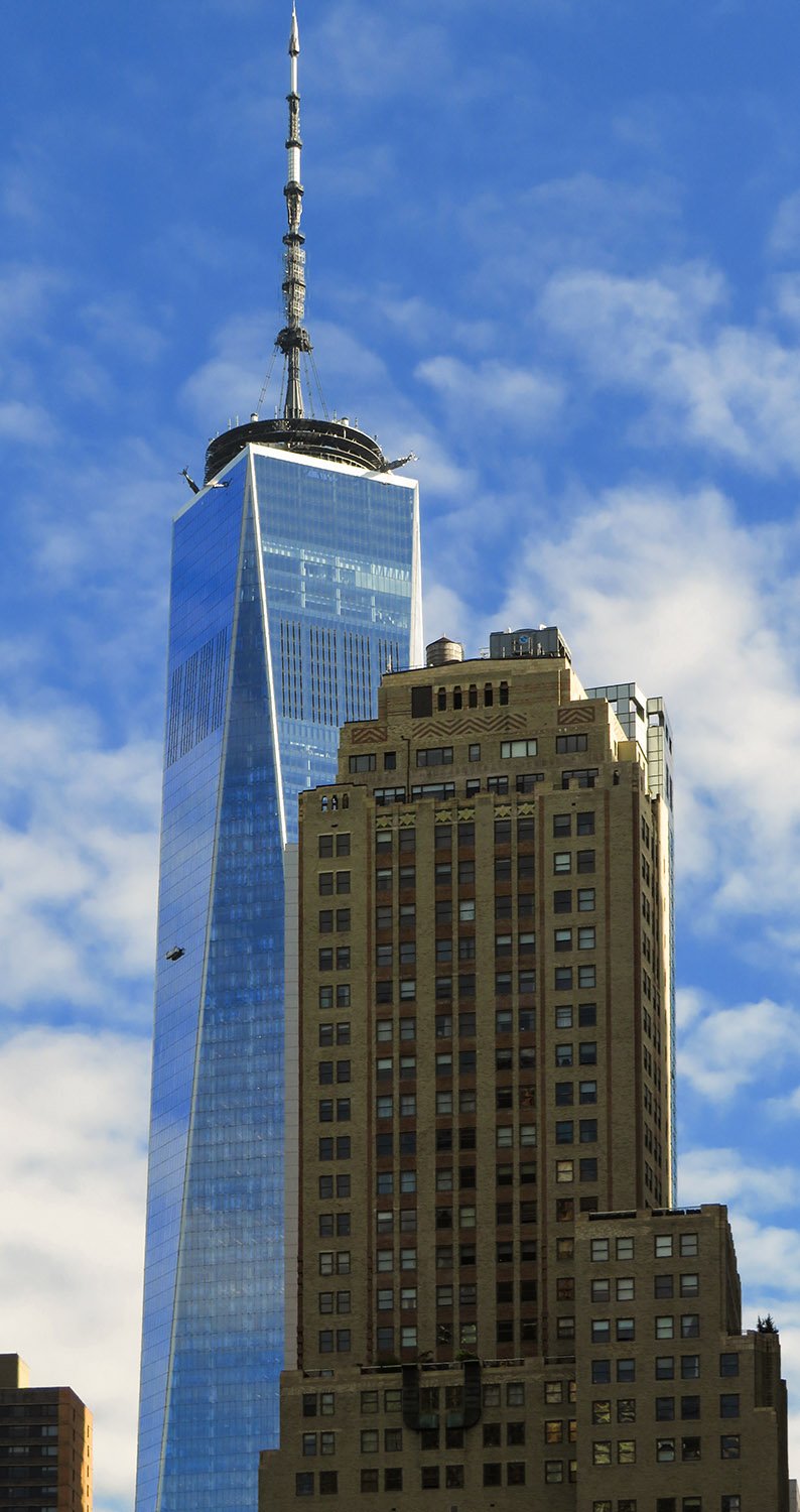
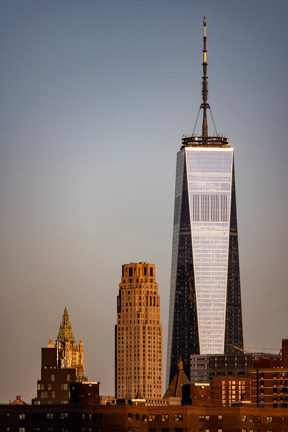
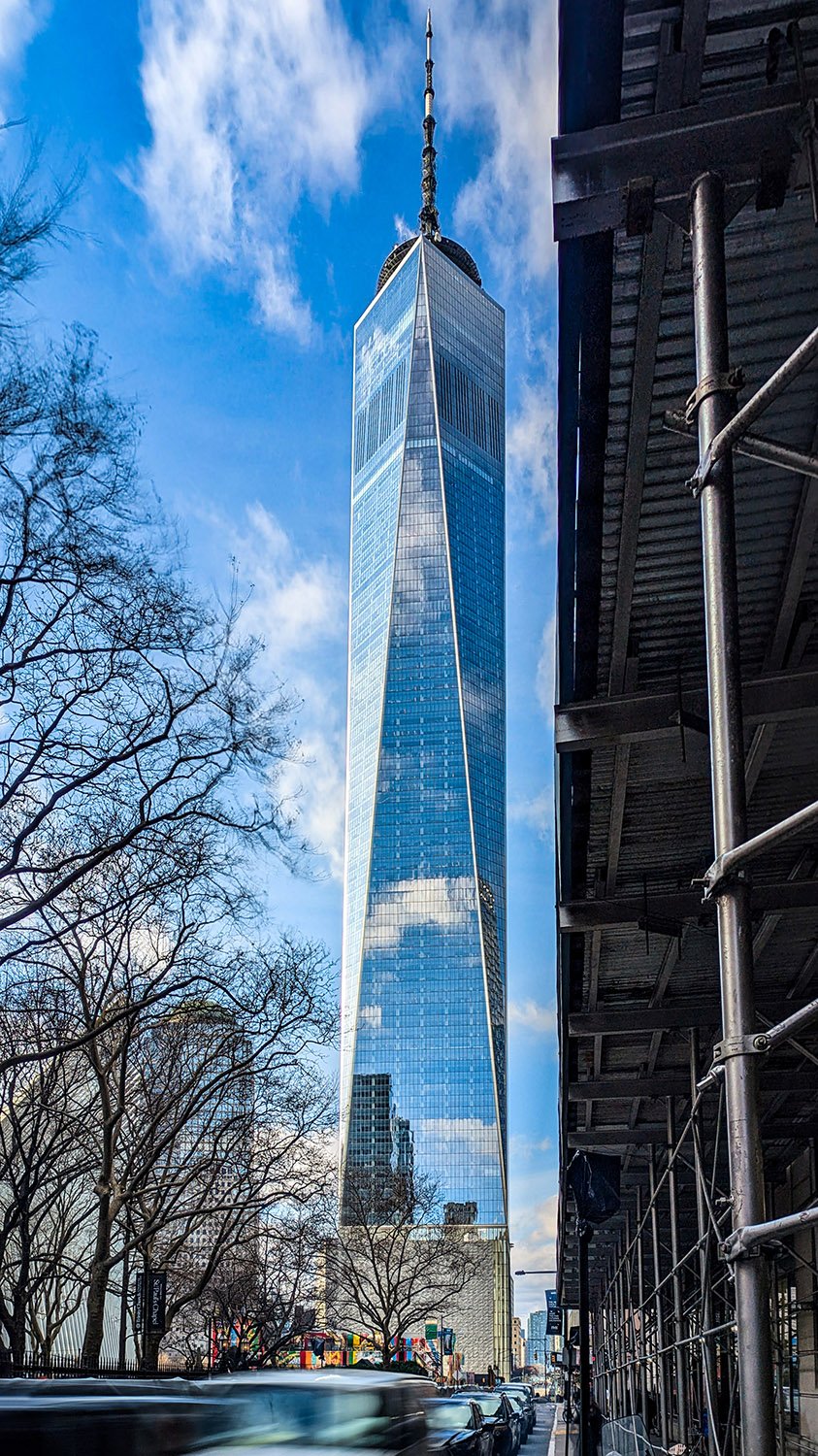
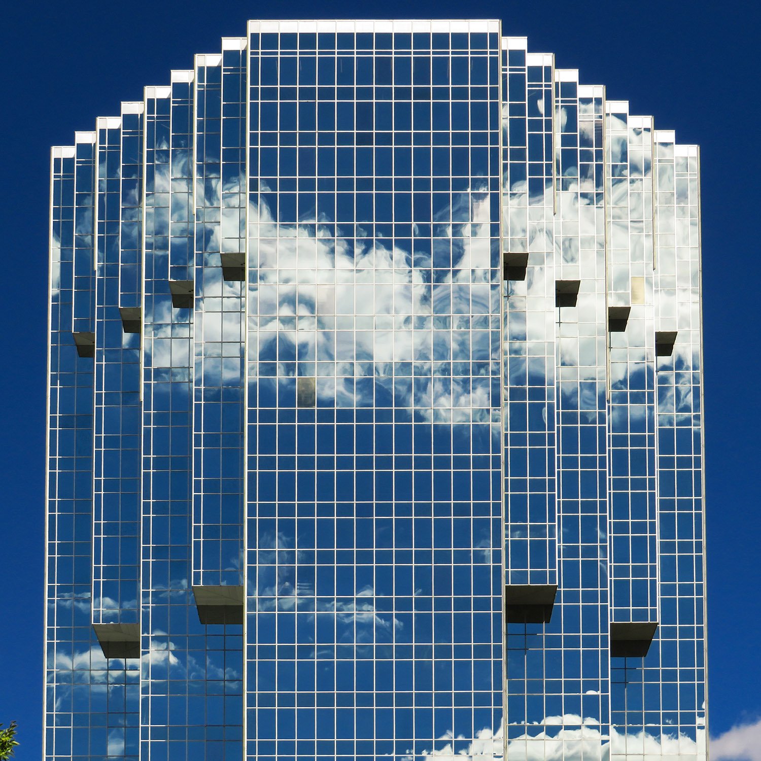
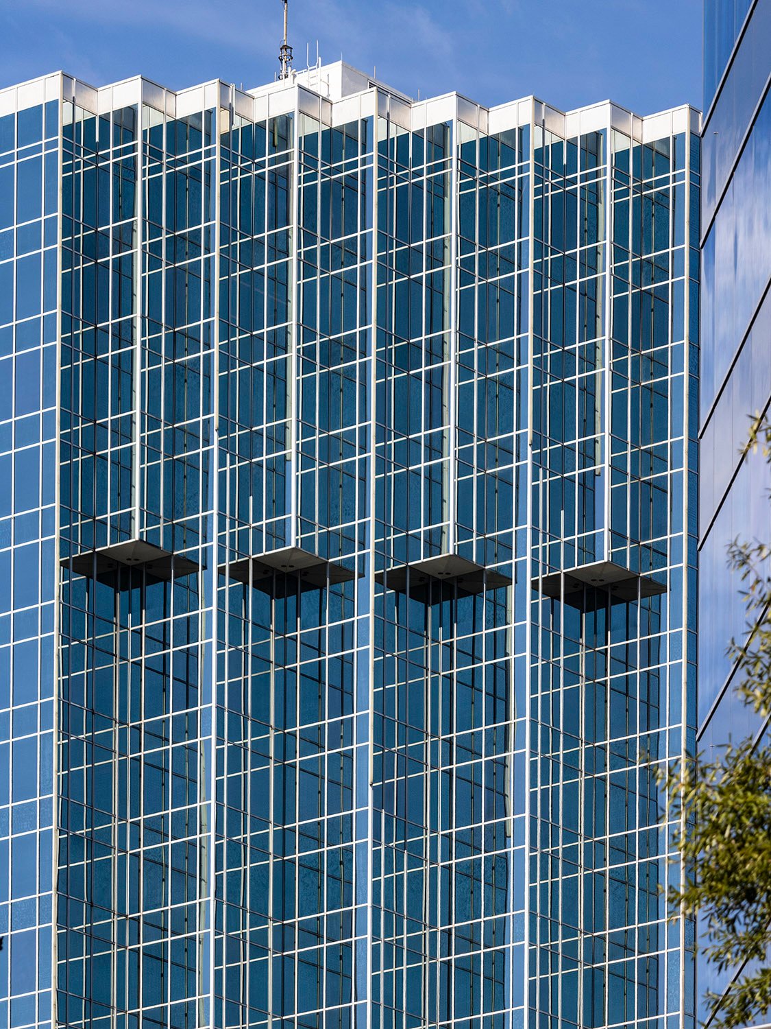
SOM. One World Trade Center (2014). New York.1Looking at One World Trade Center from the south, with 19 Rector Street (1930) in the foreground2Looking at One World Trade Center from BrooklynLooking up at One World Trade Center from the east
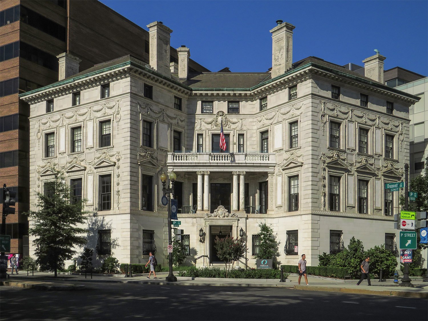
Stanford White of McKim, Mead & White. Robert Wilson Patterson Residence (1903). Washington, D.C.1
The only thing that makes this home’s exterior truly interesting is its unique butterfly shape, designed to conform to its site overlooking Washington, D.C.’s Dupont Circle.
Location of the Robert Wilson Patterson Residence
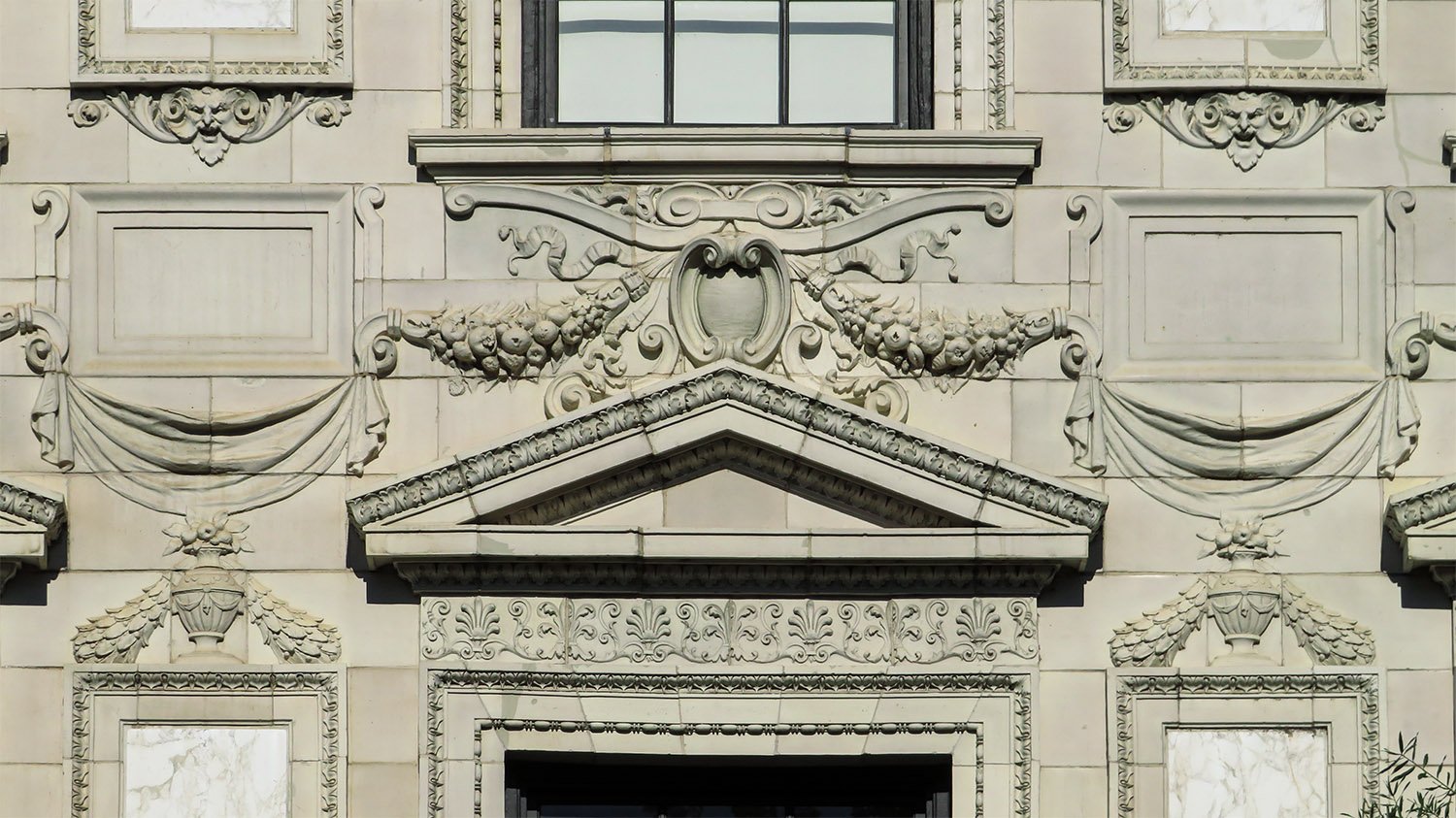
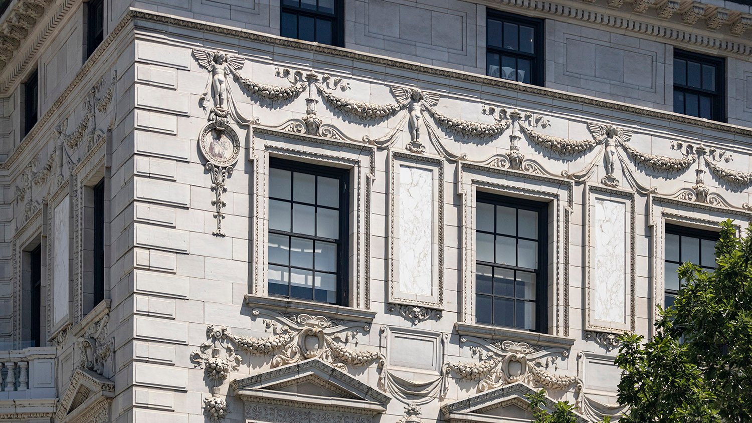
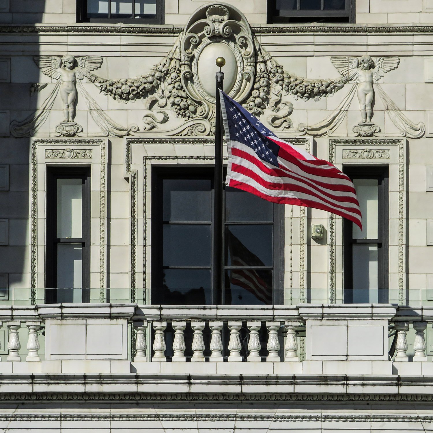
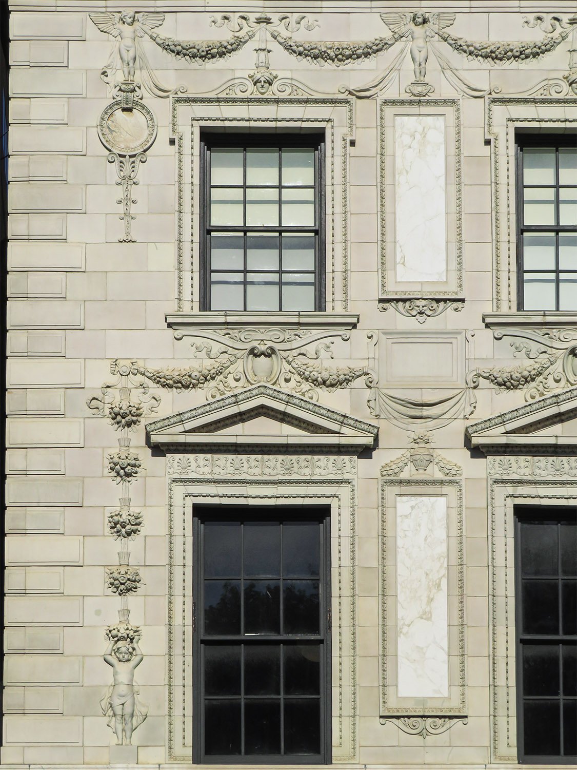
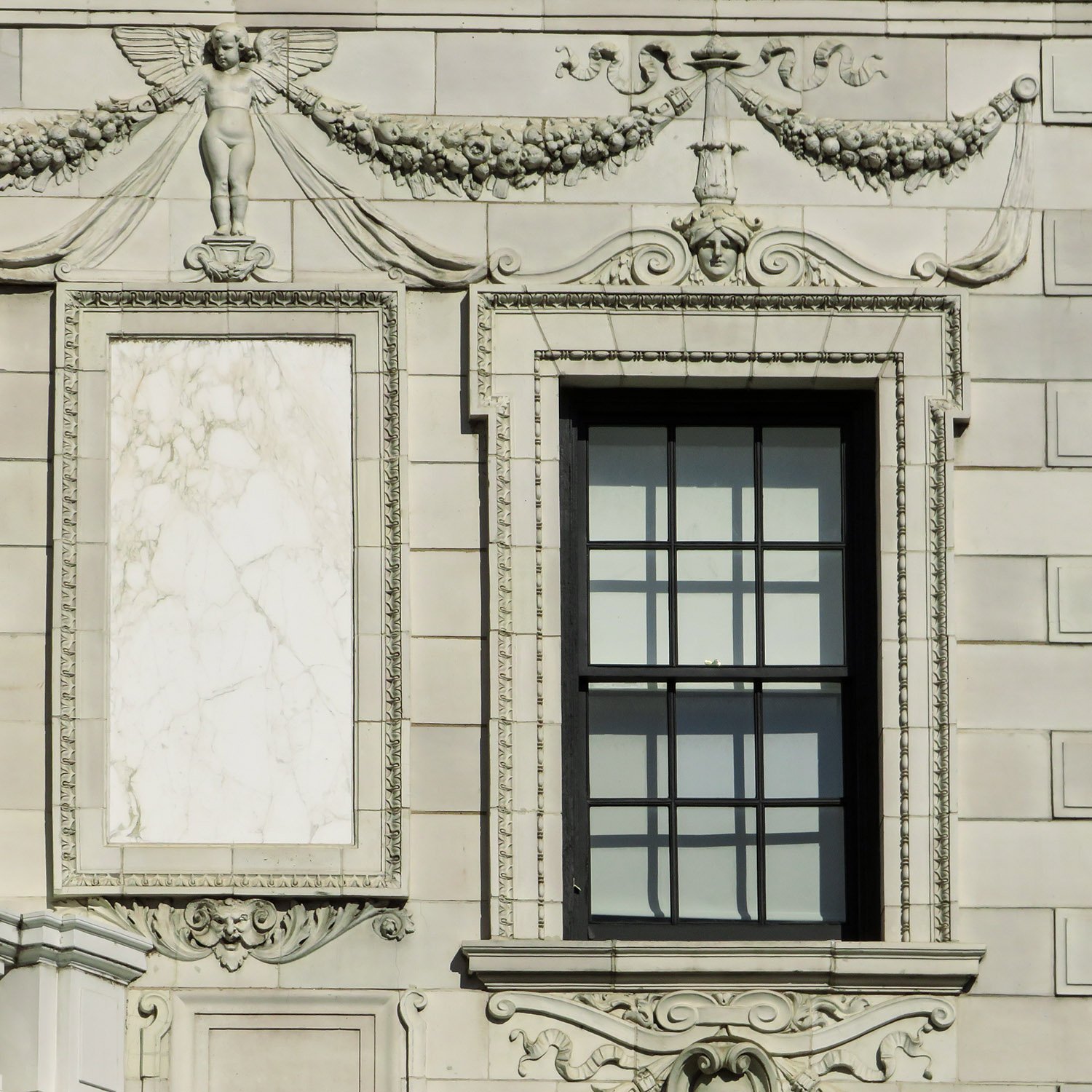
Otherwise, it’s fairly standard for Stanford White‘s later work, with an overwrought mishmash of Renaissance-inspired details that appears fitful and fussy, akin to the cluttered walls of an old art gallery.
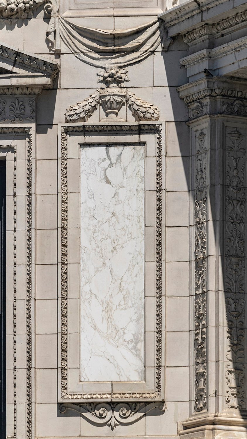
However, the marble and limestone construction is quite exquisite on close observation.
White claimed the design had a “light and rather joyous character.”2
I’m not sure about “joyous,” but I can go along with “light,” as the abundance of windows in the structure gives it an airy feel, particularly when the sun hits all five sides of the facade.
Ornamentation on the Robert Wilson Patterson Residence, Washington, D.C.
The home was built at the same time as White’s partner, Charles F. McKim, was designing the nearby East Wing of the White House, which…is no longer with us.
The Patterson Mansion is currently occupied by short-term rental units, and I hope to stay in one at some point in the future— preferably when D.C. is no longer occupied by madmen.
God knows when that may be.
Gallery
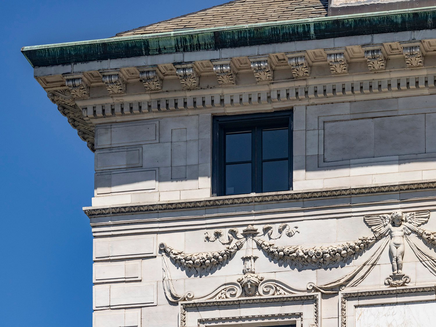
Third-floor windows on the south facade of the Robert Wilson Patterson Residence, Washington, D.C.Third-floor balcony on the Robert Wilson Patterson Residence, Washington, D.C.Pediment over the entrance of the Robert Wilson Patterson Residence, Washington, D.C.Eaves, consoles, and cornice on the Robert Wilson Patterson Residence, Washington, D.C. Pediment and ornamentation over a second-floor window on the Robert Wilson Patterson Residence, Washington, D.C. Columns, pilasters, and marble panel on the facade of the Robert Wilson Patterson Residence, Washington, D.C. Second- and third-floor windows and ornamentation on the facade of the Robert Wilson Patterson Residence, Washington, D.C. Third-floor window, marble panel, and ornamentation on the facade of the Robert Wilson Patterson Residence, Washington, D.C. Marble panel on the facade of the Robert Wilson Patterson Residence, Washington, D.C. Eaves, cornice, attic window, stringcourse, and ornamentation on the facade of the Robert Wilson Patterson Residence, Washington, D.C. Second, third-floor, and attic windows on the facade of the Robert Wilson Patterson Residence, Washington, D.C. Ornamentation over a third-floor window on the Robert Wilson Patterson Residence, Washington, D.C. Second- and third-floor windows on the Robert Wilson Patterson Residence, Washington, D.C.
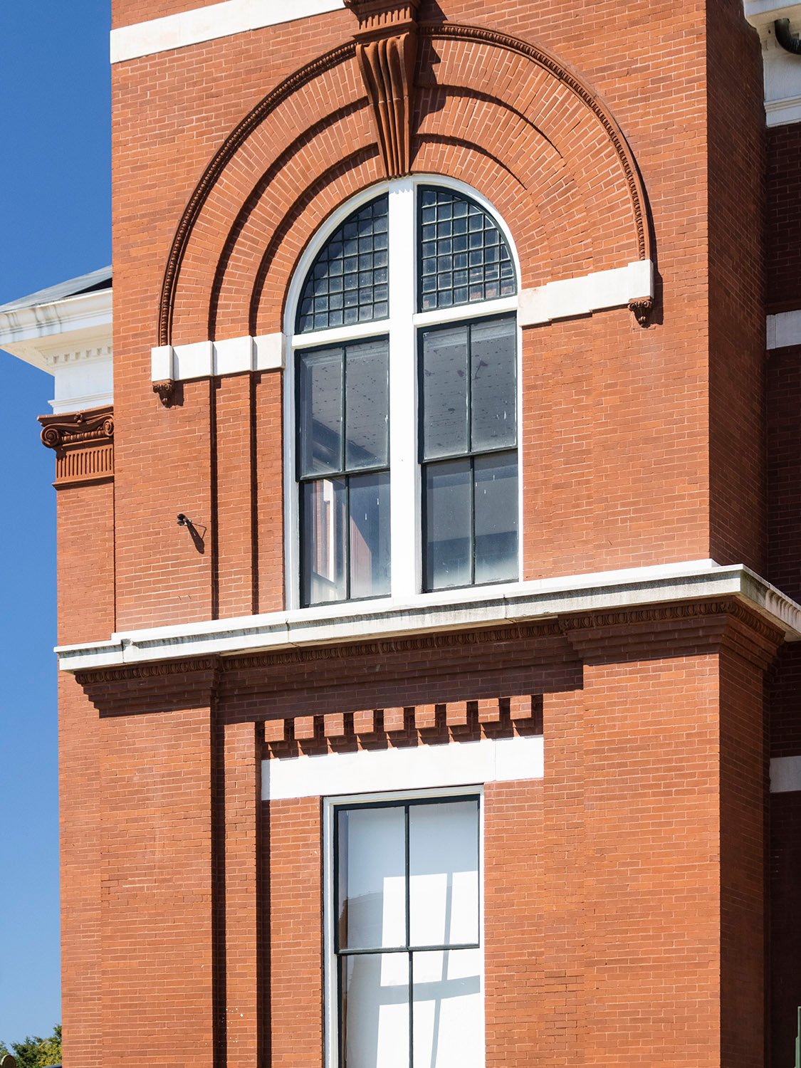
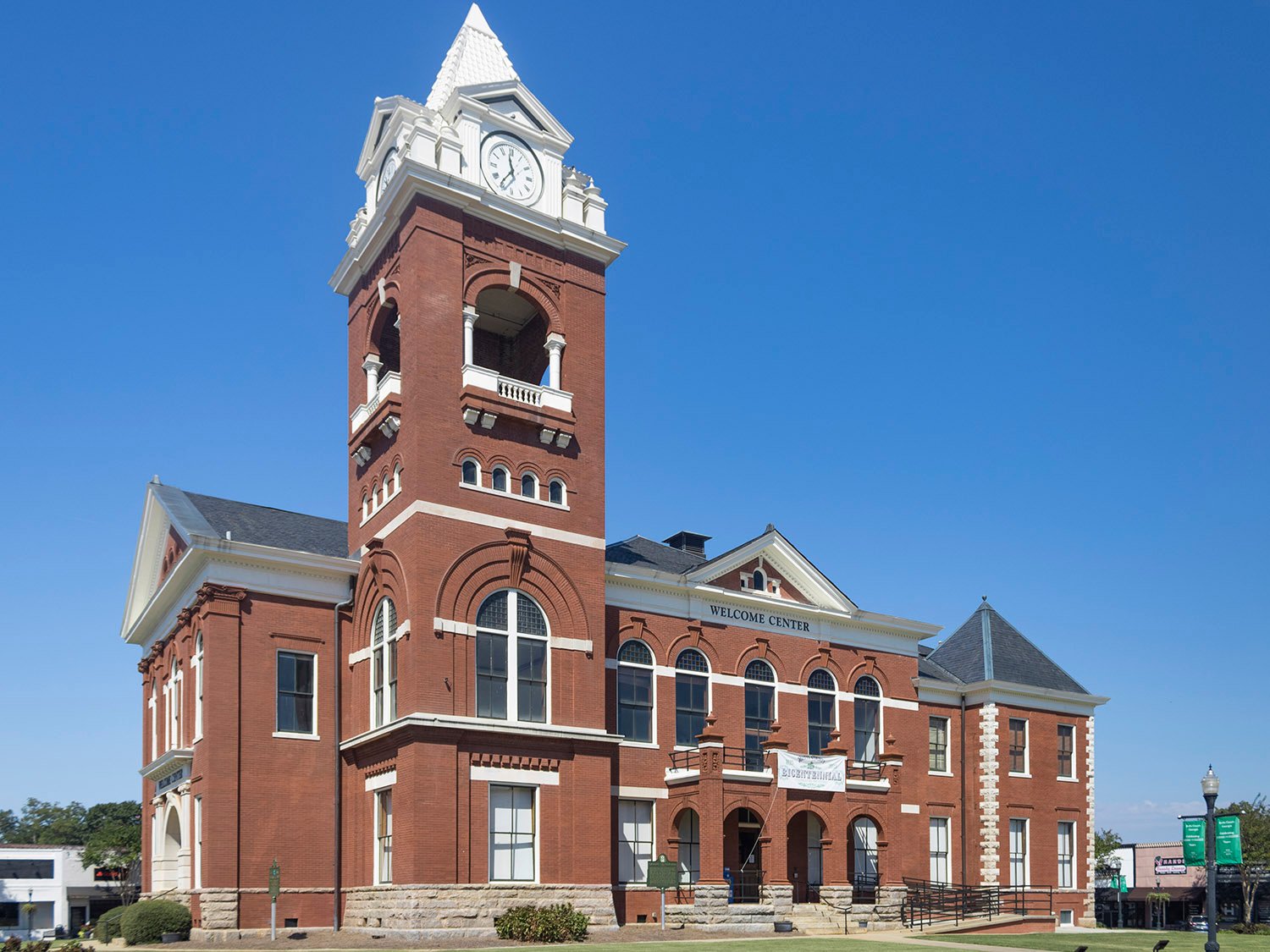
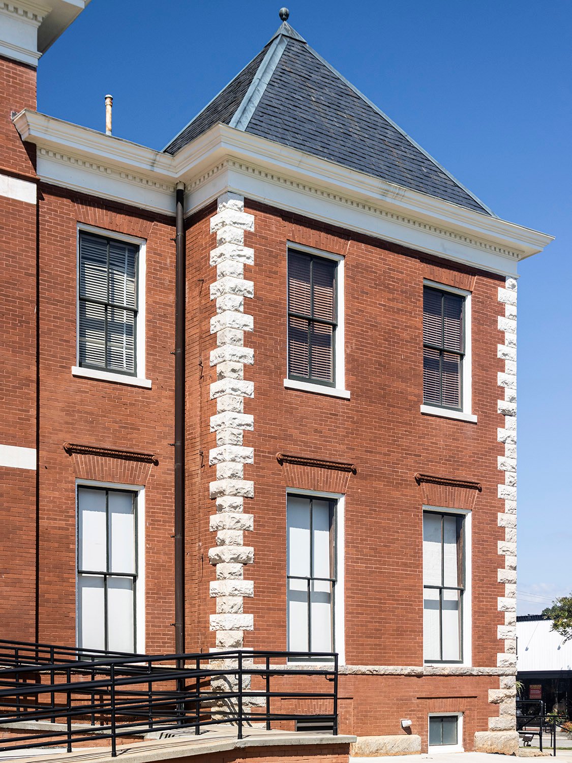
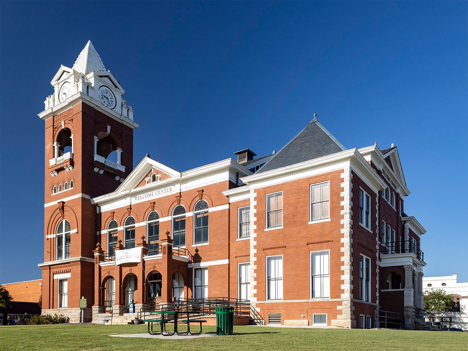
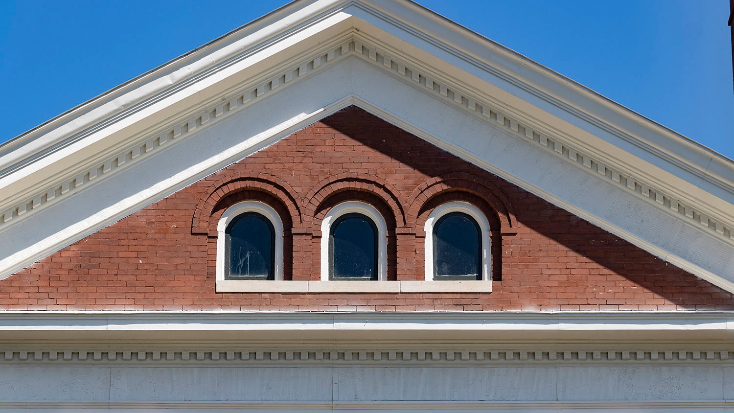
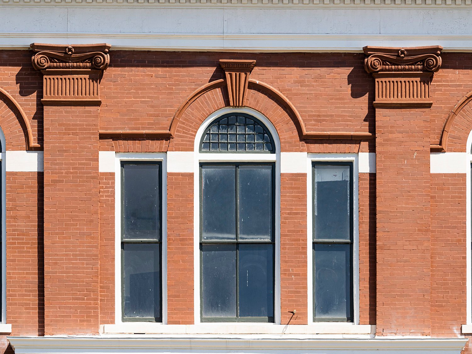
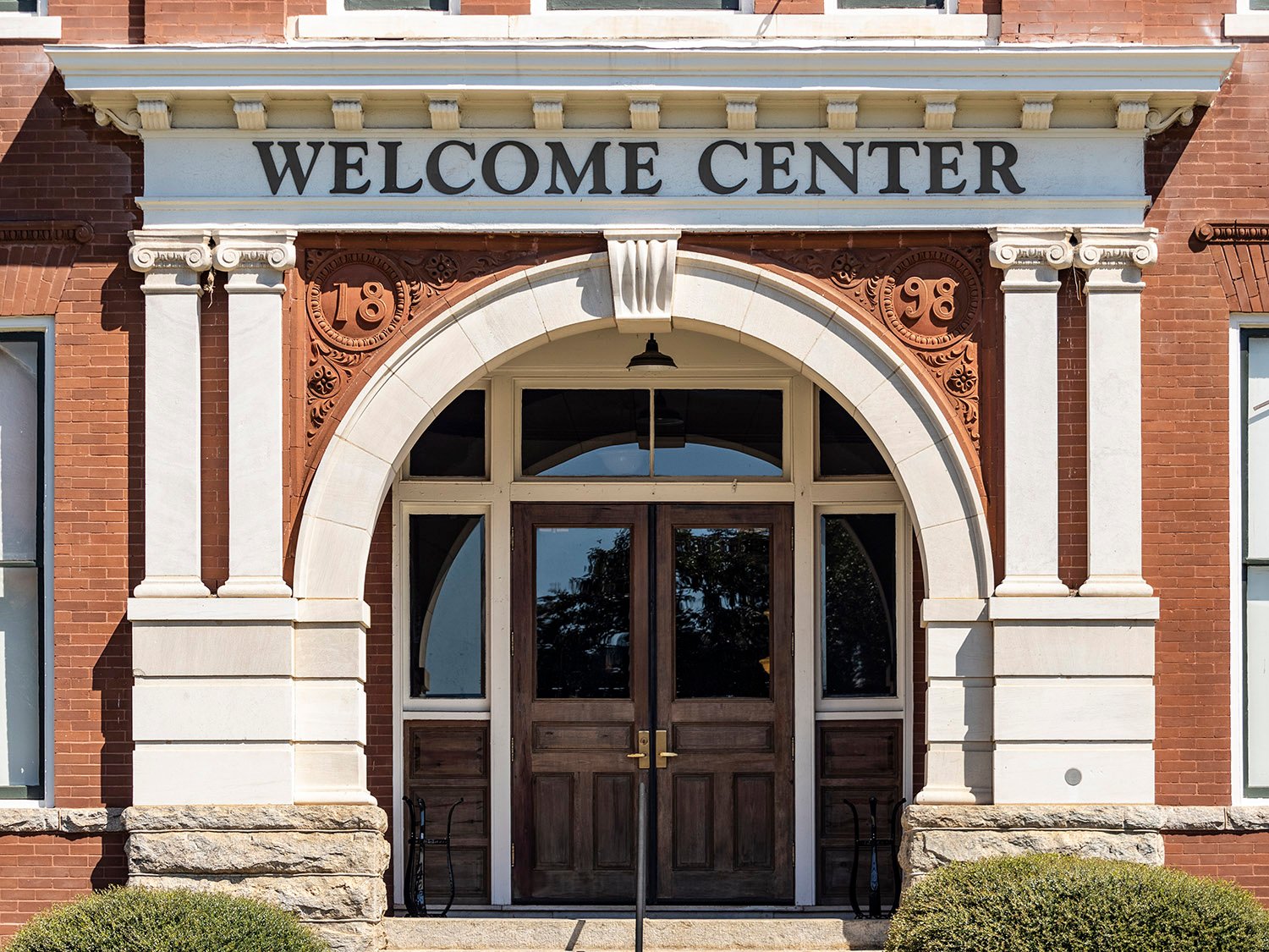
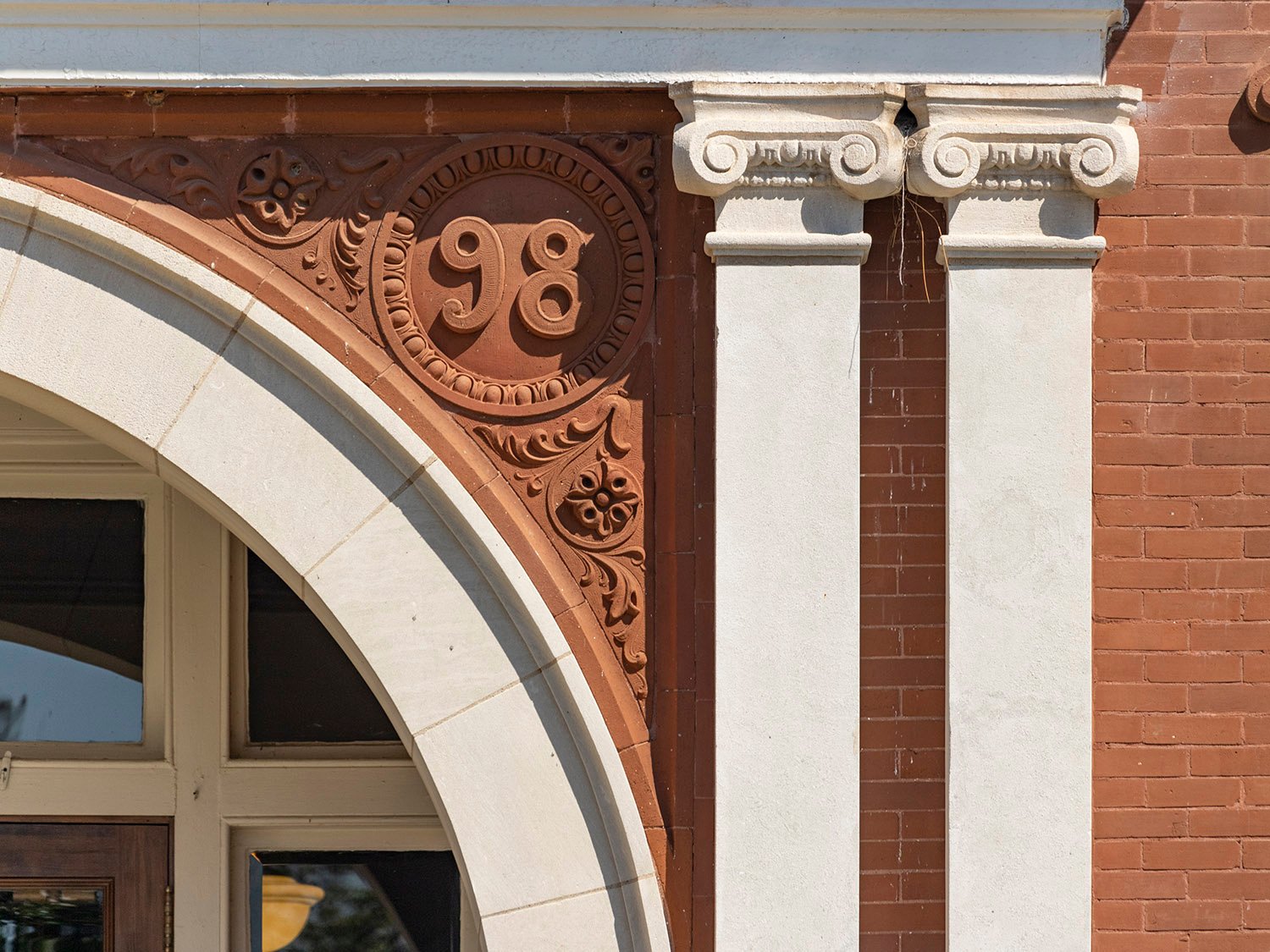
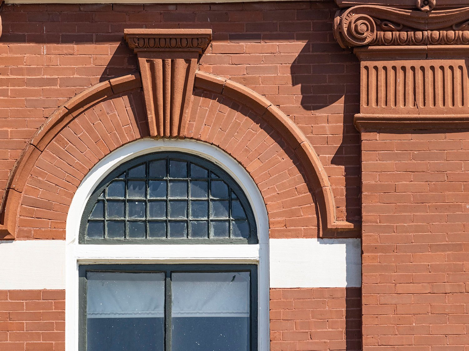
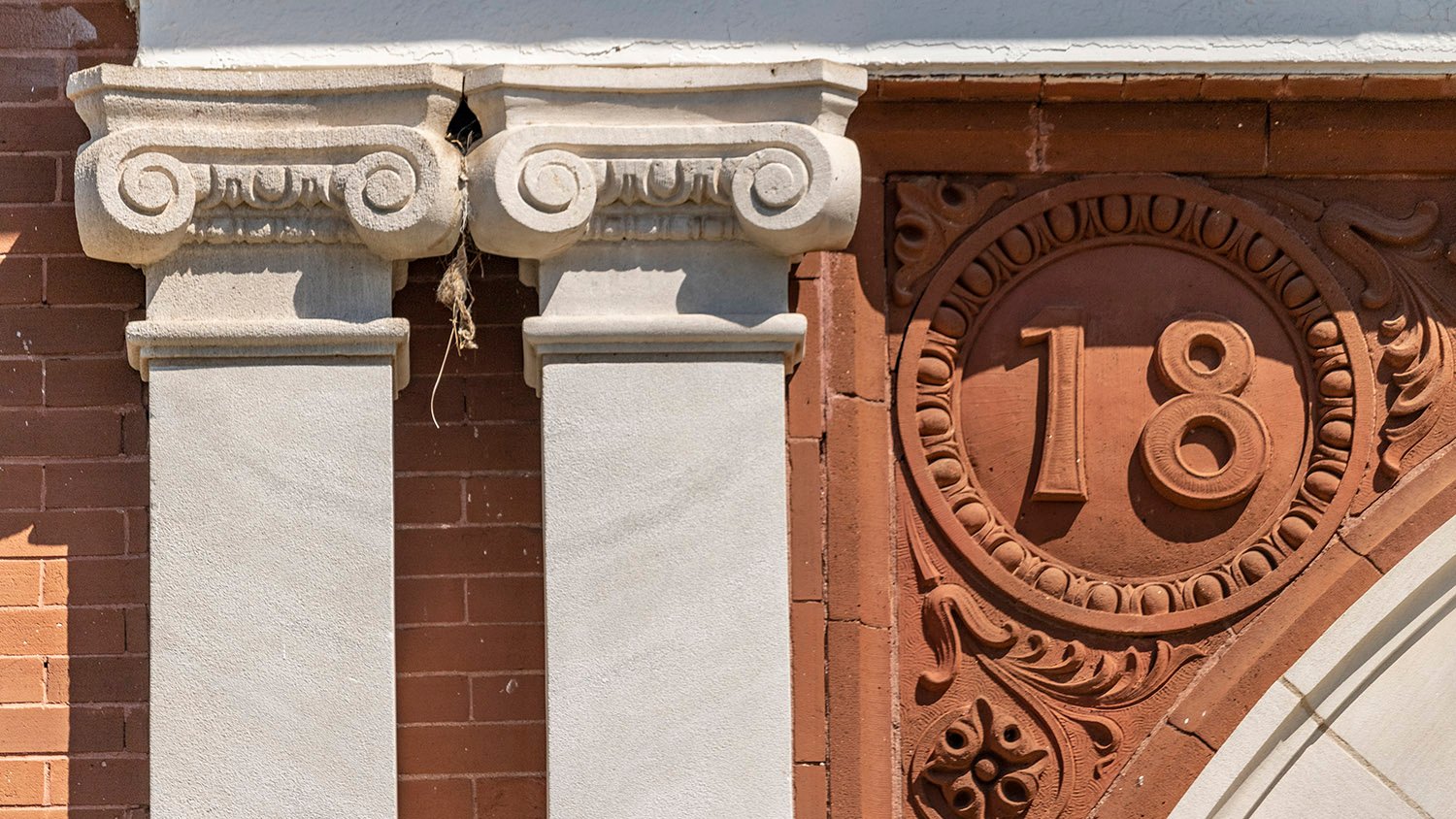
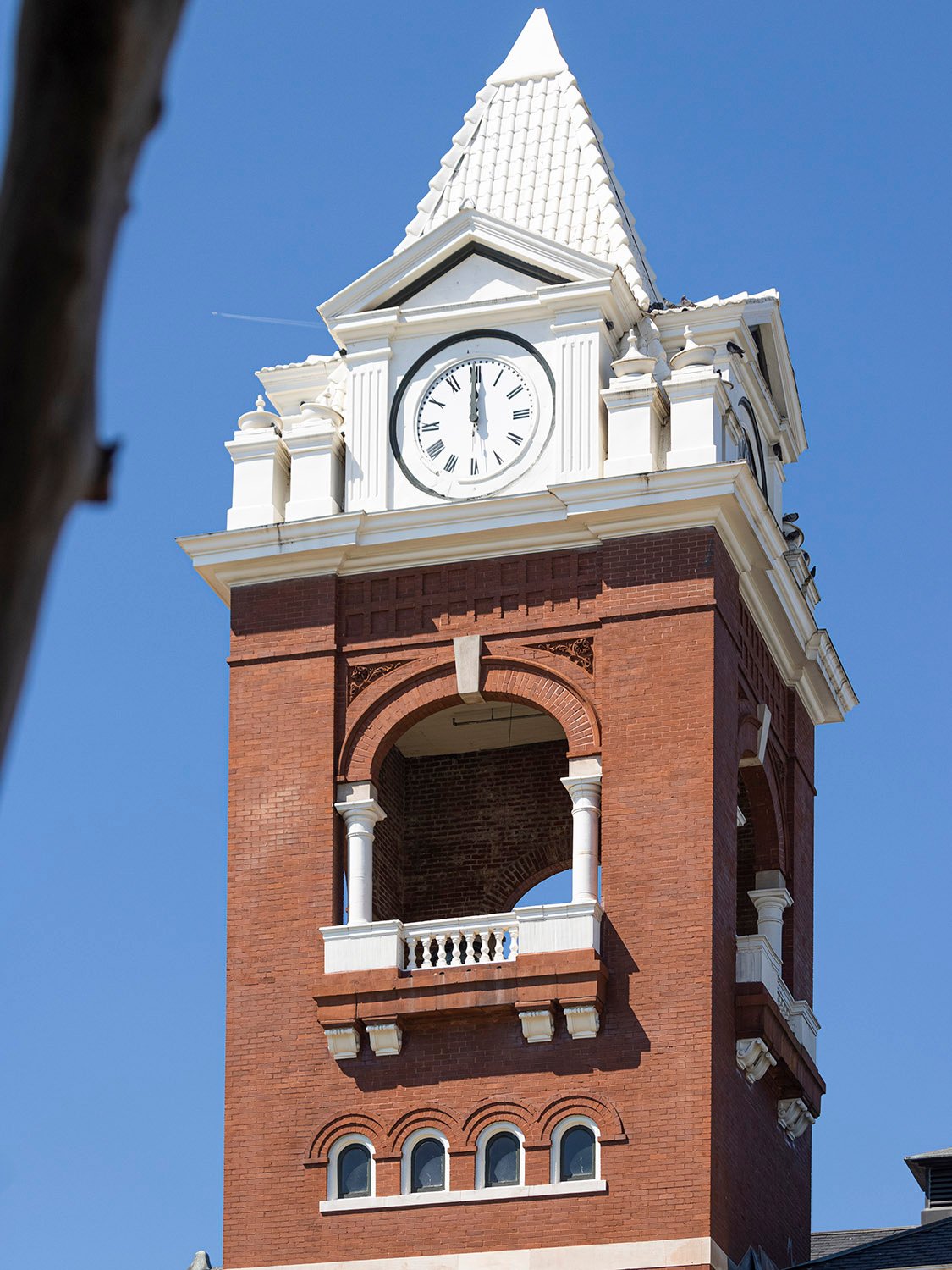
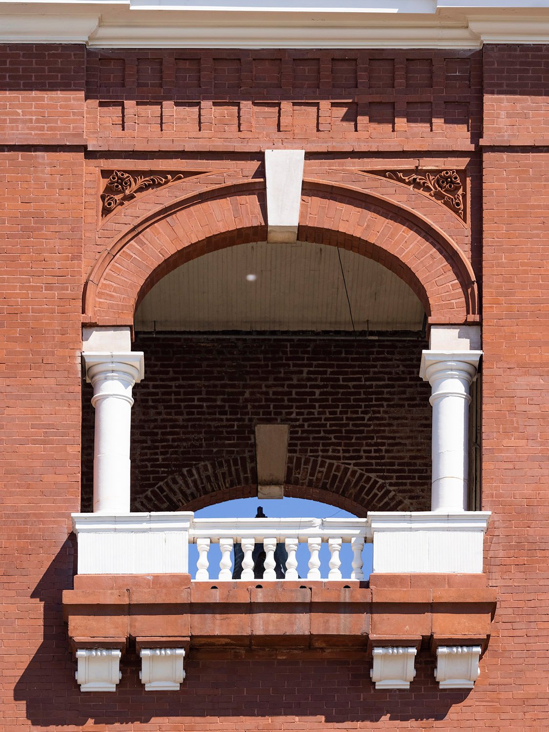
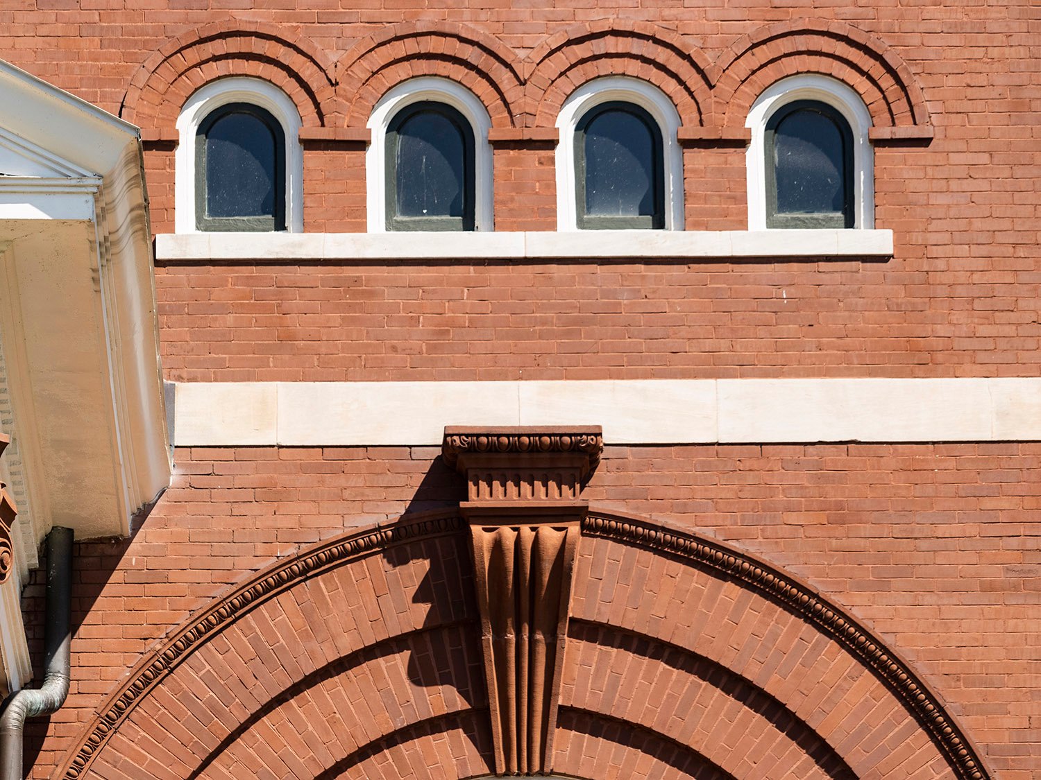
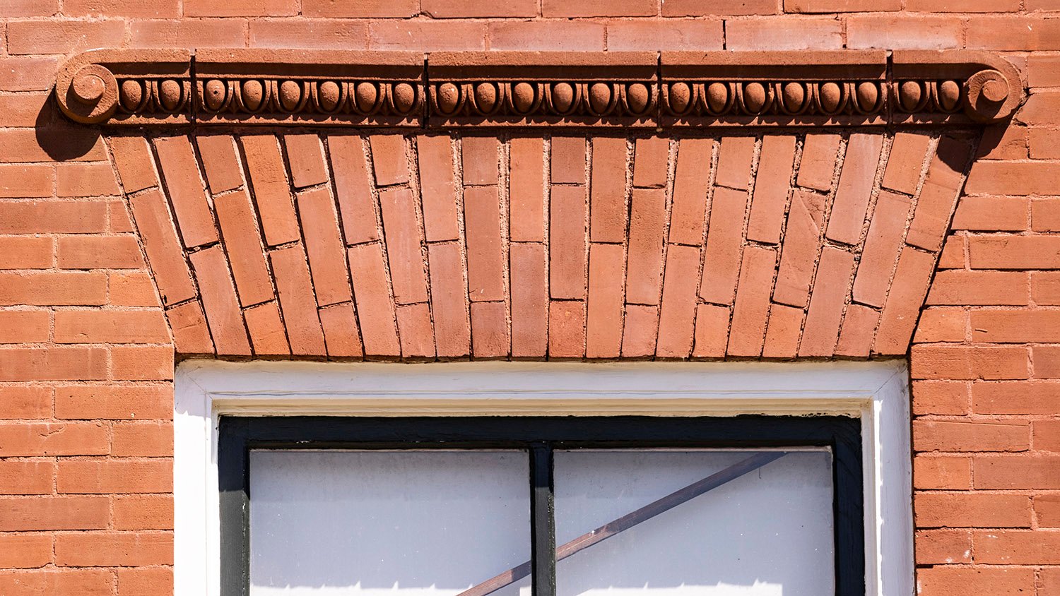
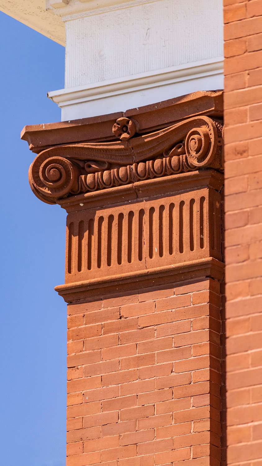
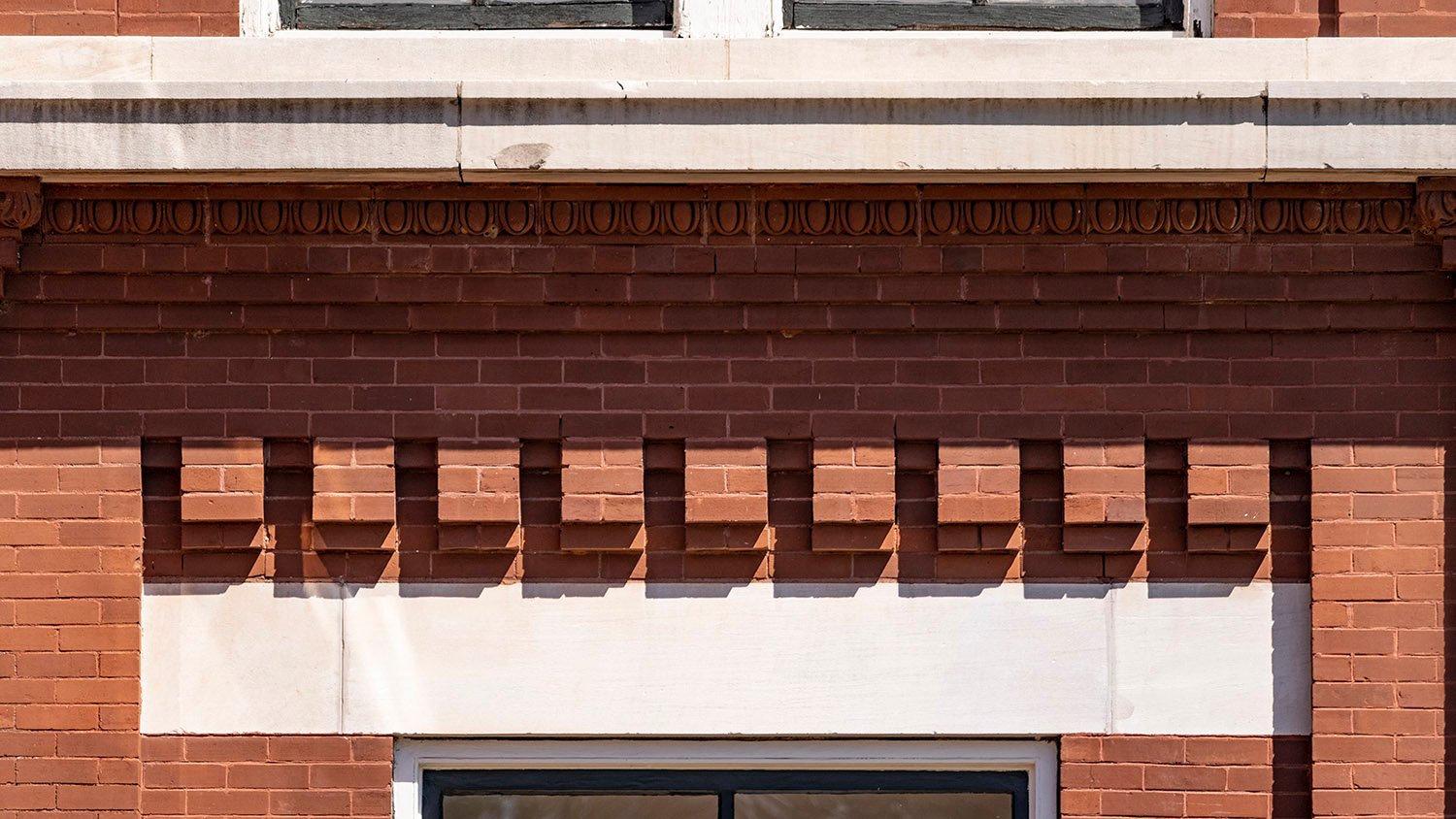
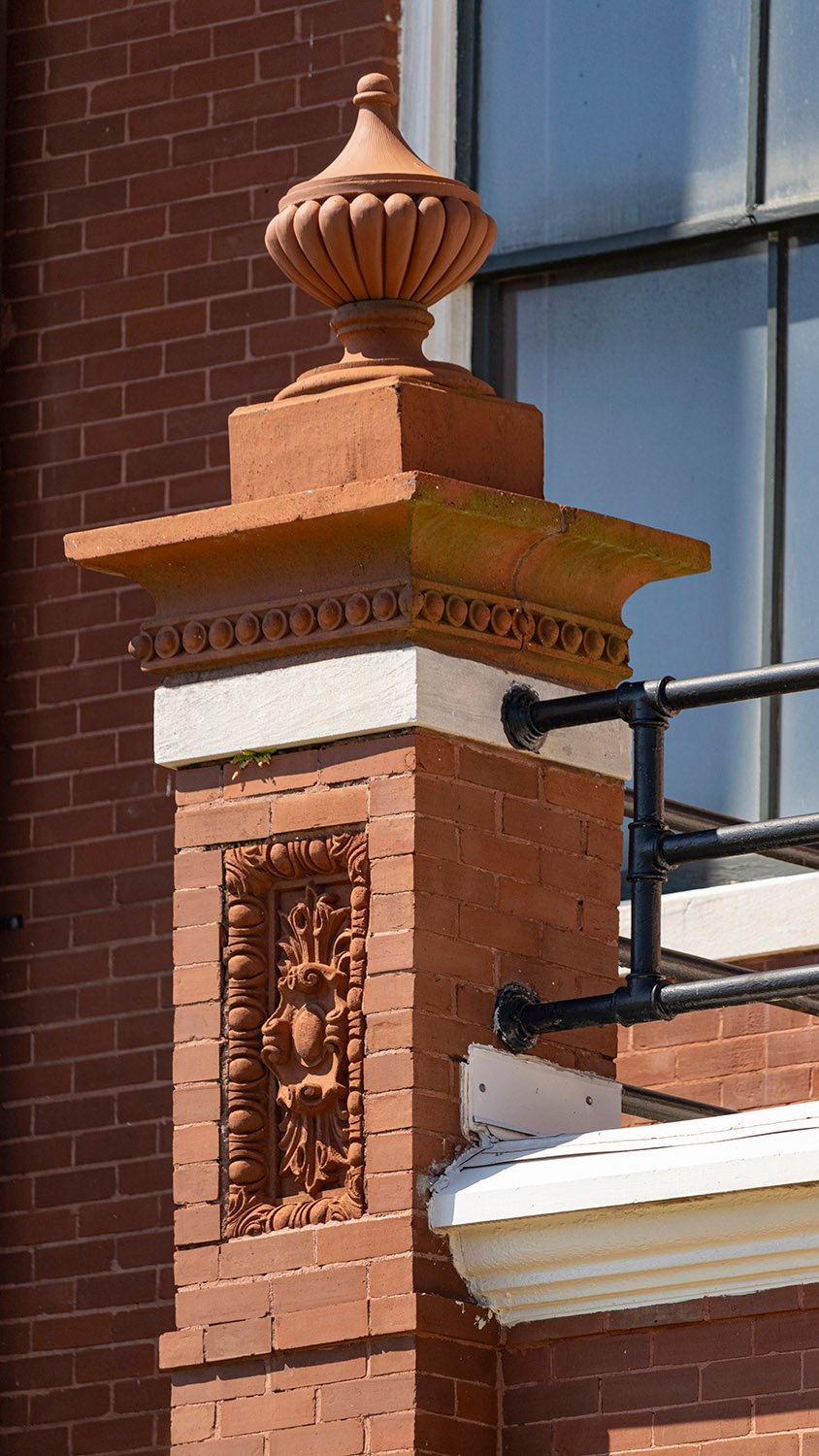
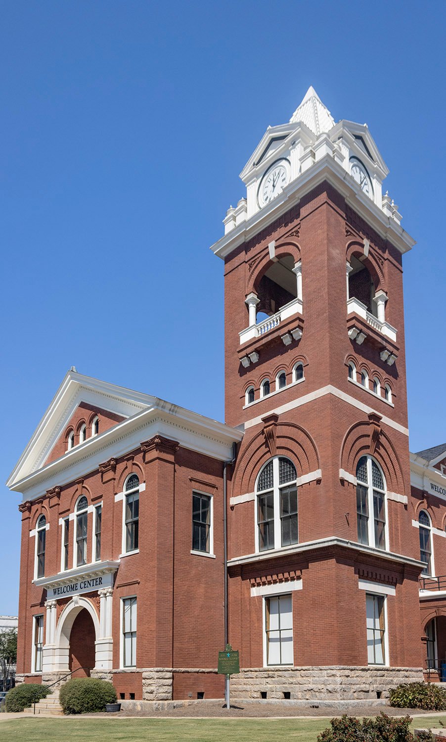
Bruce & Morgan. Butts County Courthouse (1898). Jackson, Georgia.1234Second-floor window on the tower of Butts County Courthouse, Jackson, GeorgiaEast elevation of Butts County Courthouse, Griffin, GeorgiaBay on the northeast corner of the Butts County Courthouse, Jackson, GeorgiaLooking at the Butts County Courthouse from the northeastAttic window on the south facade of the Butts County Courthouse, Jackson, GeorgiaSecond-floor Palladian window on the south facade of Butts County Courthouse, Jackson, GeorgiaEntrance on the south facade of the Butts County Courthouse, Jackson, GeorgiaTerracotta spandrel and limestone Ionic pilasters on the south facade of Butts County Courthouse, Jackson, GeorgiaArch window with terracotta keystone and terracotta Scamozzi capital on the south facade of the Butts County Courthouse, Jackson, GeorgiaTerra-cotta spandrel and limestone Ionic pilasters on the south facade of Butts County Courthouse, Jackson, GeorgiaClock tower on the Butts County Courthouse, Jackson, GeorgiaBelvedere on the clock tower of the Butts County Courthouse, Jackson, GeorgiaTiny arch windows and terracotta keystone on the clock tower of the Butts County Courthouse, Jackson, GeorgiaTerracotta and brick pediment over a first-floor window on the Butts County Courthouse, Jackson, GeorgiaTerracotta Scammozi capital on the southeast corner of the Butts County Courthouse, Jackson, GeorgiaBrick and limestone pediment over a first-floor window on the Butts County Courthouse, Jackson, GeorgiaSecond-floor arch window on the clock tower of the Butts County Courthouse, Jackson, GeorgiaPilaster with terracotta Scamozzi capital and window arch with terracotta keystone on the south elevation of the Butts County Courthouse, Jackson, GeorgiaTerracotta keystone on the front porch of the Butts County Courthouse, Jackson, GeorgiaPedestal with terra-cotta ornamentation on the front porch of the Butts County Courthouse, Jackson, GeorgiaPalladian attic window on the east facade of the Butts County Courthouse, Jackson, GeorgiaSecond-floor arch windows on the east facade of the Butts County Courthouse, Jackson, GeorgiaArch with terracotta ornamentation on the front porch of the Butts County Courthouse, Jackson, GeorgiaClock on the Butts County Courthouse, Jackson, GeorgiaPedestal with terracotta ornamentation on the front porch of the Butts County Courthouse, Jackson, GeorgiaSouthwest corner of the Butts County Courthouse, Jackson, Georgia
References
“Notice to Contractors.” The Atlanta Constitution, June 8, 1897, p. 11. ↩︎
“Butts’ New Courthouse.” The Atlanta Constitution, September 14, 1897, p. 5. ↩︎
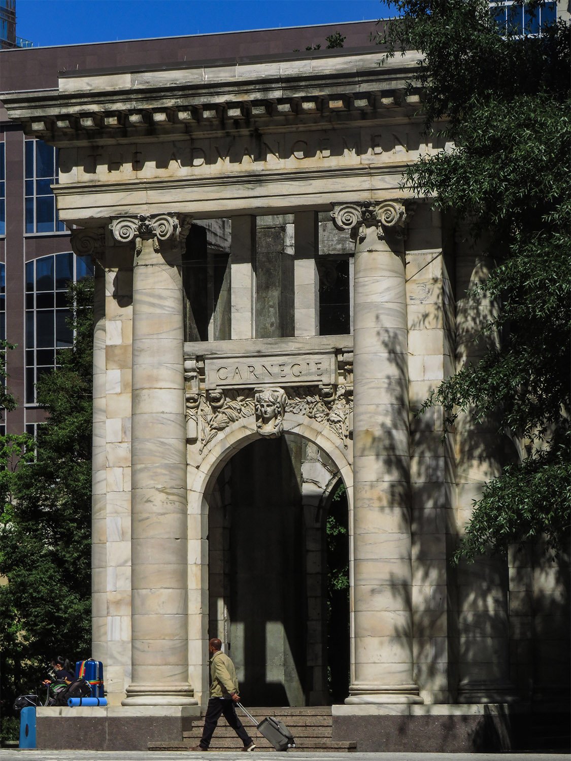
Henri Jova of Jova Busby Daniels. Carnegie Pavilion (1997). Hardy Ivy Park, Atlanta.1
Atlanta is typically willy-nilly when it comes to the persistent destruction of its own history, but occasionally, some brave preservationists can snatch a few scraps from the rubble for posterity.
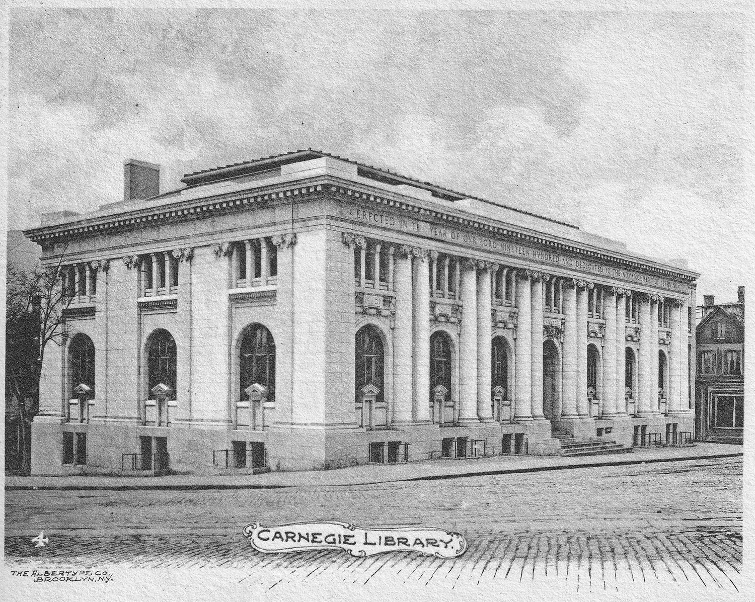
Such was the case in 1977, when the city’s Carnegie Library, built in 1902, was demolished for the Central Library.
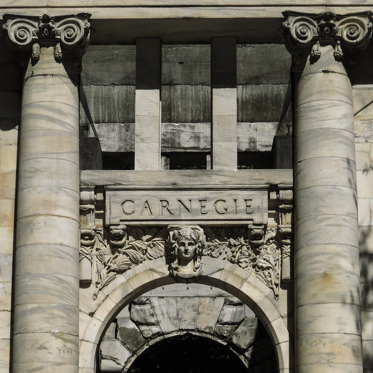
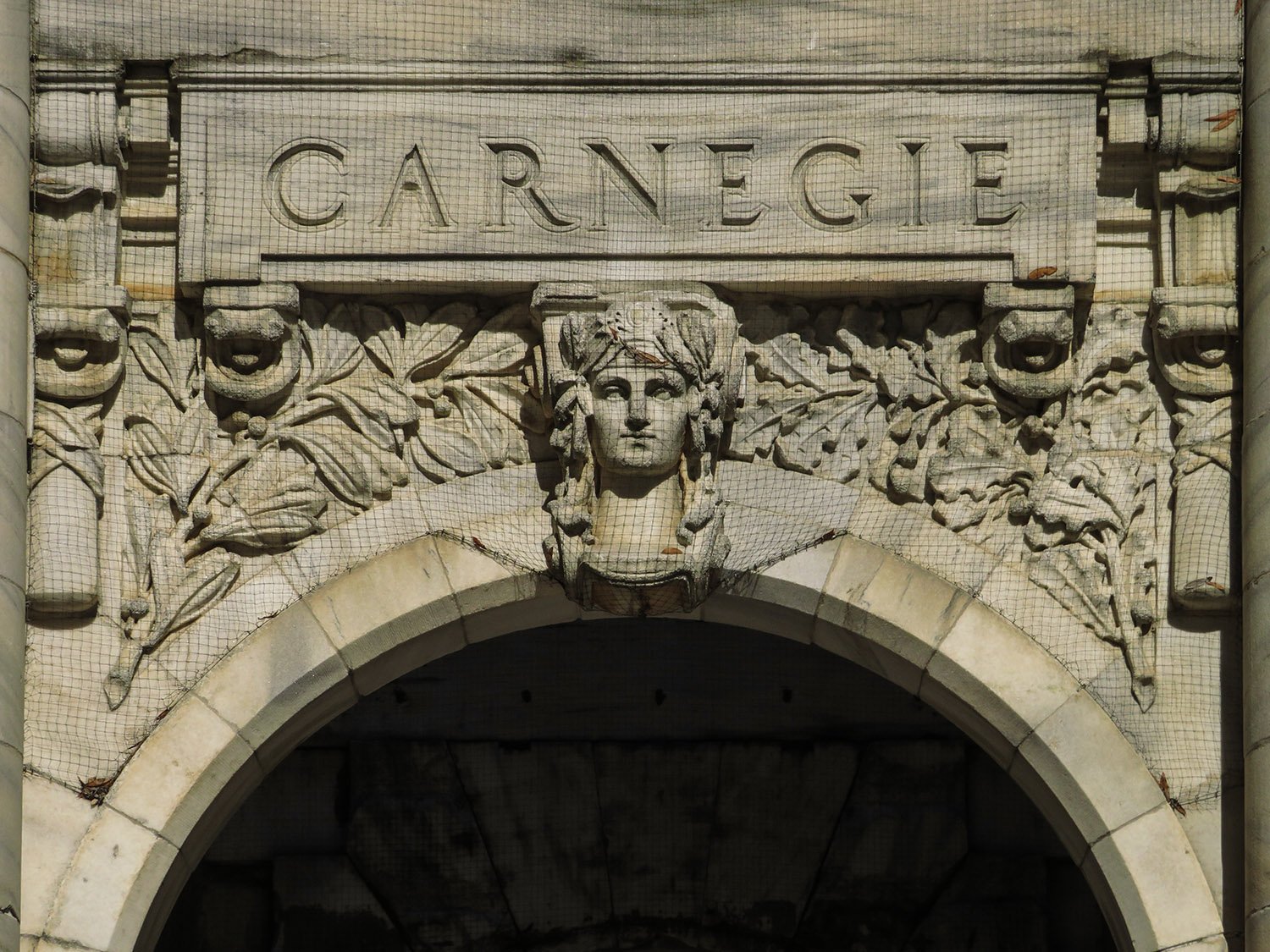
However, a local architect, A. Burnham Cooper, convinced the city to save the building’s marble facade, carefully dismantling and numbering the pieces before they were dumped at the Old Atlanta Prison Farm.2
Ackerman & Ross with J.H. Dinwiddie and Bleckley & Tyler.345Carnegie Library (1902, demolished 1977). Atlanta. Illustration from an undated postcard published by the Albertype Co.
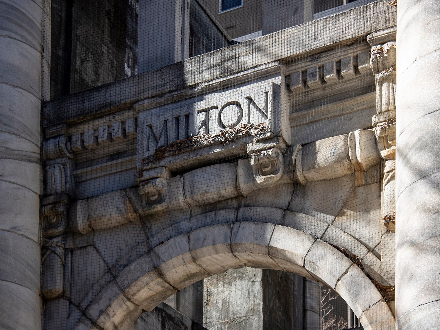
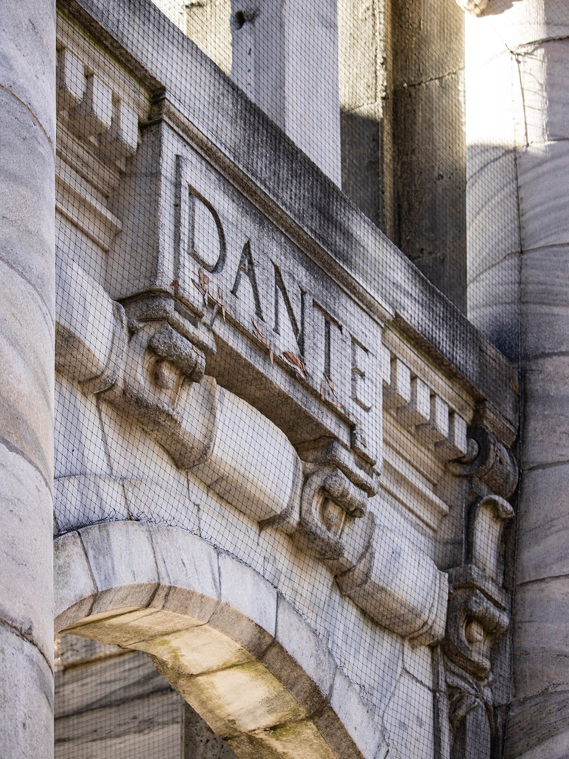
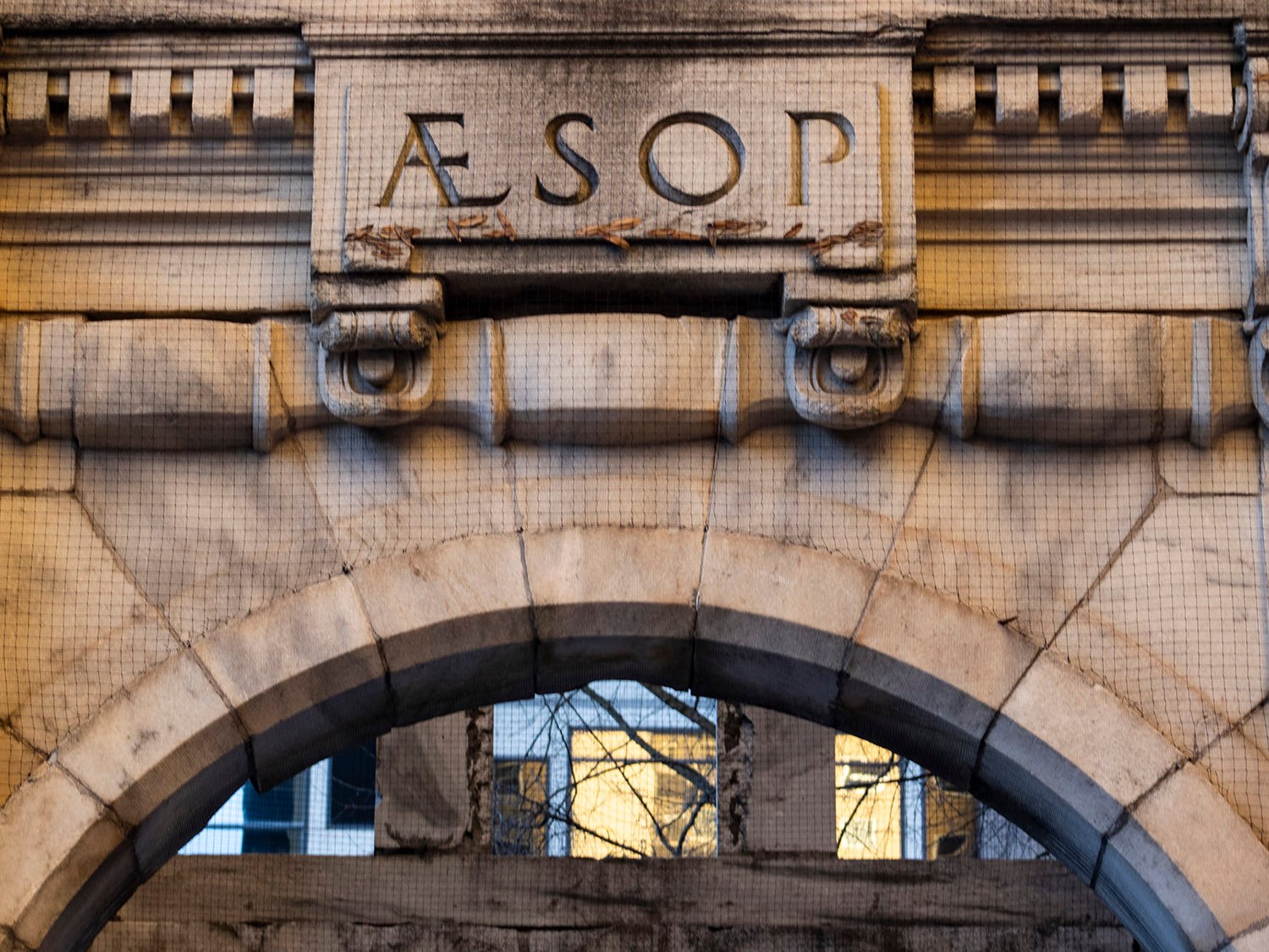
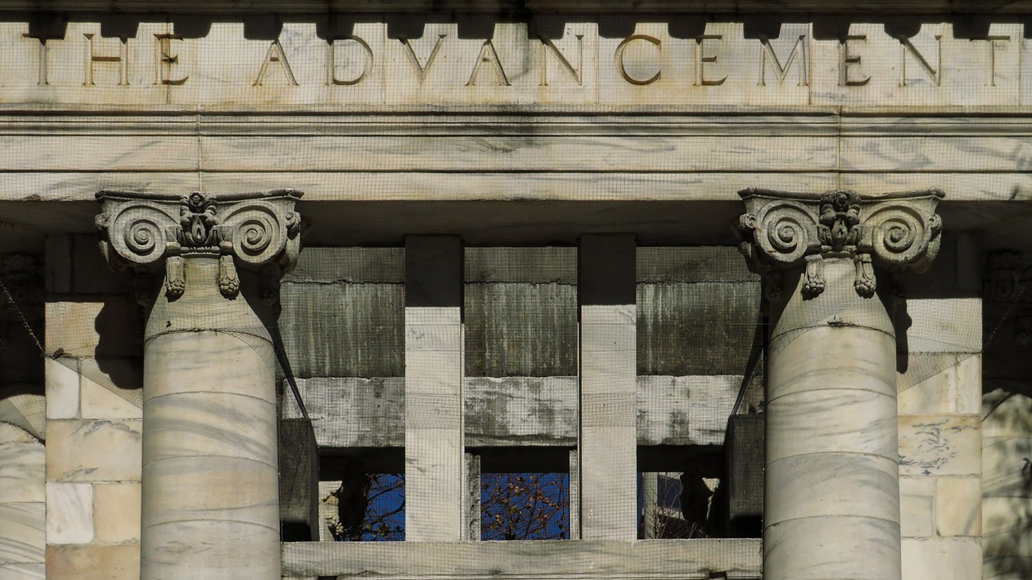
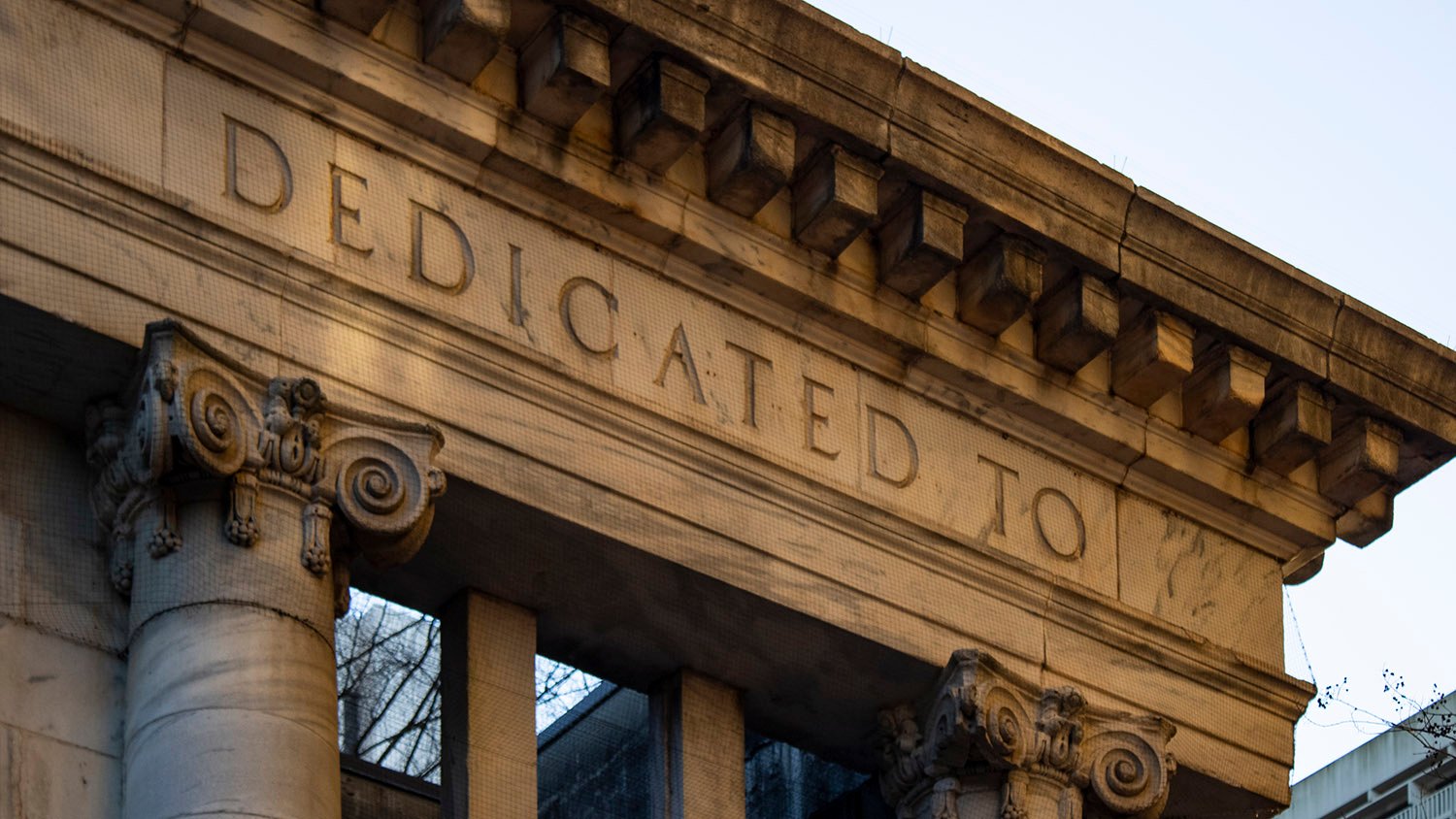
In the lead-up to the 1996 Olympics, when Atlanta was desperately trying to sell itself as a city with a legitimate cultural legacy—failing quite spectacularly, I might add—the idea was hatched to dust off the old library columns to form a centerpiece for Downtown’s new Hardy Ivy Park.6
South elevation of the Carnegie Pavilion, Atlanta
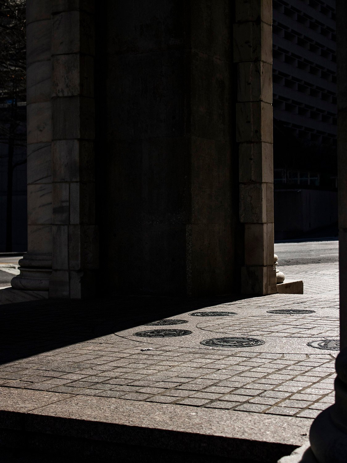
Tapped for the project was Henri Jova, one of Atlanta’s better 20th-century architects, who designed this fine Postmodern structure from the eight bays of the historic building’s Beaux-Arts facade.
The project wasn’t completed in time for the Olympics,7 but instead debuted the following spring,8 and today it stands as one of the few distinctive public monuments in the city.
East elevation of the Carnegie Pavilion, AtlantaNorth elevation of the Carnegie Pavilion, AtlantaWest elevation of the Carnegie Pavilion, AtlantaSouth elevation of the Carnegie Pavilion, AtlantaFrieze on the south elevation of the Carnegie Pavilion, AtlantaFrieze on the west elevation of the Carnegie Pavilion, AtlantaFloor of the Carnegie Pavilion, Atlanta
References
“Carnegie Pavilion dedicated”. The Atlanta Journal, April 10, 1997, p. B6. ↩︎
Fox, Catherine. “Building on History”. The Atlanta Journal-Constitution, January 26, 1996, p. E1. ↩︎
“Carnegie Library Commission Awarded To Ackerman & Ross”. The Atlanta Constitution, December 23, 1899, p. 1. ↩︎
“Will Begin Work Next Week”. The Atlanta Constitution, May 8, 1900, p. 12. ↩︎
“Local Talent Is Secured”. The Atlanta Constitution, February 22, 1902, p. 7. ↩︎