Category: Architectural Movements and Styles
-
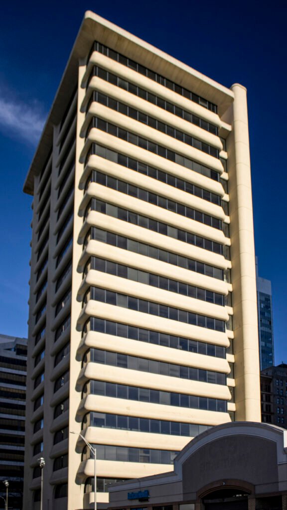
First Federal Savings and Loan Building (1964) – Atlanta
-
Walton Jackson Building – Gainesville, Georgia (1936)
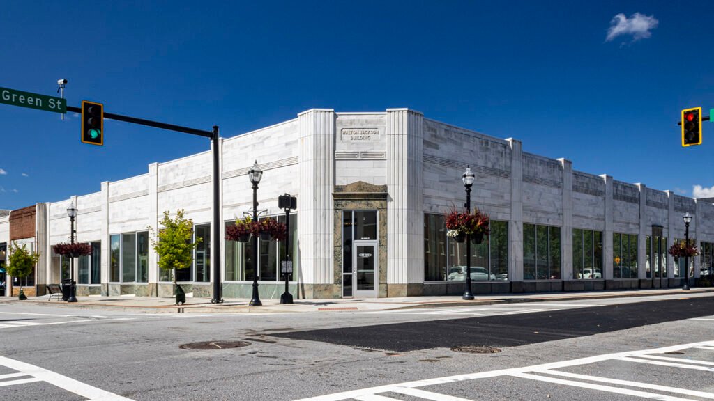
Walton Jackson Building (1936). Gainesville, Georgia.1 We’ll go with 1936 as the date for this fine building in Gainesville, Georgia, designed in the Classic Moderne style and elegantly clad in marble.
I suspect the structure was designed by Daniel & Beutell of Atlanta, who profited handsomely after Gainesville’s commercial district was substantially destroyed by a tornado in April 1936.2 3
Daniel & Beutell designed the nearby Hall County Courthouse and Gainesville City Hall — both are similar in style and appearance to this building. The firm also designed another project for Walton Jackson in 1936.4
- “Gainesville Lot Sold For $37,500”. The Atlanta Journal, April 29, 1936, p. 14. ↩︎
- “43 Known Dead, Others Feared Lost In Debris, Hundreds Are Injured In Gainesville Tornado”. The Atlanta Journal, April 6, 1936, p. 1. ↩︎
- “150 Are Known Dead At Gainesville; Fires Ravaging City Are Controlled”. The Atlanta Constitution, April 7, 1936, p. 1. ↩︎
- Manufacturer’s Record Daily Construction Bulletin, Volume 77 (1936). ↩︎
-
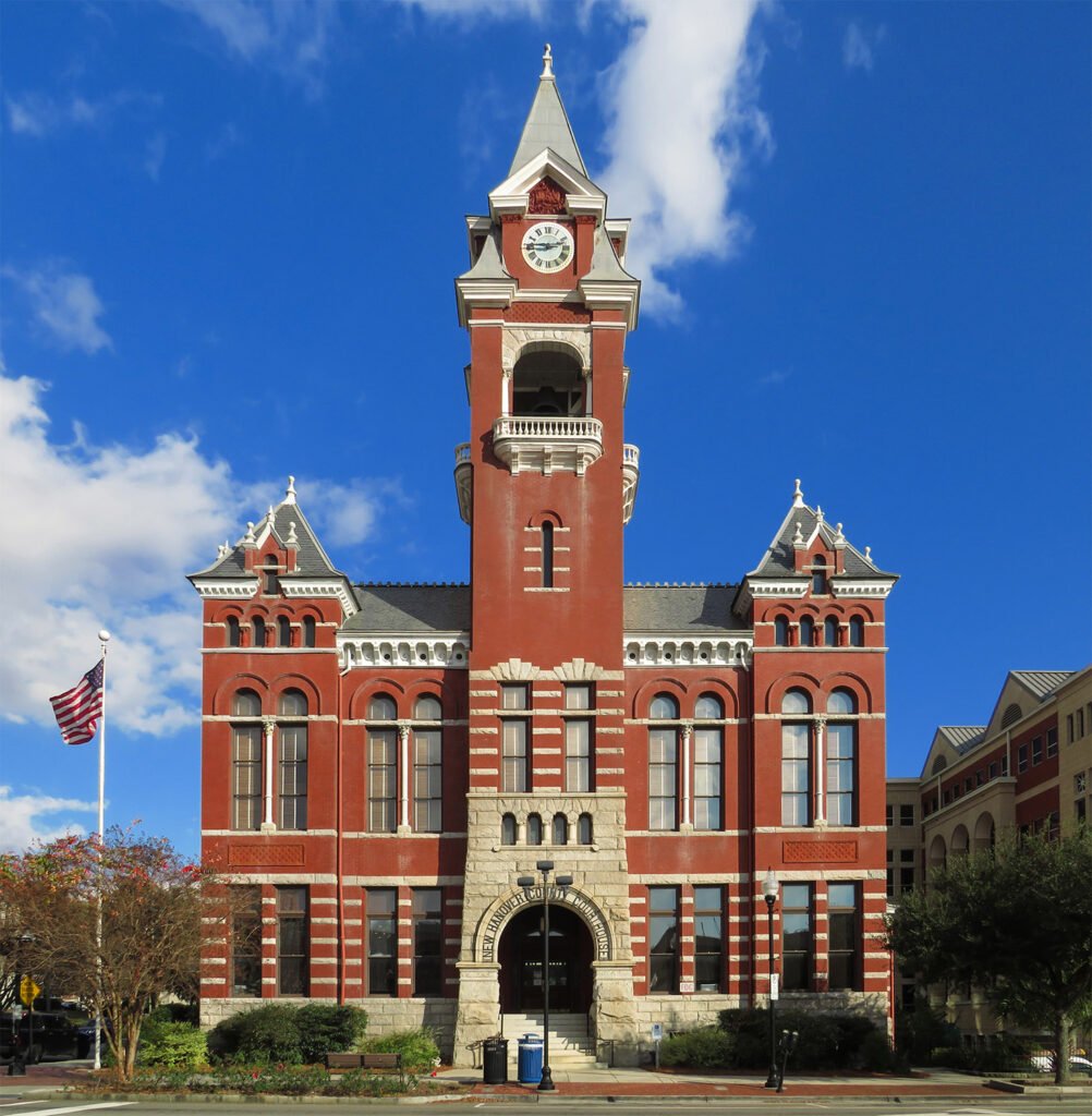
New Hanover County Courthouse (1892) – Wilmington, North Carolina
-
Van Leer Building (1961) – Atlanta
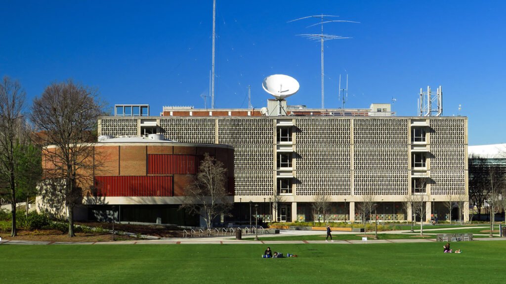
Robert and Company. Van Leer Building (1961). Georgia Institute of Technology, Atlanta.1 2 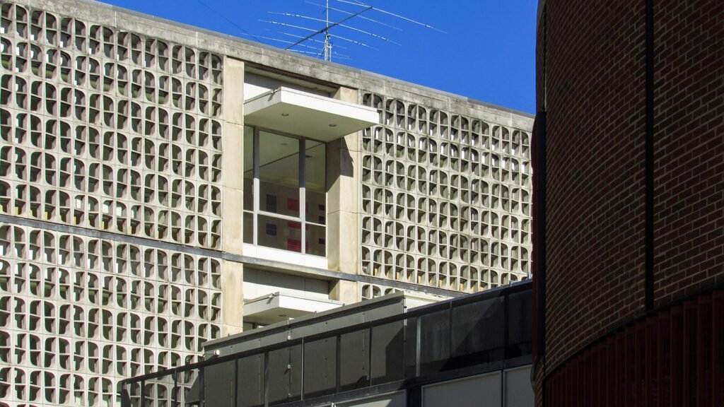
Looking at the Van Leer Building from the southwest 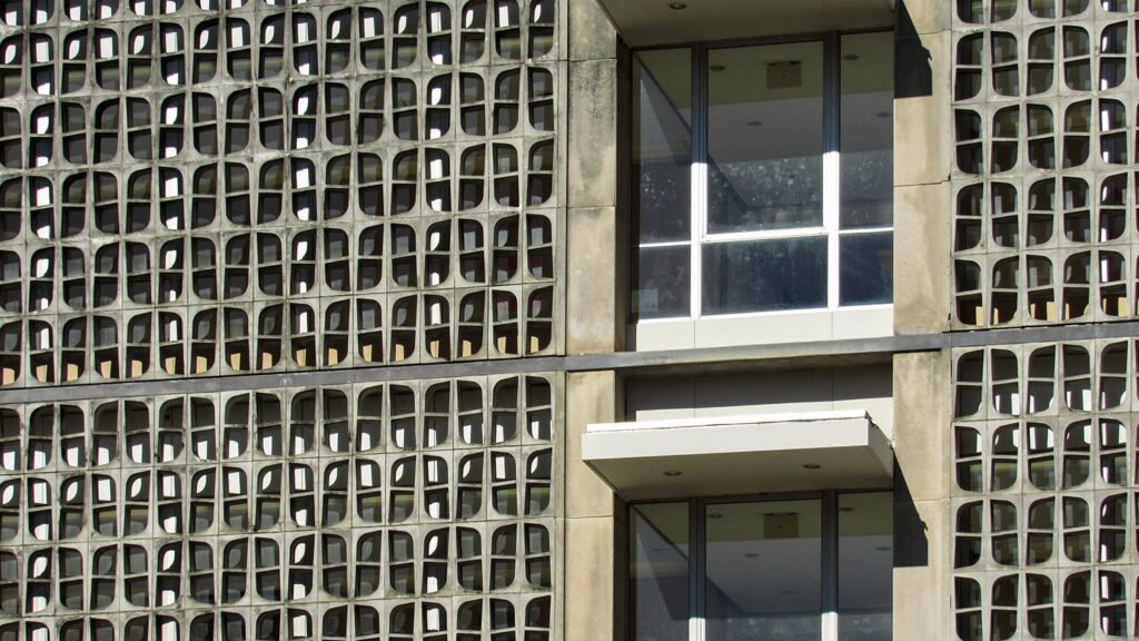
Screen wall on the south facade of the Van Leer Building 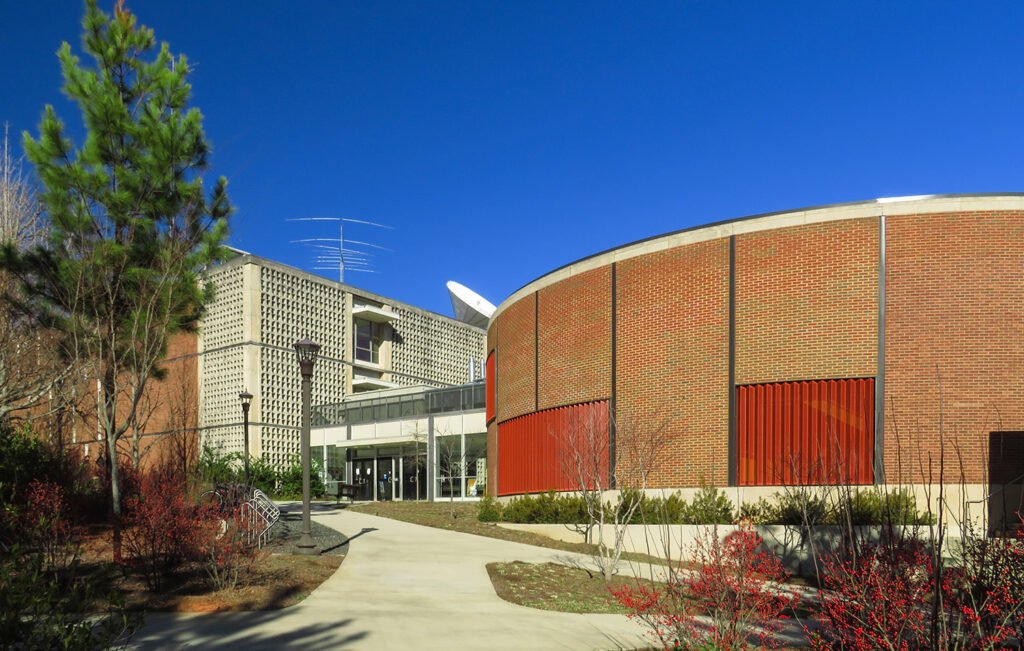
Approaching the Van Leer Building from the southwest “The genuine lover of learning, then, must make every possible effort, right from earliest childhood, to reach out for truth of every kind.” – Plato3
References
- “New Building for Georgia Tech”. The Atlanta Constitution, April 13, 1962, p. 25. ↩︎
- Georgia Institute of Technology Campus Historic Preservation Plan Update, 2023 ↩︎
- Plato.The Republic. ↩︎
-
Greenville County Courthouse (1918) – Greenville, South Carolina
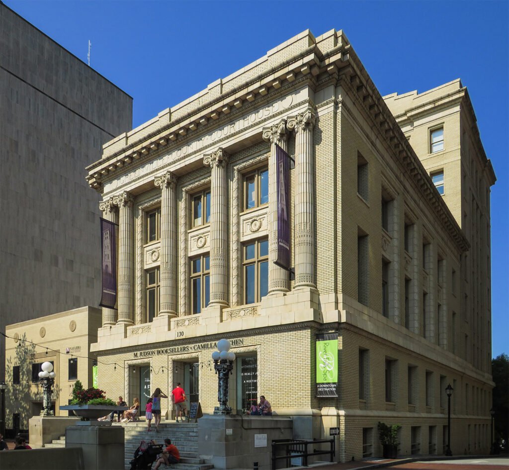
P. Thornton Marye. Greenville County Courthouse (1918). Greenville, South Carolina.1 2 3 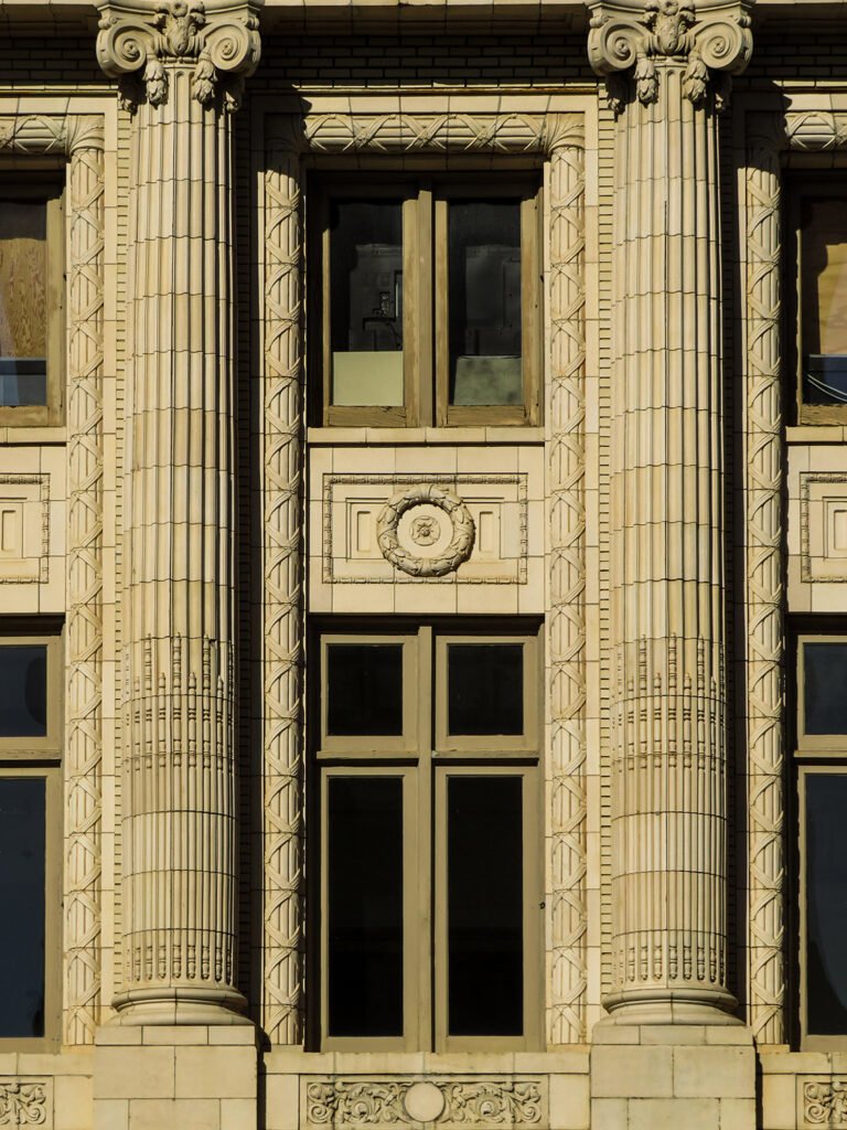
Bay on the east facade of the Greenville County Courthouse 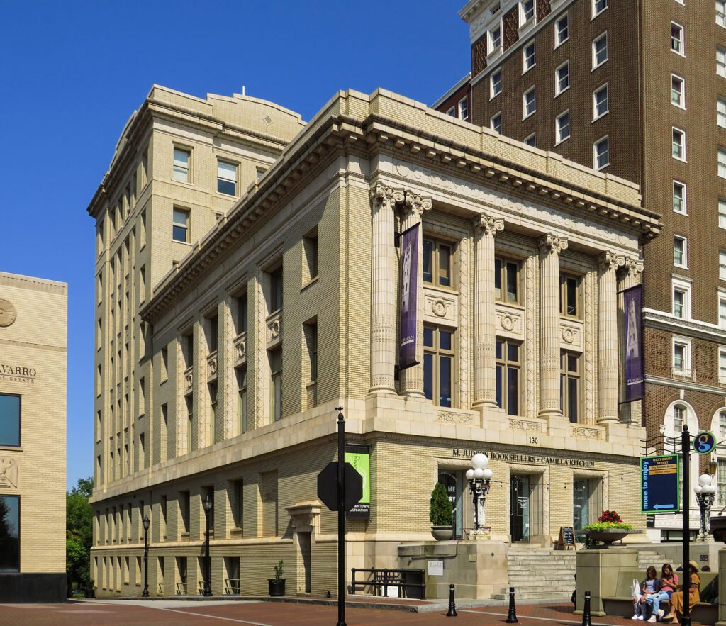
Looking at the Greenville County Courthouse from the southeast 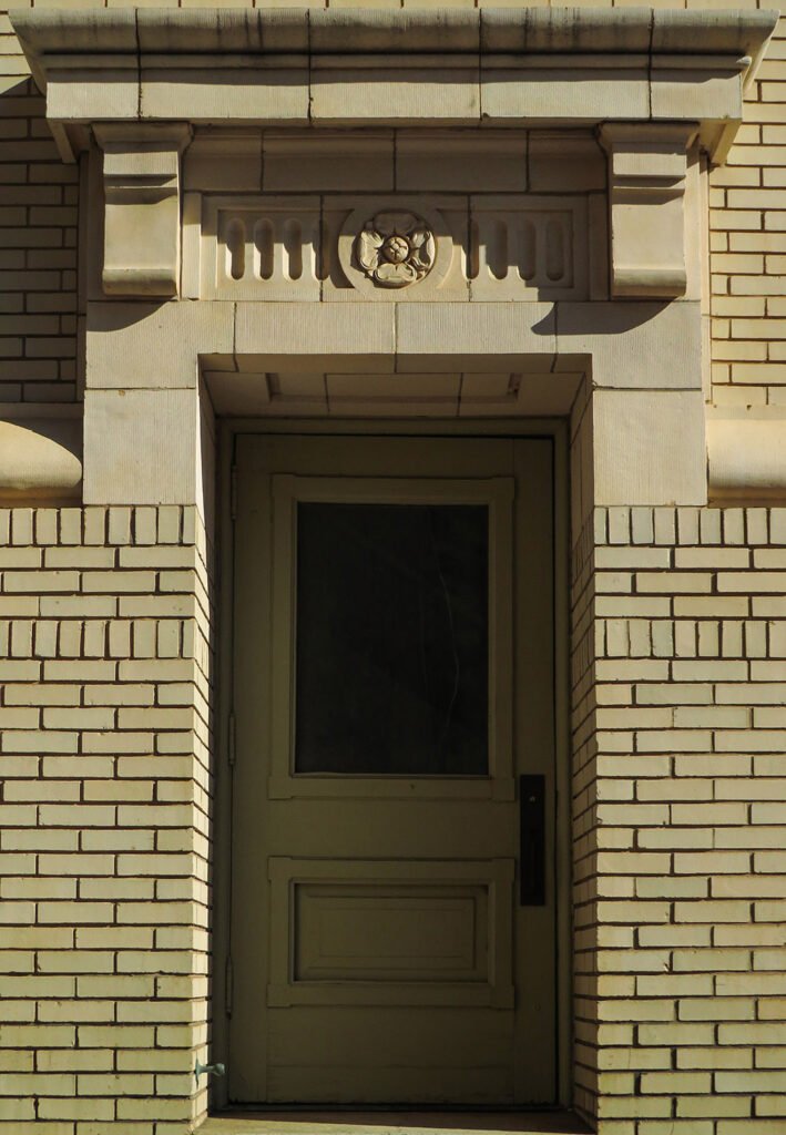
Door and pediment on the south elevation of the Greenville County Courthouse 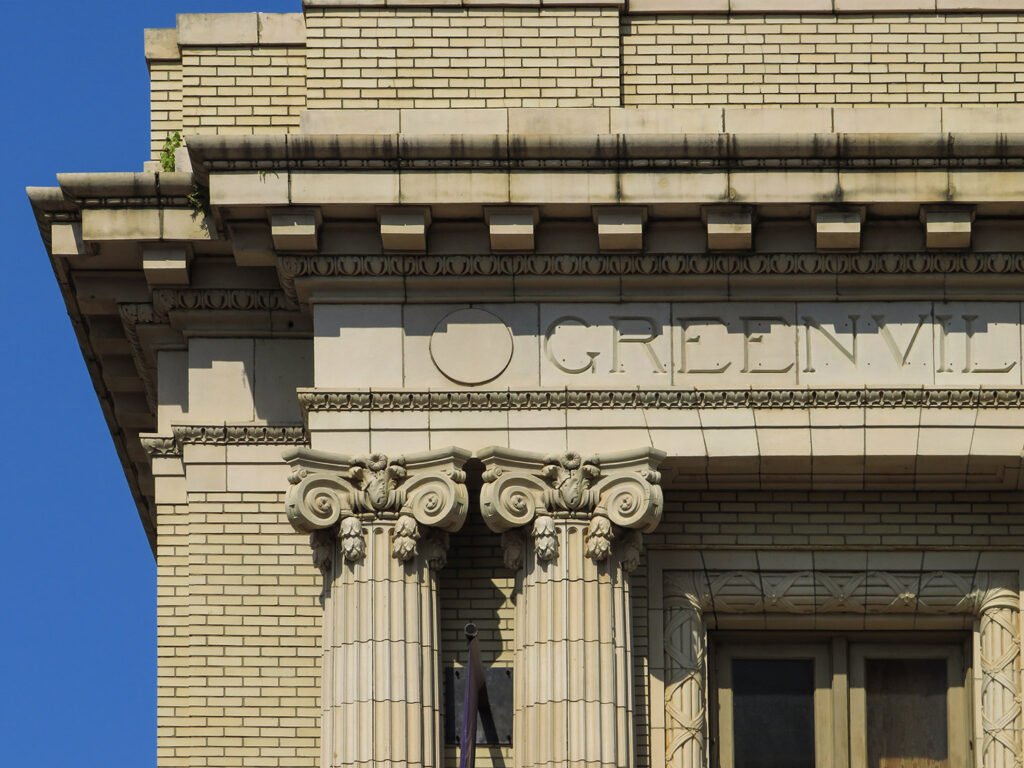
Cornice and columns on the east facade of the Greenville County Courthouse 
Architrave on the east facade of the Greenville County Courthouse References
- “Atlanta Architect Honored.” The Atlanta Constitution, June 13, 1915, p. 12 B. ↩︎
- “Invitation For Proposals.” The Greenville Daily News (Greenville, South Carolina), November 21, 1915, p. 6. ↩︎
- “First Court In New Court House”. The Greenville Daily News (Greenville, South Carolina), March 26, 1918, p. 5. ↩︎
-
Relic Signs, Mapped
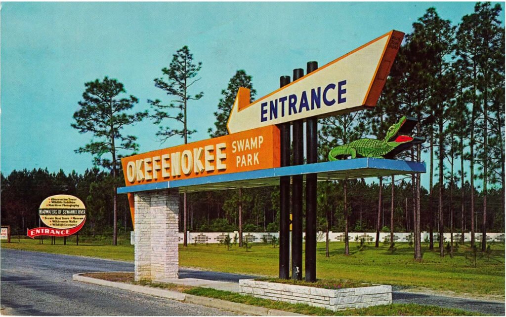
Okefenokee Swamp Park entrance sign. Photograph by Gene Aiken from an undated postcard. Year by year, more disappear: the quirky and colorful business signs of the 20th century that once littered the United States with their kitschy and eye-catching designs luring visitors to stores, restaurants, lounges, theaters, shopping centers, tourist attractions, and, of course, motels.
The synthesis of folk art tradition and cold-hard commercialism, these signs followed the growth of the American highway system, and were perhaps the most prominent symbols of the cynical and disposable culture of convenience and impulse that wholly consumed the United States in the 20th century.
The signs functioned as both advertisements and wayfinding tools, and could never be classified as high art: even in their prime, they were widely criticized as crass and unsightly markers to rampant consumerism and unfettered sprawl. Yet one era’s trash becomes another era’s treasure, and these signs attracted wider appreciation as their numbers began to dwindle.
Hand-painted, two-dimensional signs on the outer walls of buildings were a ubiquitous feature of the American landscape starting in the late 19th century, but by the 1920s, sign-making reached new heights and three-dimensional form with “sky signs”, now known as scaffold signs.
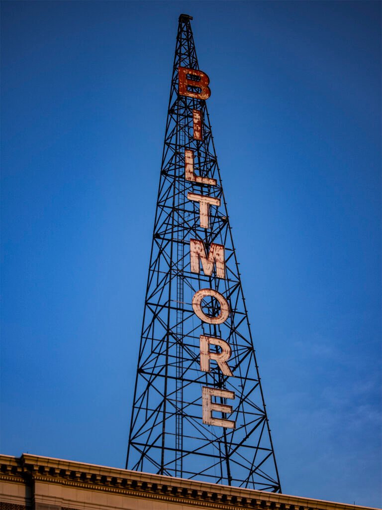
Sky sign on Biltmore Hotel (1924). Atlanta. Often perched atop towering hotels or other tall buildings in city centers, these machine-produced signs were attached to steel scaffolding and lit by electricity, still a novelty in many places.
As Americans began driving the first automobiles across a patchwork network of highways, sky signs served as bright, beckoning beacons that could be easily spotted from miles around.
Neon lights also debuted in the 1920s, and their distinctive glowing colors quickly became a standard feature of commercial signage, seemingly overnight.
Used by everyone from mom-and-pop shops to department stores, by the 1940s, neon signs were synonymous with nightlife entertainment and what is now referred to as Streamline Moderne architecture.
Clubs, diners, and movie theaters of the era often prominently incorporated neon elements into their sleek, curvaceous designs inspired by an increasingly mobile world of planes, trains, and automobiles.
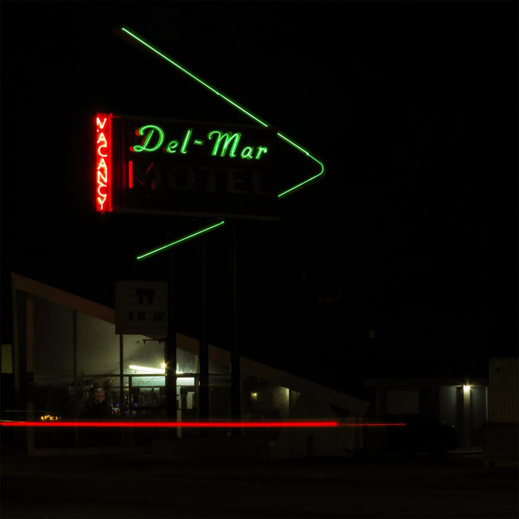
Del-Mar Motel (1955). Valdosta, Georgia. Designed by Joe Bright. The creative zenith of signmaking emerged with the advent of the Interstate Highway System in the mid-20th century.
Far-out, futuristic signs inspired by the Space Age and the Atomic Era dominated in the 1950s and 60s, today closely associated with Googie architecture, which originated in southern California and spread unevenly throughout the country.
Popular elements of Googie-derived signs included:
- starbursts
- shooting stars
- exploding atoms
- orbiting satellites
- giant boomerangs
- oversized arrows
Many signs of the era were more down-to-earth in their inspiration: roadside business signs often incorporated symbols that were evocative of their specific locale or region — a chomping alligator on the entrance sign for Okefenokee Swamp Park in Georgia, for instance (pictured above).
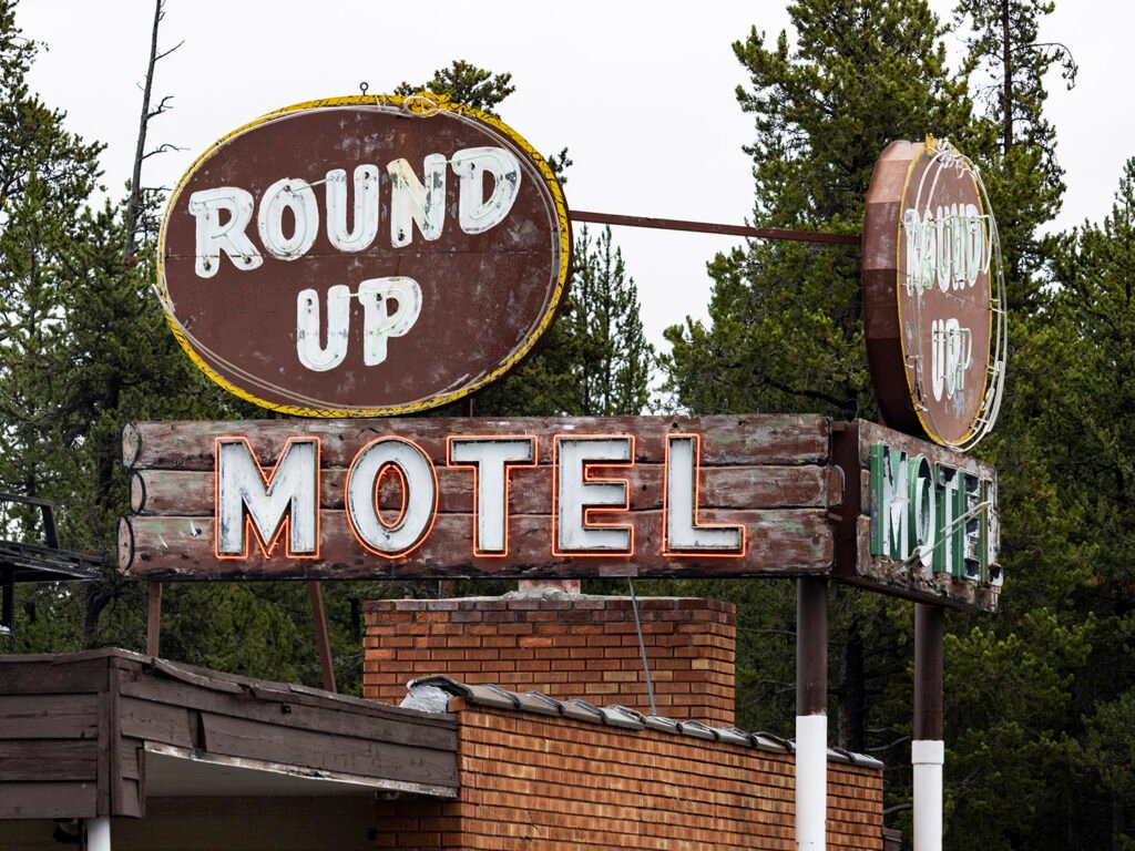
Round Up Motel. West Yellowstone, Montana. Other signs were more exotic in flavor, capitalizing on the Tiki culture that emerged in the White middle class following World War II, using symbols and typefaces that were stereotypically Polynesian, Hawaiian, or Pan-Asian.
Typically designed by local sign makers, vernacular roadside signs were often used as distinctive focal points for structures that were otherwise unremarkable and interchangeable — see one hole-in-the-wall motel, for instance, and you’ve seen them all. It was the sign that was memorable, not the building.
Vernacular signs were already falling out of fashion when Robert Venturi and Denise Scott Brown, a husband-and-wife architectural team from Philadelphia, galvanized the architectural world with the 1972 publication of Learning from Las Vegas, in which they praised vernacular road signs for their “architecture of communication over space”1 and presented them as a legitimate art form worthy of analysis.
Venturi and Scott Brown accused architects of designing to suit “their own particular upper-middle-class values, which they assign to everyone” and admonished them to “gain insight from the commonplace”.2
Yet even as architects began drawing inspiration from them, by the 1970s, vernacular roadside signs were steadily supplanted by standardized signs that became more subdued, less conspicuous, and thoroughly homogenous.
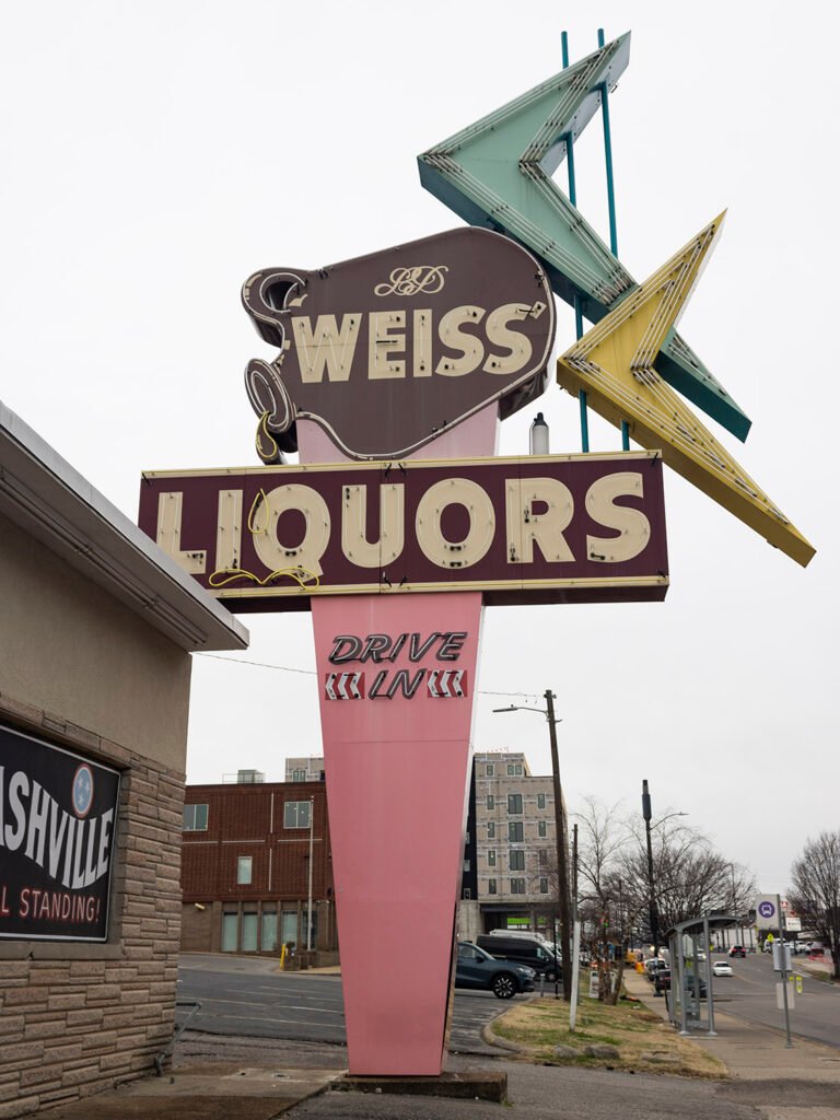
Weiss Liquors (circa 1966). Nashville, Tennessee. Today, roadside signs from the mid-20th century are nearly extinct, often regulated out of existence by restrictive sign ordinances or demolished when their associated businesses close or succumb to redevelopment. Those that remain are either in a state of decay or have been well-maintained and, in some cases, skillfully restored.
If you’re hunting for relic roadside signs in the United States, there are a few good places to start:
- Neglected or run-down urban neighborhoods or rural towns.
- Nostalgic destinations such as long-running local restaurants, theaters, and stores, or tourist areas near beaches, mountains, or national parks.
- Shopping centers built in the 1950s, 60s, or 70s that have retained elements of their original design.
These relic signs are quaint reminders of a time when the appeal of travel lay in the freedom of its uncertainty and little surprises, when Americans weren’t so embedded in the illusion of control, merely navigating from one planned destination to the next on routes prescribed by machine, coddling our consumed minds with the bland promise of comfort, safety, and familiarity.
Or, perhaps, that time never existed at all.
The map below charts the location of every vintage sign I’ve photographed so far, with accompanying images. Many of the signs have since been removed.
References
-
High Museum of Art Expansion (2005) – Atlanta
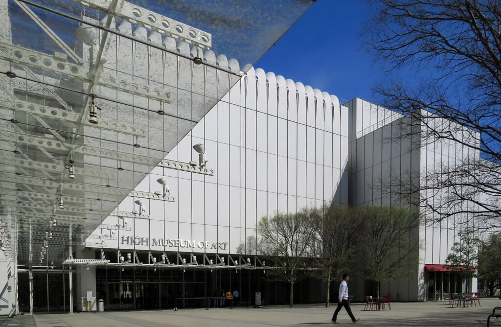
Renzo Piano Building Workshop with Lord, Aeck & Sargent, Inc. High Museum of Art Expansion (2005). Midtown, Atlanta.1 2 
Aluminum panels on the facade of the High Museum of Art Expansion 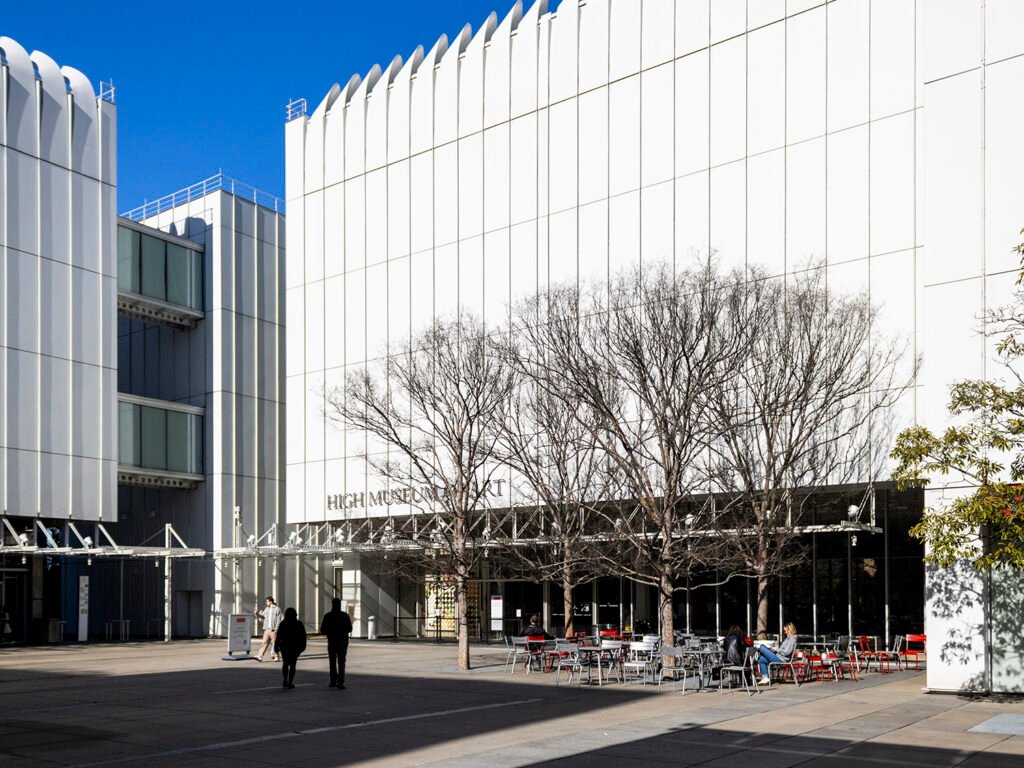
Looking northwest toward the entrance of the High Museum of Art Expansion 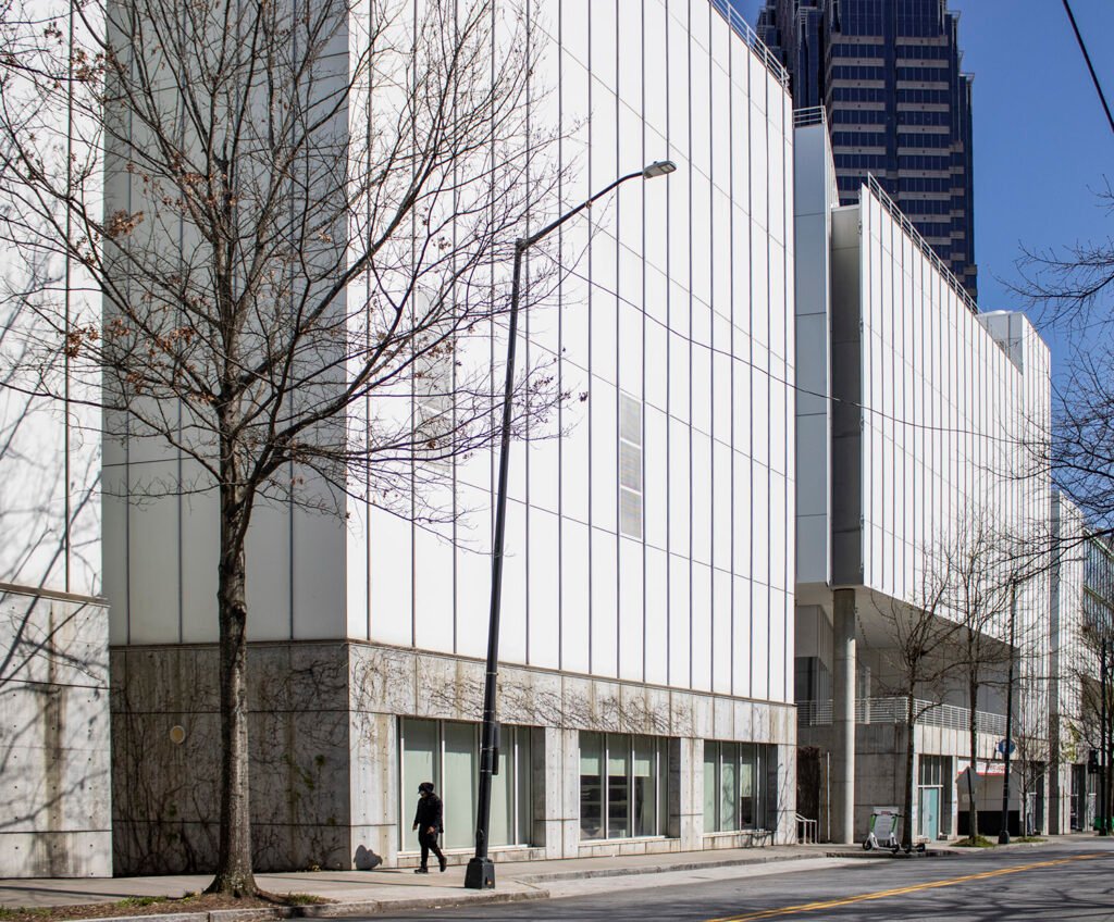
West elevation of the High Museum of Art Expansion 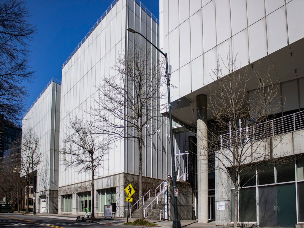
West elevation of the High Museum of Art Expansion 
Looking toward the Anne Cox Chambers Wing of the High Museum of Art Expansion 
Entrance to the Anne Cox Chambers Wing of the High Museum of Art Expansion 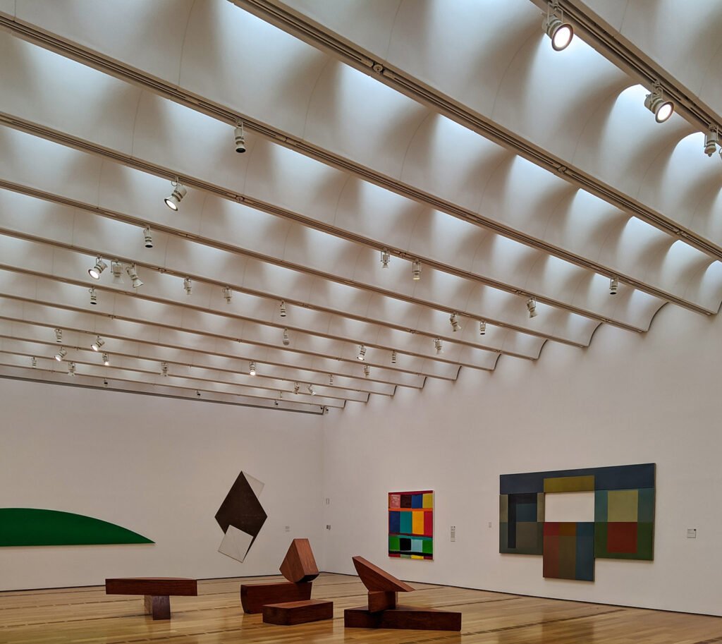
Third-floor gallery in the High Museum of Art Expansion 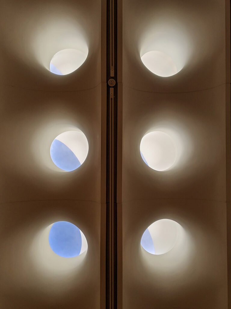
References
- High Museum Expansion – RPBW ↩︎
- Fox, Catherine. “Piano’s Forte”. The Atlanta Journal-Constitution, November 4, 2005, p. 1A. ↩︎
-
The Priest’s House (1884) – Atlanta
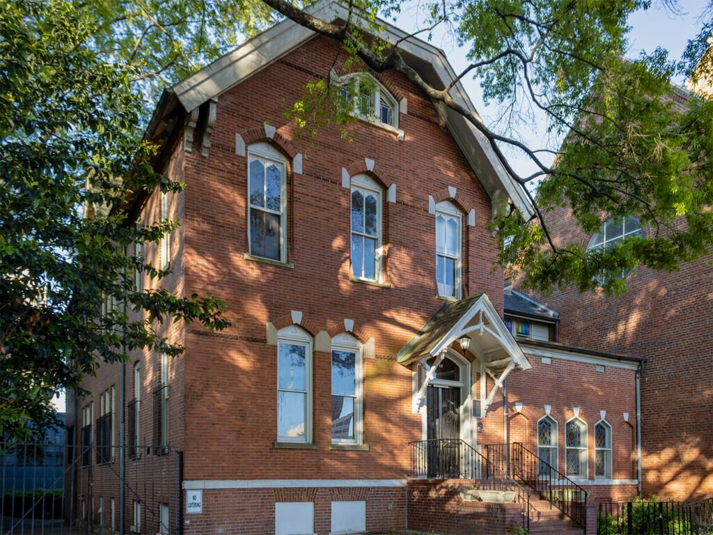
E.G. Lind. The Priest’s House at Catholic Shrine of the Immaculate Conception (1884). Atlanta.1 2 3 4 5 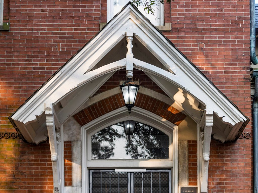
Porch on the north facade of The Priest’s House 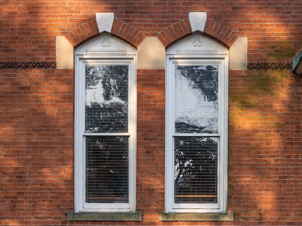
First-floor windows on the north facade of The Priest’s House 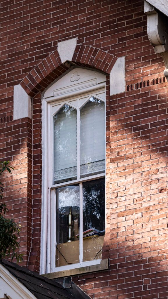
Second-floor window on the north facade of The Priest’s House 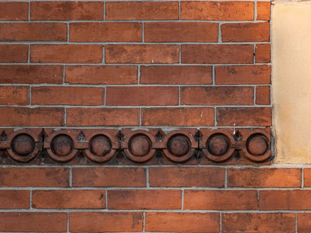
Terracotta stringcourse on the north facade of The Priest’s House 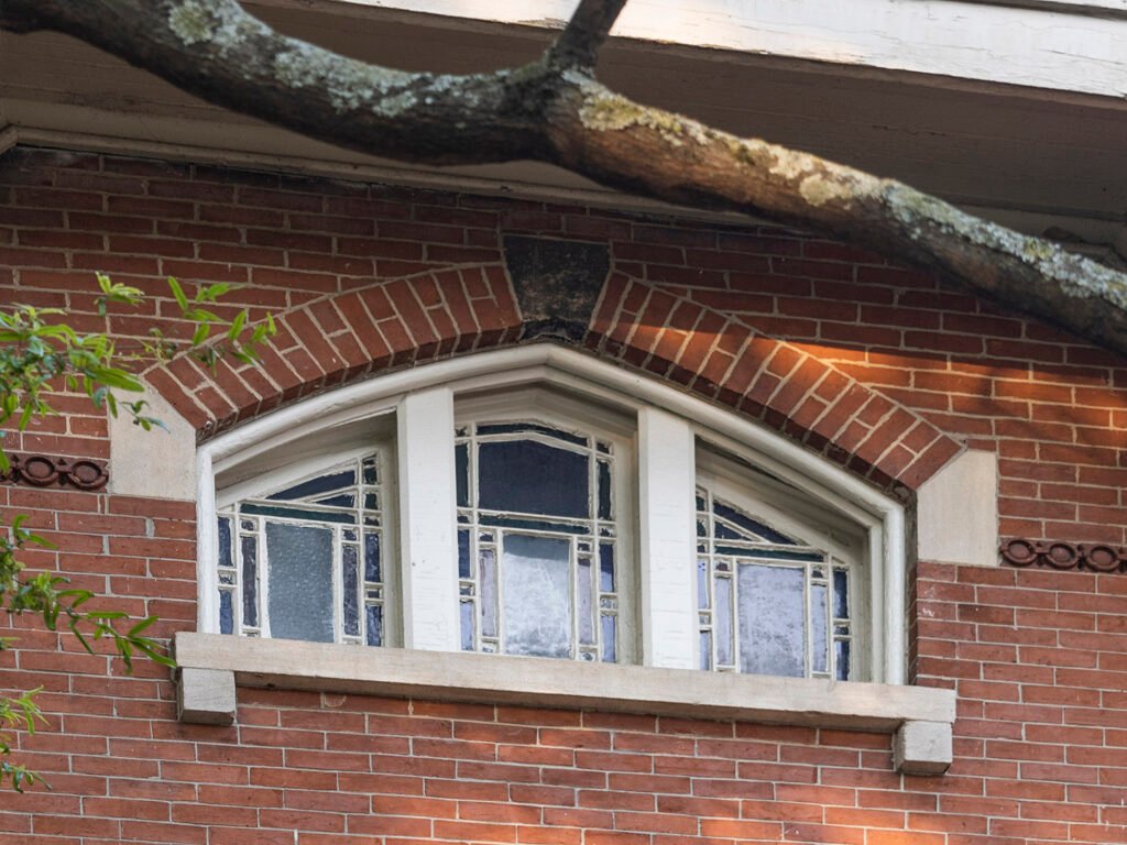
Attic window on the north facade of The Priest’s House 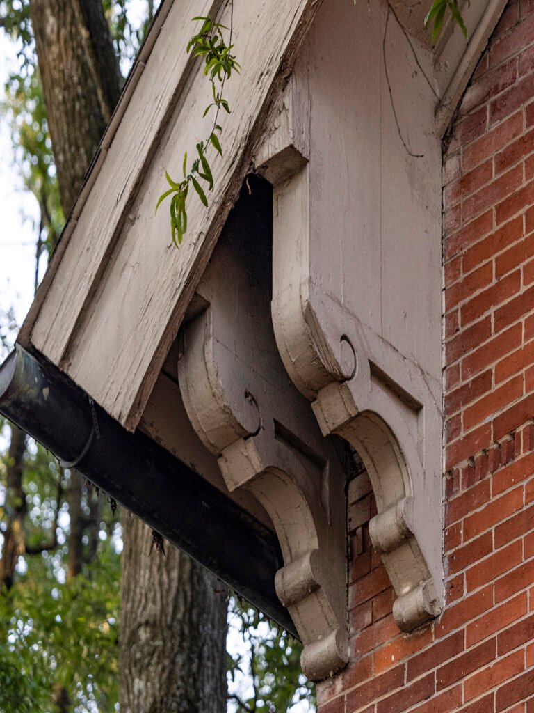
Brackets on the north facade of The Priest’s House 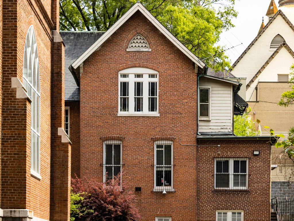
West elevation of The Priest’s House References
- Belfoure, Charles. Edmund G. Lind: Anglo-American Architect of Baltimore and the South. Baltimore, Maryland: The Baltimore Architectural Foundation (2009). ↩︎
- “Notice to Builders & Contractors”. The Atlanta Constitution, June 25, 1884, p. 5. ↩︎
- “Building Bits.” The Atlanta Constitution, May 30, 1884, p. 7. ↩︎
- “The Priest’s House”. The Atlanta Constitution, November 9, 1884, p. 9. ↩︎
- “A Brilliant Occasion.” The Atlanta Constitution, November 12, 1884, p. 7. ↩︎
-
FMC Tower (2016) – Philadelphia
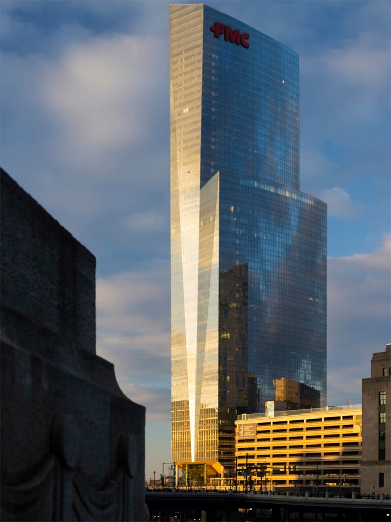
Pelli Clarke & Partners with BLT Architects. FMC Tower (2016). Philadelphia.1 References